Table of Contents

- App performance optimization covers speed, responsiveness, and perceived smoothness, not just milliseconds off the initial load.
- Performance and UX are the same user problem: one is measured in milliseconds, the other is measured in clarity and confidence.
- Most SaaS teams fix the wrong layer first, optimizing server speed before addressing the UX patterns that make fast apps feel broken.

Founders who hand app performance entirely to their engineering team lose users at a rate they never trace back to the right cause. Google's research shows a 1-second load time delay reduces conversions by 7%. More revealing: 53% of mobile users abandon an app that takes over 3 seconds to load, according to Google's 2023 Core Web Vitals report. Neither number is fixed by a faster server alone.
App performance optimization sits at the junction of engineering speed and UI/UX optimization. Most SaaS teams address only half of it. Engineers improve Core Web Vitals scores. Designers clean up the interface. Nobody coordinates the perceived experience in between, and users still leave.
This guide is for founders past the "we know we have a problem" stage and now deciding how to fix it: which changes to prioritize, what a good outcome looks like, and how to evaluate whether a design or development partner can actually deliver results. By the end, you will have a clear framework to audit your app's performance gaps and act on them with confidence.
What Most Founders Get Wrong About App Performance
App performance optimization is not a backend problem alone. Founders treat it that way, end up with a faster server running the same broken UX patterns, and watch users still leave.
Measuring performance with only technical metrics is the most common mistake. A Google PageSpeed score climbs from 52 to 89. Engineering celebrates. But users still watch a blank loading spinner for 2.1 seconds after login before seeing any data. Metrics improved. Perceived experience did not.
Perceived performance is the user's experience of speed, regardless of what the actual load time reads. A skeleton screen, a placeholder layout shaped like the incoming content, loads identical data but makes users feel the app is up to 40% faster, according to research from the Nielsen Norman Group. No server changes required. No engineering sprint needed. Pure UI design decision.
Second mistake: treating app performance as a one-time sprint instead of a continuous product practice. Stripe's dashboard team ships performance improvements every quarter as a first-class product goal. Linear treats perceived responsiveness as a design constraint in every feature spec, not a post-launch cleanup task. Both products feel immediate and trustworthy because speed is built into their design and development culture, not bolted on after users complain.
Design debt compounds this problem. Every shortcut taken in onboarding screens, every spinner left as a placeholder, every unoptimized image quietly added to a feature page: these accumulate into a product that slows down faster than any server upgrade can compensate.
Now that you understand where the mistake actually lives, here is what a complete, two-sided approach looks like.
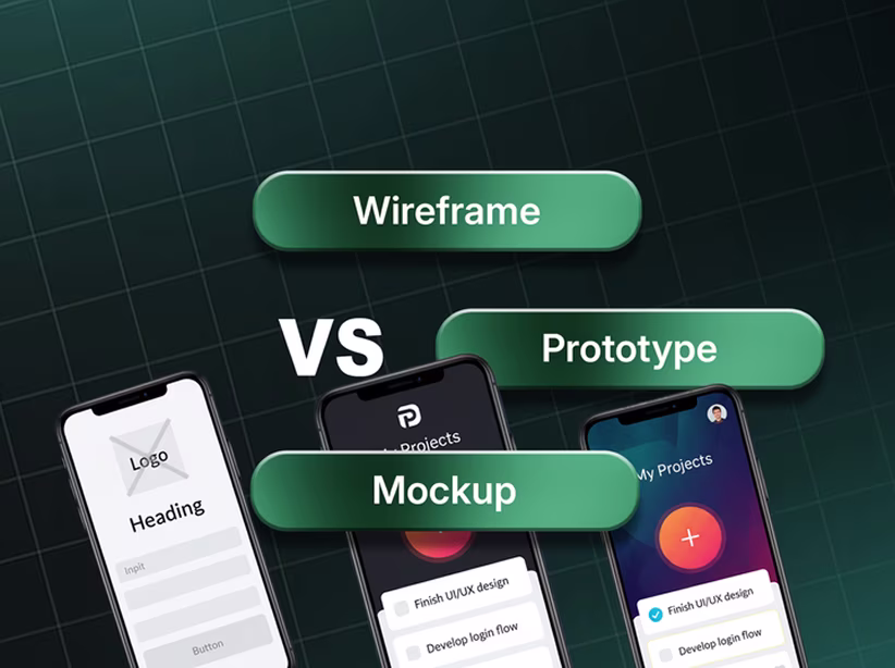
Performance vs UX: Two Problems, One Fix
App performance and UI/UX optimization are different names for the same user problem. Performance measures how fast the system responds. UX measures how well the user understands and trusts that response. Both fail together, and both must be fixed together.
When Performance Is the Primary Problem
A SaaS app with a Largest Contentful Paint (LCP) above 4 seconds has a measurable technical problem. Fixes live in the code: reduce JavaScript bundle size, add code splitting, remove render-blocking resources, and improve Time to First Byte (TTFB) at the server layer. These are engineering decisions.
Clear signs that performance is the primary culprit:
- LCP above 2.5 seconds on Google PageSpeed Insights
- Cumulative Layout Shift (CLS) above 0.1, causing the interface to jump during load
- Core Web Vitals flagged in Google Search Console with "Poor" ratings
- High bounce rate on the first page load, before any user interaction
Apps like Vercel and Netlify publish their own performance benchmarks and optimize infrastructure as a product feature, because for developer-tools SaaS, frontend performance speed is not a feature, it is the product itself.
When UX Is the Primary Problem
A SaaS app with strong technical metrics but high drop-off after login has a UX problem, not a performance problem. Users are not waiting; they are lost. Empty states with no clear next action, navigation that buries core features three levels deep, dashboards showing 12 metrics when a user checks 2: these patterns drive churn that looks like engagement decay in analytics but originates entirely in design decisions.
Clear signs that UX is the primary culprit:
- Users log in consistently but rarely complete core workflows
- High exit rate on feature pages that load quickly
- Support tickets asking where to find basic functions
- Trial-to-paid conversion below benchmark despite good traffic
Intercom reduced early-session support ticket volume by 30% after redesigning empty state screens across their mobile app with context-aware onboarding prompts. Server response time was unchanged. UX changed everything. Feedback loops in UI design, the visual signals that tell users their action registered, their data loaded, their context switched, drive user confidence more than any infrastructure upgrade.
When Both Need to Be Fixed Together
SaaS products in the 18-to-36-month range carry both problems layered on top of each other. Slow load time on a confusing interface compounds into churn that looks unsolvable. Fixing only load time delivers a user quickly to a screen they cannot navigate. Fixing only UX leaves a user who eventually understands the product but gives up waiting for it to open.
Web app performance and UX design must be scoped as a single workstream. The technical team and design team need a shared definition of "done" that includes both PageSpeed benchmarks and user task completion rates.
What Good App Performance Optimization Actually Looks Like
Good app performance optimization produces measurable results on both sides: technical metrics improve and user behavior shifts. One without the other is an incomplete fix.
Technical markers of a successful optimization:
- LCP under 2.5 seconds on both mobile and desktop
- INP (Interaction to Next Paint) under 200 milliseconds. Google's 2024 update to First Input Delay, measuring UI responsiveness to user actions
- CLS below 0.1, ensuring the layout never jumps during load
- JavaScript bundle under 200KB for initial load, with non-critical code split and lazy-loaded
- Images served in WebP format with lazy loading active below the fold
- Above-the-fold content fully rendered before any below-fold assets begin loading
UX markers of a successful optimization:
- First core action completion rate within the first session increases (benchmark: 15–25% lift after structured UX improvements, per Reforge product onboarding data)
- Time-on-task for key workflows decreases measurably
- Support ticket volume related to navigation and "where is X" questions drops
- Session depth increases without increasing session length. Users do more in less time
For mobile specifically, the performance bar shifts again. Mobile users operate on variable network conditions, smaller viewports, and interrupted sessions that desktop optimization never accounts for. Applying mobile app UX best practices as a design constraint from the start prevents the most expensive rewrites later.
A B2B project management SaaS with around 2,000 active users restructured their dashboard navigation from a 4-level nested menu to a flat two-tier structure. Engineering made zero performance changes. Task completion time for their most common user workflow, switching between project views, dropped from 14 seconds to 4 seconds. No server changes, no frontend refactor. Navigation architecture alone was the bottleneck. That is the UX layer doing the same job a server upgrade was being blamed for failing to do.
How Orbix Studio Approaches App Performance and UX Together
Orbix Studio's process for app performance optimization starts with a structured UX audit before any code changes are scoped. Most development teams quote a performance fix before understanding what the user is actually experiencing. Orbix Studio runs a product audit first, mapping the gap between technical metrics and perceived performance before a single line of code is touched.
Auditing covers three layers:
Layer 1: Technical Baseline
Core Web Vitals, PageSpeed score, TTFB, and bundle size are benchmarked against Google's thresholds and against direct competitors using public tools. This separates technical problems that actually impact user experience from score-padding improvements with no real user effect.
Layer 2: UX Friction Mapping
Session flow analysis identifies where users stop progressing. When users drop at step 3 of onboarding consistently, the cause is rarely load time. Typically it is an empty state with no clear call to action, a missing visual confirmation, or a confusing microcopy decision made in a 3-minute Figma sprint six months ago. Orbix Studio maps this layer completely before recommending any engineering change.
Layer 3: Perceived Performance Design
Loading states, skeleton screens, optimistic UI patterns, and progressive loading are designed to match the specific data architecture of each product. A dashboard pulling from 3 separate APIs needs a different loading strategy than a static report screen. At Orbix Studio, perceived performance design is delivered as its own design output, not a footnote added to the visual pass after the real design work is complete.
This approach connects performance directly to retention. UX patterns built for retention and app performance optimization solve the same root cause: friction in the user's path. Designing these together produces compounding retention improvement rather than isolated wins.
Want to see how Orbix Studio handles this for a product like yours? See our mobile app development process →
Five Questions to Ask Before You Optimize (and the Red Flags)
Before committing to an optimization approach, whether internal, with a freelancer, or with a design and development partner, these five questions reveal more than any proposal document.
1. Are you measuring perceived performance or only technical performance?
Good answer: Both, using Lighthouse for technical metrics and session recording tools (Hotjar, FullStory, or equivalent) for UX friction mapping.
Red flag: "We will improve your PageSpeed score." Score optimization without UX analysis addresses at most half the problem. A score of 90 does not prevent users from abandoning a confusing onboarding flow.
2. Does your approach account for mobile network conditions?
Good answer: Tests run on throttled 3G and 4G conditions, not only broadband. Mobile performance budgets are set separately from desktop.
Red flag: "Our scores are great on the desktop." Mobile UX optimization and desktop UX optimization are structurally different decisions. Variable connection speeds, touch targets, and viewport constraints change which optimizations matter most. Cross-platform UX design requires a framework that handles all of them deliberately, not as an afterthought.
3. How do you handle loading states and empty states in the design?
Good answer: Skeleton screens, optimistic UI responses, and empty state designs are scoped as part of the UX deliverables, not handed to developers to improvise.
Red flag: "That is up to the dev team." Loading states are design decisions. Leaving them to developers produces the spinning loader that makes a technically fast app feel broken to users.
4. Do you set specific Core Web Vitals targets before you start?
Good answer: LCP, INP, and CLS targets are established before any work begins, with before-and-after measurement built into the project scope.
Red flag: Vague language like "improve responsiveness" or "optimize the frontend" without measurable targets attached. Performance budgets need numbers before the work starts, not after.
5. How does your process handle progressive web apps or cross-platform products?
Good answer: PWA architecture decisions, service workers, and offline-first caching strategies are part of the upfront technical scoping conversation.
Red flag: "We can add PWA support later." Progressive web apps change the caching and loading architecture from the foundation up. Our complete PWA guide for SaaS covers exactly why this decision cannot be deferred without significant rework cost later.
A Real Example: From Sluggish to Shippable
A SaaS team building a cross-platform project tracking tool saw mobile app retention drop sharply at the 7-day mark. Average session load time: 2.8 seconds, within an acceptable range. PageSpeed score: 74. Engineering assumed the problem was infrastructure.
Trigger: A mid-market enterprise client with 400 seats required role-based dashboards. Engineering built and shipped them in three weeks. Churn accelerated instead of stabilizing.
What the audit found: Role-based dashboards loaded in the same 2.8 seconds. But because the dashboard showed no loading state feedback during role context switches, and the role-switching UI gave users no visual confirmation that their workspace had actually changed, users were manually reloading the page to verify they were in the right context. Every reload added 2.8 seconds of wait time and created the perception of a broken product. Nothing was broken. Nothing confirmed that it was working.
What Orbix Studio changed: Role context indicators (persistent header badges showing the active role), optimistic UI responses for workspace switching so the interface acknowledges the action instantly before the data loads, and skeleton screens for dashboard data panels during the context switch. Engineering implemented all three changes without touching server architecture or modifying the data pipeline.
Result: Seven-day retention improved measurably in the following month. Support tickets categorized as "the app is broken" dropped 60% in the first 30 days post-launch. Server speed was never the problem. Perceived performance design closed the gap that infrastructure optimization could not.
Understanding how this kind of architecture decision ripples through the full product roadmap is covered in our mobile app development guide, because perceived performance choices made at the design stage determine how expensive they become to fix at the engineering stage.
Frequently Asked Questions
How does app performance affect user experience?
App performance directly determines how quickly users complete tasks. A 2-second delay in a SaaS workflow breaks the user's attention and signals an unreliable product. Google's research shows each additional second of load time reduces conversions by 7%. Poor performance is also a top-cited reason for mobile app uninstall, even when the app's core functionality works correctly.
What is the difference between performance optimization and UX optimization?
Performance optimization reduces technical load times, server response speeds, and frontend bundle sizes. UX optimization reduces perceived friction in the user's path through the product. Both matter because a technically fast app with poor loading state design still feels slow to users, and a well-designed app on a slow server still loses users. Effective app performance optimization addresses both layers together.
How do Core Web Vitals affect SaaS app retention?
Core Web Vitals (LCP, INP, and CLS) measure the real user experience of speed, interactivity, and visual stability. SaaS apps that fail Google's thresholds deliver measurably worse user experiences and lose search ranking positions. INP, Google's 2024 update, specifically measures how quickly the UI responds to user actions, which ties directly to session depth and 30-day retention rates.
What causes slow app performance in SaaS products?
Common technical causes include oversized JavaScript bundles, render-blocking resources, unoptimized images, slow API response times, and absent caching strategies. On the UX side: missing skeleton screens, unnecessary page reloads, unoptimized component re-renders, and confusing navigation patterns that force users to repeat actions. Cross-platform products built without separate performance budgets for mobile and desktop often compound all of these problems simultaneously.
How does load time affect conversion rate?
According to Google's research, a 1-second improvement in load time improves mobile conversion rates by up to 27%. For SaaS products, the conversion points are not only the first page load. Every state transition inside the product: loading a new module, switching views, submitting a form. Optimizing only the homepage load misses roughly 80% of the total conversion impact across a user's session.
When should a SaaS founder hire a design team for app performance issues?
Hire a design team when your technical metrics are within acceptable range but user behavior metrics are not improving. If your PageSpeed score is above 70 but 30-day retention sits below your benchmark, the problem is UX, not infrastructure. A design team focused on perceived performance, loading state design, and UX friction mapping addresses the layer that engineering optimization alone cannot reach.
How does Orbix Studio approach app performance and UI/UX optimization?
Orbix Studio starts with a product audit covering three layers: technical baseline (Core Web Vitals, TTFB, bundle size benchmarked against Google thresholds and direct competitors), UX friction mapping (session drop-off, empty states, navigation analysis), and perceived performance design (skeleton screens, optimistic UI, progressive loading scoped as a dedicated design deliverable). Changes are prioritized based on what actually affects user behavior, not what improves scores in isolation.
Conclusion
App performance optimization fails when teams treat it as either a purely technical problem or a purely design problem. Products that retain users longest, Linear, Stripe, and Intercom, treat speed and UX as a single product decision made at every sprint, not alternating between a performance quarter and a design quarter.
Start with the layer your users are actually experiencing. When they drop off after login, the problem is UX. When they never reach login, the problem may be load time. Audit both before scoping anything, and set measurable targets for both before any work begins.
Ready to make the right call for your product? Book a free strategy call →
Schedule Your Free Consultation
.png)