


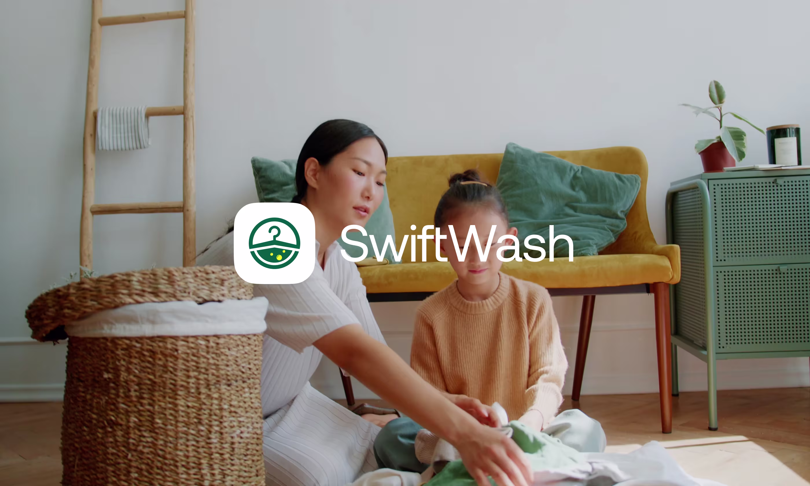
Swift Wash App


.svg)
SwiftWash is a mobile laundry service app designed to make booking, tracking, and receiving laundry simple and reliable.
Our task was to design SwiftWash in a way that makes booking laundry quick and easy to understand. Users needed a clear way to schedule pickups, and track their orders. At the same time, the experience had to support laundry partners by helping them manage orders, and handle requests without confusion.


Users Struggled to Understand How NexCard Worked
Most users had never used a digital contact-sharing product before, so the experience felt unclear during setup and sharing actions.
- Profile Setup Issue: Users did not know how to create and complete their profile during first-time use.
- Sharing Clarity Issue: People were unsure how NFC, QR, and social sharing actually worked inside the app.
- Information Visibility Issue: Important sharing actions and connected links were difficult to notice quickly.
- Product Understanding Issue: Users could not immediately understand what NexCard helps them do after opening the app.
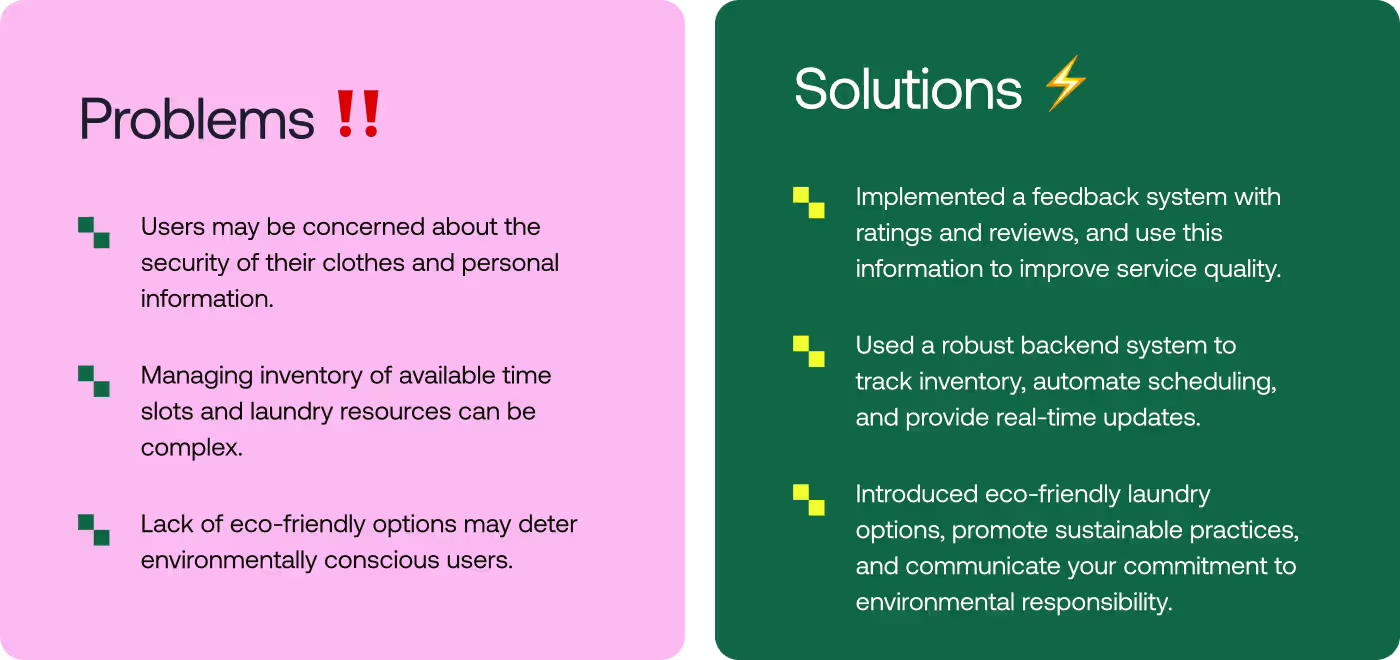
We Simplified Profile Setup and Made Sharing Easier
The experience was redesigned to help users understand NexCard faster, complete setup more easily, and share profiles without confusion.
- Setup Flow Improvement: Profile creation was simplified into clearer step-by-step actions for first-time users.
- Sharing Experience Improvement: NFC, QR, and social sharing actions were made easier to find and use quickly.
- Information Structure Improvement: Contact details and social links were reorganized to improve readability and scanning.
- Experience Consistency Improvement: Navigation, layouts, and interactions were aligned to make the app feel more predictable across screens.
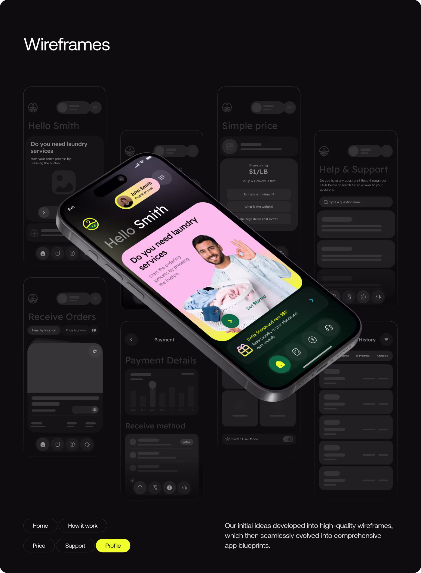
Building the Laundry Journey
- Studied the full laundry flow
- Noted where users might get stuck
- Looked at what each side needed
- Set the design direction
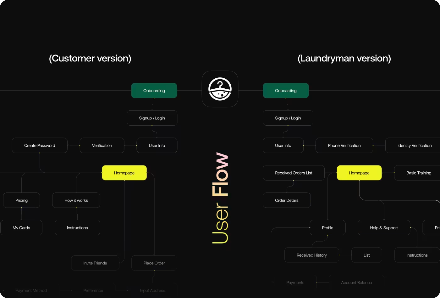
- Separated customer and laundryman flows
- Mapped the main steps
- Kept the process simple
- Focused on clarity
- Designed the key screens
- Added order details and tracking
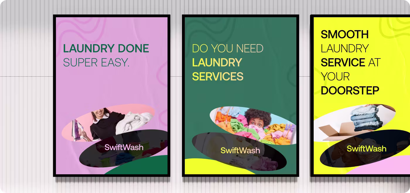
- Used bold color and spacing
- Kept the look easy to read
- Completed the main flow
- Added dashboard views
- Made social and promo layouts
- Kept everything consistent
Understanding how people use laundry services
The research focused on how customers and service providers handle laundry orders, what causes confusion, and what the app needed to make easier.
- We looked at how people usually book and manage laundry services.
- Found that the process can feel unclear when there is no simple flow.
- Note that trust matters because users are handing over personal clothing.
- Saw that clear status, pricing, and timing details help make the service easier to use.
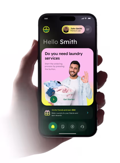
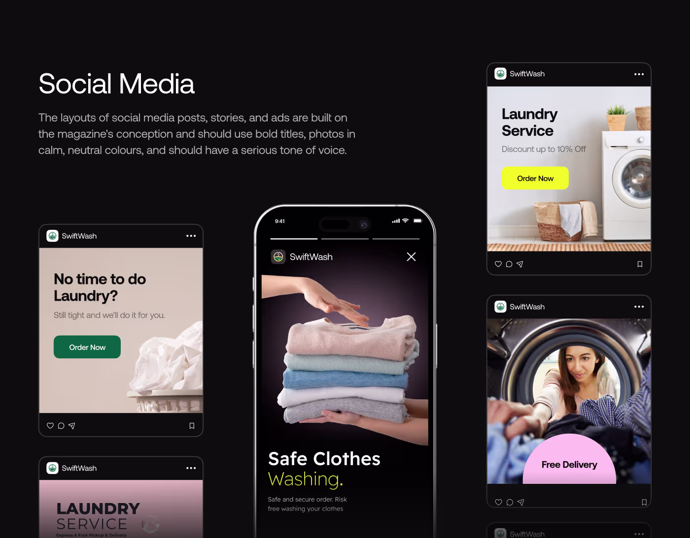
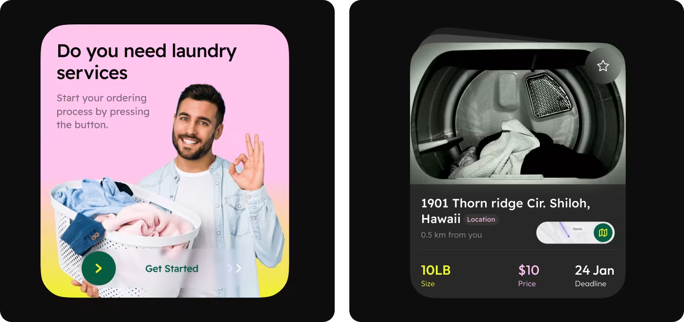
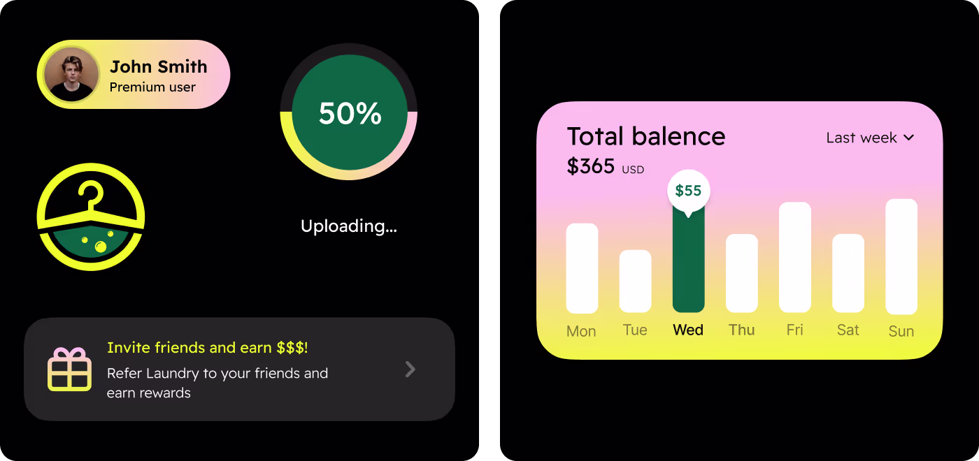
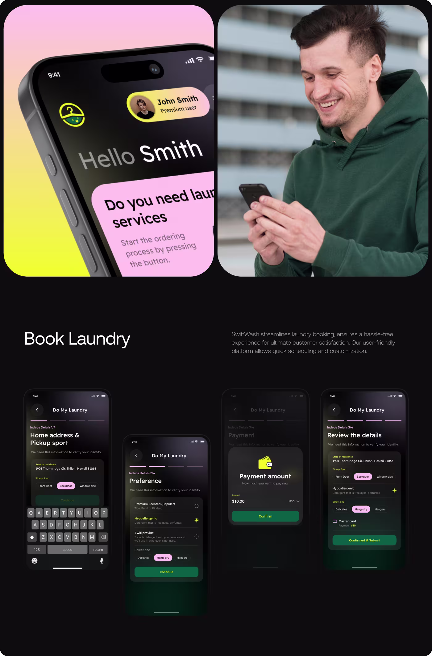
Customer App Experience Design
This part focused on the customer side of the SwiftWash app. The goal was to make booking laundry feel simple, clear, and easy to trust.
The flow covers onboarding, service selection, order setup, and payment details. Pricing, timing, and order status are shown in a way that feels easy to read and quick to understand.
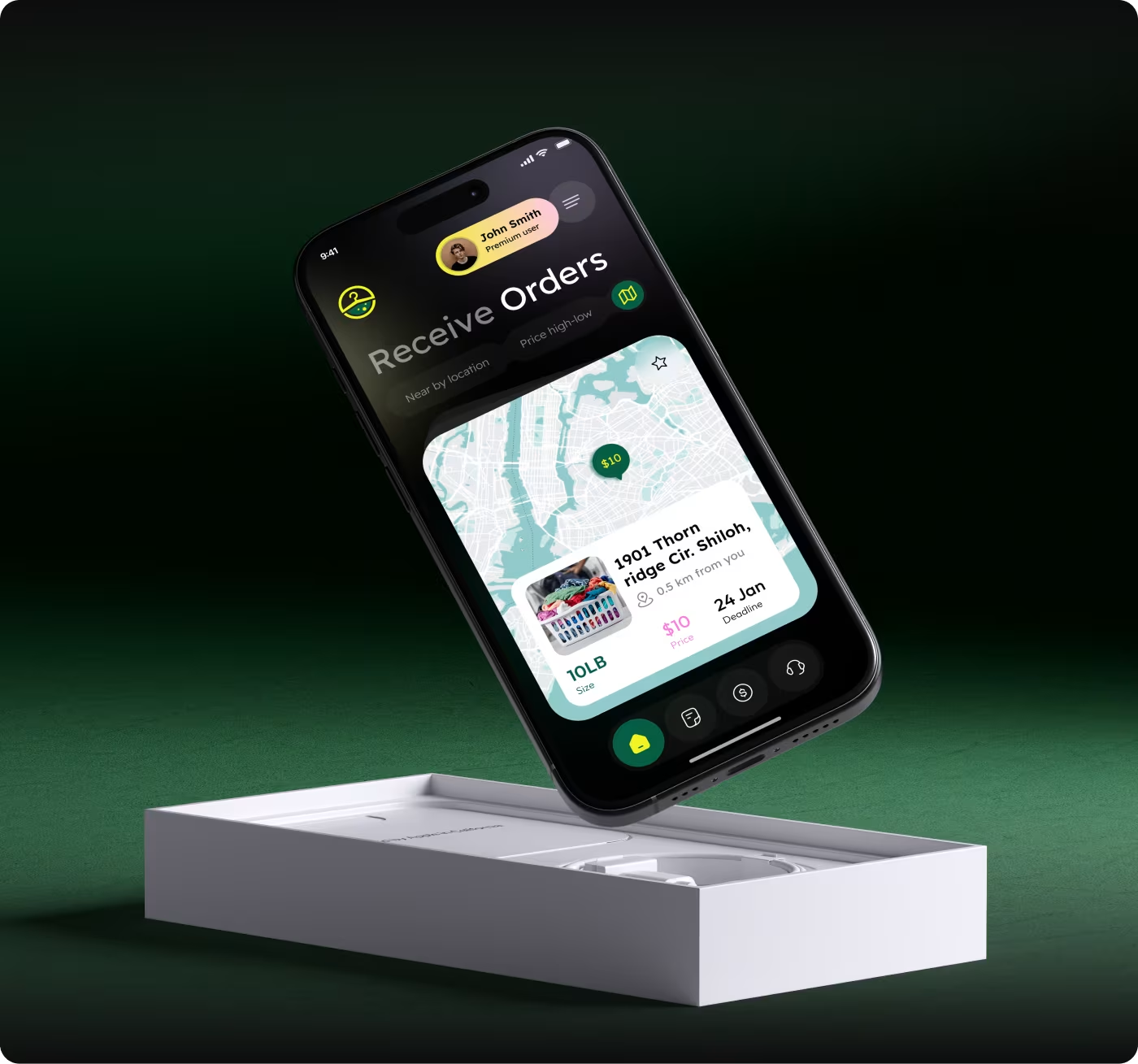
Service Provider Flow Design
This part focused on the laundryman side of the app. The design was shaped to help service providers manage orders without getting lost in the process.
It includes order lists, order details, progress updates, and account views. The layout helps make the work easier to track and the whole service feels more organized.
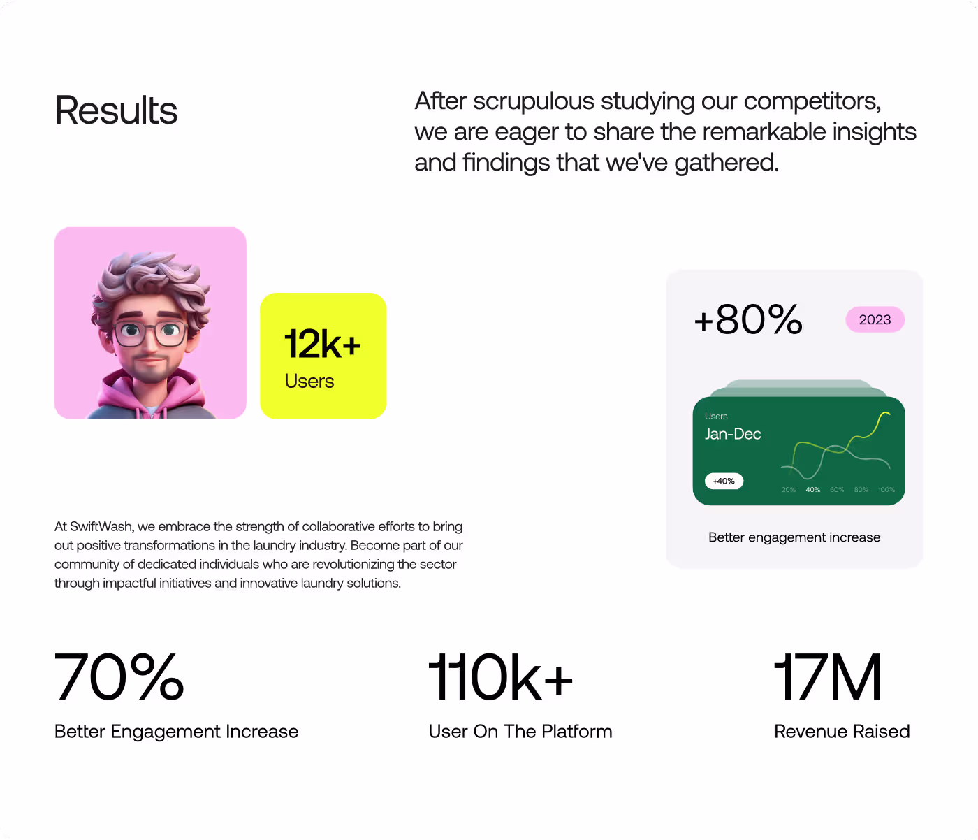
Clear & More Trusted Laundry Experience
The project turned a confusing service into a simpler app flow that feels easier to use for both customers and service providers. The overall experience became more organized, more readable, and more consistent from screen to screen.
- Made the order flow easier to follow from start to finish
- Gave both user types a clearer path, with 2 separate service sides
- Helped make pricing, timing, and order status easier to understand at a glance
- Built a stronger brand look that feels more polished and trustworthy
Got a project in mind? Let's build it
.avif)


.svg)


.svg)

.svg)


