
Do you know why people are leaving your ecommerce store? You might think it is because they got distracted or they are just browsing. In most cases, the reason is a bit different. Most customers leave because they get confused by messy navigation, tiny text, and buttons that are hard to find.
These bad design moments are part of the user experience. And by following smart UX practices in your store, you can increase the amount of people who actually want to buy your product.
In this post, we are going to show you exactly what you need to do to fix ecommerce UX design issues and turn visitors into buyers. Ready to boost your sales? Let’s get started.
What is Ecommerce UX Design?
Ecommerce UX design is about making it easy for shoppers to move from browsing to buying. It focuses on how people find products, understand product details, trust the store, and complete checkout without confusion.
Think of it as the invisible path running through your store. When a customer lands on a page, everything they see either keeps them moving forward or stops them in their tracks. Good UX means removing the friction between the moment they want a product and the moment they actually buy it.
If your product details are clear, buyers feel confident. When buyers feel confident, they don't hesitate to hit the checkout. And when checkout is simple, that initial browse naturally turns into a completed sale.
That’s why UX isn’t really about making the site "look good." It’s about building a store that feels effortless to shop in - where the next logical step is always obvious, and nothing gets in the way of the customer deciding to buy.

Why Ecommerce UX Matters
Ecommerce UX matters because it directly controls whether a shopper stays to buy or leaves out of frustration. It determines how easily people find products, understand details, and trust your store enough to hand over their payment.
When any part of the shopping journey feels confusing or difficult, people do not just leave. They often take their money to a competitor whose store feels easier to use. That is why ecommerce UX matters so much.
Here are a few numbers that show why ecommerce UX design matters:
- If the final checkout step asks for too much effort, people will abandon their cart. 31% of shoppers left because checkout was too complicated, and 23% left because they were required to create an account. (Forter)
- A clear, smooth shopping experience is what actually builds brand trust. Consumers are willing to spend 51% more, on average, with retailers they trust. (Forter)
- Your mobile experience is essentially your real storefront now. Smartphones drove 54.5% of online purchases during the 2024 holiday season. (Adobe)
- Even a barely noticeable delay in page speed creates enough friction to lose a sale. A 0.1-second improvement in mobile site speed was linked to an 8.4% increase in retail conversions. (Deloitte)
- The overall experience does not end when someone clicks buy, because a difficult returns process will stop them from coming back. 76% of consumers consider free returns an important factor in where they shop. (NRF)
Ecommerce UX Best Practices
Improving your store's UX comes down to fixing the specific areas where customers get stuck. If you make the menus, product pages, mobile view, and checkout simple to use, people will easily find what they want and buy it without getting frustrated.
Make Navigation and Product Discovery Simple
If shoppers can’t find what they’re looking for, how long do you think they’ll stick around? Not very long.
It doesn’t matter how good your products are. It doesn’t matter how beautiful your photos are. If your navigation is confusing, the whole store feels frustrating to use.
People want to move through an online store quickly. They don’t want to waste time guessing where things are.
Think of your main menu like a directory in a mall. A shopper should be able to glance at it and instantly know exactly which direction to walk. Your categories should make sense. Your labels should be plain English. Nobody should have to stop and decipher what you mean.
But what about the people who already know exactly what they want?
They don’t want to browse menus. They want to type it in and find it instantly. That’s where your search bar, filters, and sorting options come in.
These tools aren’t just nice extras. They are the difference between a shopper finding their perfect product in ten seconds… or leaving out of pure annoyance. Instead of creating extra work for the customer, these tools should make the buying journey feel effortless.
[Image Suggestion: A close-up mockup of a clean, centered search bar on a desktop screen, maybe with a subtle "Search for shoes, bags..." prompt inside to show how it guides the user.]
At the end of the day, this is what good product discovery really does: it removes one of the biggest barriers standing between a visitor and a sale.
When customers can find the right product quickly, they feel confident. And when they feel confident, they keep exploring. They keep clicking. And they move one step closer to buying.
Create Product Pages That Help People Buy
Think of your product page like a really good salesperson standing right next to the customer.
A good salesperson doesn't just point at a product and walk away. They answer questions, explain how it works and make sure that the customer feels completely safe handing over their money.
Your product page needs to do the exact same thing. If a shopper lands on the page and has to guess how much the item costs, what size they need, or what the material feels like, they are going to leave.
To make people feel ready to buy, your page needs a few simple things:
- Clear pictures: Shoppers need to see the product from different angles so they know exactly what they are getting.
- Honest descriptions: Tell them what it is, what it does, and how big it is using normal words, not confusing technical terms.
- Easy choices: If the shirt comes in blue or black, picking the color should take one second.
- Social proof: Show them the star ratings and let them read what other people think.
If you skip these steps, people will just go to another store. In fact, a study by Baymard found that 62% of mobile stores have product pages that are confusing or poorly designed.
Other numbers from Salsify show exactly what happens when you get it wrong:
- 78% of shoppers say the pictures and descriptions are the most important part of the page.
- 72% of shoppers won't buy unless they can see ratings and reviews first.
- 45% of shoppers have returned an item because the website didn't explain the product properly.
When someone returns an item because your page was confusing, you don't just lose a sale. You lose the cost of shipping it back.
That is why the best product pages give the shopper confidence. They put the return policy right there on the page and make the "Add to Cart" button impossible to miss.
A product page that’s clear to the customer makes it easy for the customer to understand the product, and take the next decision - buy the product.
Optimize the Mobile Shopping Experience
When you build an online store, it is easy to picture people shopping on a big computer screen. But the truth is, most of your customers are walking around with your store right in their pocket. For many ecommerce owners, the phone screen is actually where the majority of sales happen.
If a customer opens your store on their phone and it feels harder to use than a computer, they are not going to stick around to figure it out. They will simply leave and find a store that works better on their device.
During the 2024 holiday season, over half of all online purchases - 54.5% to be exact - were made entirely on smartphones. Even with those massive numbers, a study by Baymard found that most mobile ecommerce sites are still rated as just mediocre. (Sources: Adobe, Baymard)
Making your mobile experience better comes down to paying attention to a few basic details. Your layout needs to adjust neatly to a smaller screen so that everything looks right.
Check how your current store measures up on these mobile basics:
- Readable text: Words should be large enough to read without squinting.
- Tap-friendly buttons: Buttons need to be big enough to tap with a thumb without hitting the wrong link.
- Smooth scrolling: Pages should flow naturally and never feel jumbled or crowded.
- Clear product pages: The image, price, and "add to cart" button should be visible right away without pinching the screen to zoom in.
- Simple menus: Navigation should collapse into a clean menu that doesn't take over the whole screen.
The biggest mistake you can make is taking your desktop website and simply shrinking it down to fit a phone. Instead, you want to build a mobile experience that feels smooth and natural for a smaller screen.
When you remove the little frustrations that make phone shopping feel annoying, your customers can simply focus on the products. Browsing starts to feel clear and easy, which makes them much more likely to stay and buy.
Make Checkout Fast and Easy
Checkout is the final step in the buying journey, but it is also where most sales are lost. A shopper can be completely ready to buy, add a product to their cart, and still leave if the process feels like too much work.
The numbers show exactly how easily a sale can slip away. The average cart abandonment rate is 70.19%. When shoppers were asked why they left, 39% said surprise costs scared them off, 19% left because they were forced to create an account, and 18% said the whole process was just too complicated. (Sources: Baymard)
You can fix this by simply removing the roadblocks that make people second-guess their purchase. To keep shoppers moving smoothly to the finish line, make sure your checkout:
- Reduces the number of steps: Get them from their cart to the confirmation page as quickly as possible.
- Offers guest checkout: Let first-time buyers check out easily without forcing them to create an account.
- Keeps forms short: Only ask for the details you actually need to ship the order.
- Displays a clear order summary: Never hide the items, taxes, or shipping costs out of sight.
- Avoids surprise fees: Be upfront about the total cost early on so they never feel tricked at the last second.
- Offers multiple payment options: Give them the freedom to pay with a credit card, PayPal, Apple Pay, or whatever they prefer.
Build Trust With Clear Policies and Reassurance
A shopper might love your product, but still hesitate to click buy. That usually happens when something feels uncertain. They wonder what happens if the shirt doesn't fit?, when the package will actually arrive?, or if their credit card is safe?
This is where trust becomes a huge part of your store's UX. Shoppers want to know exactly what they are paying for, when it will show up, and how to reach you if something goes wrong. When you make that information easy to find, people feel safe moving forward.
You can stop that hesitation by answering their questions before they even have to ask. To make shoppers feel completely secure, your store should clearly show:
- Secure payment signals: Familiar icons (like PayPal or Visa) that prove their money is safe.
- A simple return policy: Honest rules about how many days they have to send something back.
- Contact details: A visible way to email or chat with you if they need help.
- Customer reviews: Real feedback from other buyers to prove the product is good.
- Trust badges: Small icons near the checkout button that show your site is secure.
Improve Speed and Reduce Friction Across the Store
Even if your navigation, product pages, and checkout are perfectly designed, small frustrations can still ruin the shopping experience. Slow pages, cluttered layouts, and too many popups might seem like minor issues on their own, but together they make your store feel tiring to use.
When a store feels tiring, people leave. The best example of this would be the website speed.
A study by Deloitte found that making a mobile site just 0.1 seconds faster led to an 8.4% increase in sales. On the flip side, Contentsquare found that load-time frustration ruined 11.6% of shopping sessions, and annoying JavaScript errors caused problems in 17.8% of sessions. (Sources: Deloitte, Contentsquare)
Reducing friction across your entire store comes down to creating a smooth, comfortable environment for the shopper. To keep people focused and moving forward, make sure your store:
- Loads pages quickly: Every second a customer waits is a second they might give up and leave.
- Uses optimized images: Large, heavy image files are usually the main reason a site drags. Compress them so they load instantly.
- Removes visual clutter: Keep the design clean so the products stand out, not the banners and sidebars.
- Keeps layouts consistent: The menu, buttons, and colors should look the same from page to page so the shopper never gets confused.
- Makes content easy to read: Use normal-sized fonts, clear headings, and short paragraphs so nobody has to squint.
Examples of Good Ecommerce UX Design
The best way to understand how these best practices work is to see them in action. Here are a few stores that get it right, each solving a different piece of the puzzle.
Amazon
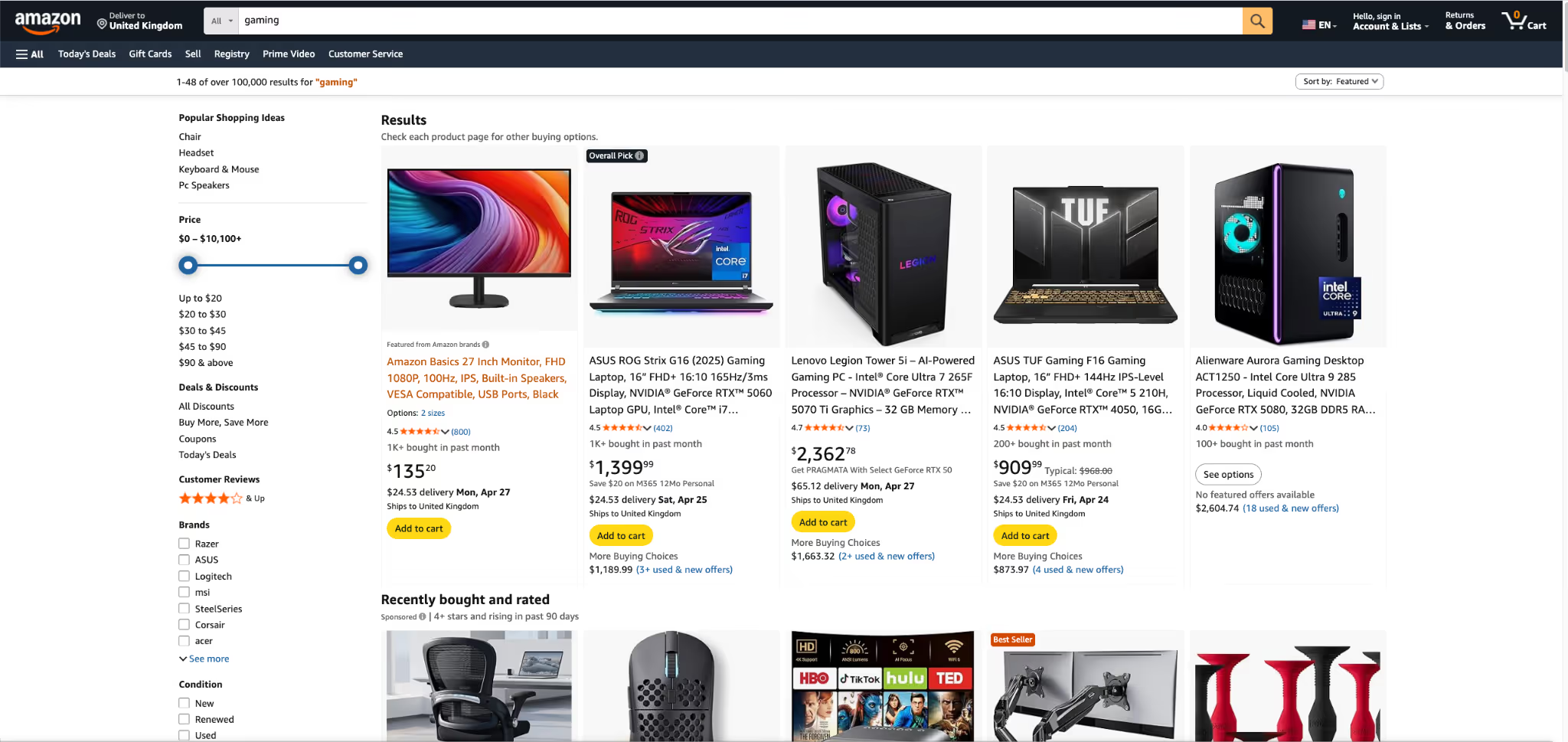
Amazon wins by making product discovery incredibly fast. Between the detailed filters, the massive review section, and the one-click buying option, shoppers can compare items and make a decision without ever feeling stuck. It is built entirely around saving the customer time.
Nike
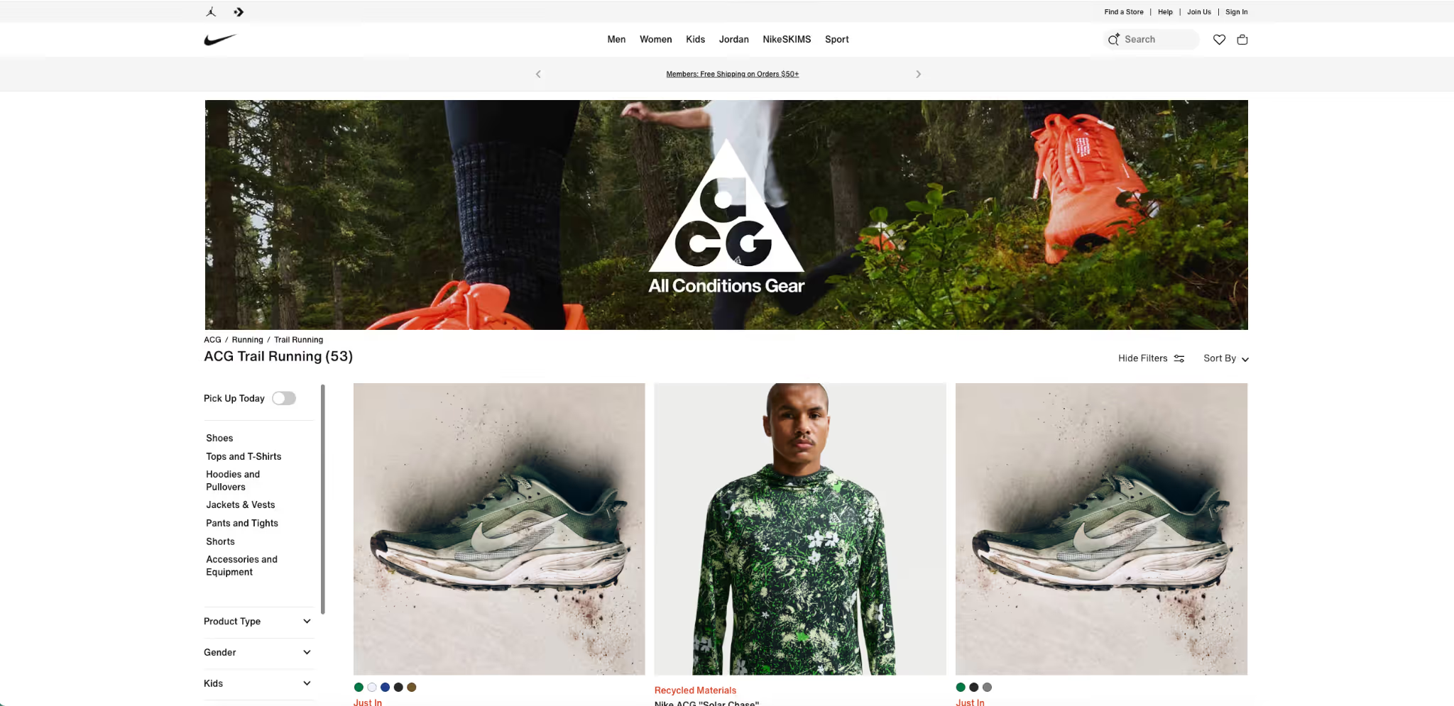
Nike proves that a store can be highly visual without becoming cluttered. Especially on mobile phones, their product pages let the images do the talking. The layout is spacious, which makes choosing a size or color feel completely effortless instead of overwhelming.
Apple
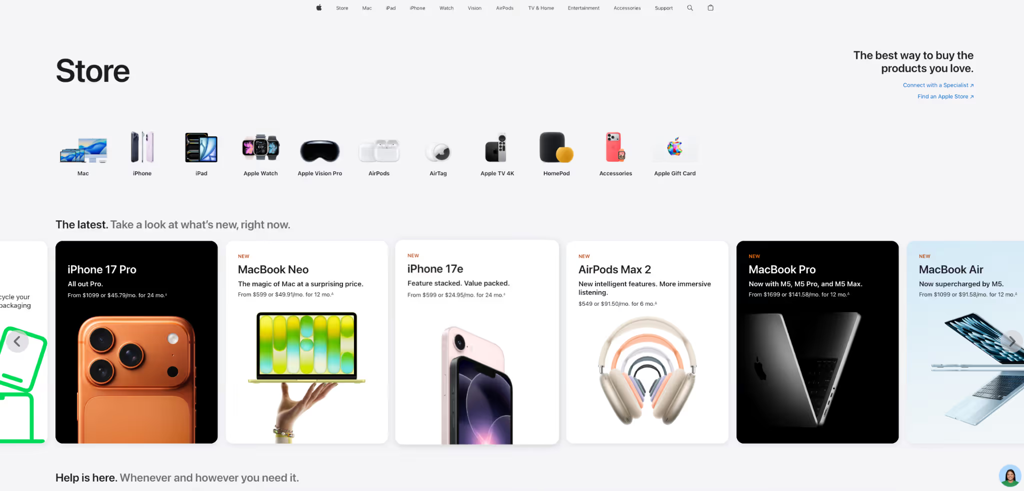
When it comes to removing distractions, nobody does it better than Apple. Their pages use tons of white space and straightforward text. You never have to hunt for the price or the features, which makes understanding the product and hitting "buy" feel incredibly simple.
Warby Parker
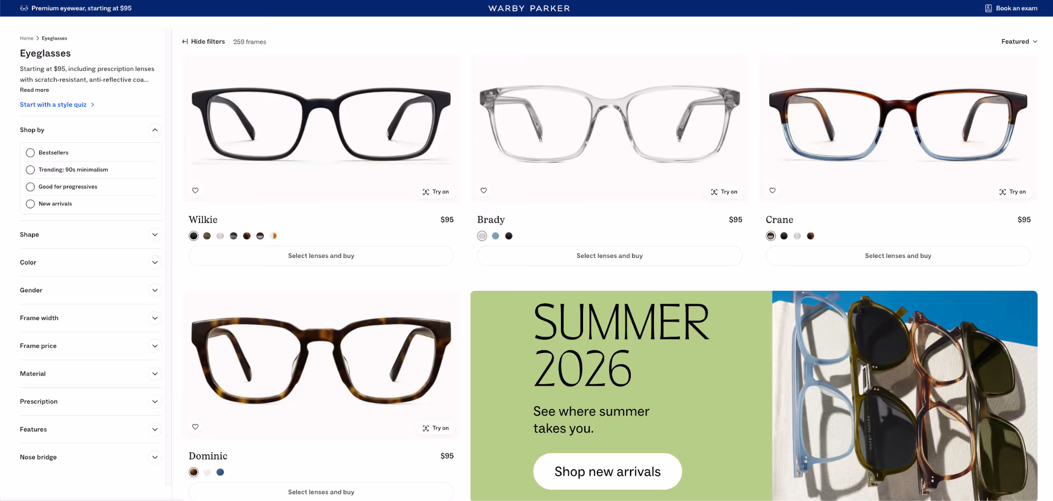
Warby Parker is a masterclass in building trust. They take the fear out of buying glasses online by mixing helpful details with strong reassurance. Clear return policies, easy navigation, and a clean layout make the whole brand feel safe and reliable to shop from.
Orbix Studio Ecommerce Design
If you want to see how custom design can elevate a store, look at Orbix Studio’s work. They show how to balance a polished, premium look with an interface that is actually easy to use. It is a great example of using visual hierarchy to guide the shopper's eyes exactly where you want them to go.
Final Thoughts
Good ecommerce UX is simply about clearing the path from the moment a shopper arrives to the moment they buy. When people can easily find your products, understand what they are getting, they are going to buy a lot more often.
Now that you have read through these best practices, open your store on your phone and try to buy a product. Find the first place that feels annoying or confusing, and fix that single thing today.
Frequently Asked Questions
What is ecommerce UX design?
Ecommerce UX design is the process of making an online store easy to use. It helps shoppers browse products, understand information, trust the brand, and complete their purchase without confusion or frustration.
How does ecommerce UX affect conversions?
Good ecommerce UX improves conversions by removing friction from the buying journey. When shoppers can find products easily, trust the store, and check out smoothly, they are more likely to complete a purchase.
How can I improve ecommerce checkout UX?
You can improve checkout UX by making the process faster and simpler. Reduce the number of steps, offer guest checkout, keep forms short, show total costs clearly, and support easy payment options.
What makes a good ecommerce product page?
A good ecommerce product page gives shoppers the information they need to buy with confidence. It includes clear images, useful descriptions, visible pricing, reviews, product options, and simple shipping or return details.
Why is mobile UX important for online stores?
Mobile UX is important because many shoppers browse and buy on their phones. If your store is hard to read, tap, or navigate on mobile, visitors may leave before completing a purchase.
What are the most common ecommerce UX mistakes?
Common ecommerce UX mistakes include confusing navigation, poor product pages, hidden shipping costs, complicated checkout, weak mobile design, slow page speed, and missing trust signals that make shoppers hesitate before buying.
What is a good conversion rate for an e-commerce store?
A good conversion rate varies by industry, but most e-commerce stores average between 1% and 3%. Fashion and beauty stores tend to sit at 1.5–4%, while electronics and furniture stores typically see 0.5–1.5% because the purchases are bigger and people think longer before buying. Instead of comparing yourself to an industry average, the more useful question is: 'Is my rate improving?' Even small consistent gains going from 1.8% to 2.3% can mean thousands of dollars in extra revenue without spending more on traffic.
.avif)

.avif)