Table of Contents
A recent study has found that people spend around 5 hours on their phones every day. They open a lot of applications, but because of slow loading, difficult navigation, and outdated designs, they are more likely to abandon them.
By redesigning a mobile app, you can find the usability issues, solve them, and make sure that the app matches user expectations. This leads to overall increased satisfaction and user retention.
In this guide, we'll share the fundamental mobile app redesign guidelines to turn your outdated app into a smooth, delightful experience that users actually love to keep using.
What is Mobile App Redesign?
To put it simply, an app UX redesign is the process of improving an existing mobile application so it becomes faster, clearer, and easier to use.
Every app is built with an ideal user, a goal, and a journey in mind. But over time, things change as more users join, more features get added, and new technologies come in.
As a result, the app starts to feel slower, harder to navigate, and less intuitive than before. What once felt simple starts feeling confusing. A mobile app UX redesign fixes that. It reshapes the app based on how users behave now, what they expect now, and what the product is trying to achieve today. It's not just about changing colors or updating visuals. A proper redesign rethinks the entire experience:
- How users move through the app
- How actions are presented
- How easily tasks can be completed
But how do you know if you should redesign your app or not? Read the next section, where we discuss the common reasons you should consider redesigning your application.

Signs App Needs Redesign

Not every application needs a redesign. But when it does, it usually shows some signs. These issues do not appear as obvious problems at first, but you might notice users dropping off more often, struggling to complete tasks, or expressing frustration.
Declining User Metrics
Declining user metrics is one of the clearest signs that your app design needs a change. This usually happens after a long period without a design update. When your application starts to slow down, key metrics begin to fall, including user growth, retention time, and more.
Most of these issues are caused by something in the user flow. It can be something that is holding users back or creating confusion along the way.
Negative App Reviews
Negative app reviews are the most direct signal of user frustration with the design. Users do not usually describe their frustrations in design terms, but they will leave reviews saying the app feels confusing, hard to navigate, or that certain actions do not work as expected.
Individually, these reviews might seem minor. But when the same complaints come up repeatedly, they point to users struggling to understand how the app works, even when everything is running technically fine.
Outdated Design Trends
Over time, users become familiar with new design patterns through other apps they use every day. New navigation styles, layouts, and interaction patterns become second nature to them without even noticing it.
When your application still follows old design patterns, it starts to feel off. Users might struggle to find options, feel unsure about what to do next, or take longer to complete tasks. This creates a gap between what users expect and what the design delivers.
App Performance Issues
App performance is also a part of the user experience. Common performance issues seen in mobile applications include:
- The app feels slow
- Screens take longer to load
- Actions feel delayed
- The app freezes momentarily
These issues, over time, create frustration for users. Performance problems tend to appear as the application grows and becomes more complex, with more features and heavier processes running in the background. If these experiences are not addressed, they turn into a barrier in the overall user experience.
Run a Quick Redesign Audit
A quickUX audit for a mobile app helps reveal where your application's experience is breaking down and lets you look at your app from a fresh perspective, just like a new user would.
If you find yourself hesitating while using the app, you are likely facing the same issues as your other users. If you want to find out the specific issues you need to work on, get a free mobile app redesign audit from us.
Research Your Users and Current App
Without understanding your users' needs and the current application, most redesigns jump straight into solutions. That's the wrong approach.
Instead of jumping straight into a solution, you first need to understand the real problems users are facing while using your application.
So, instead of asking "what should we redesign?", ask yourself: "where are users struggling in my application right now?"And to get an answer to that, you need to look at both the user and the application sides together.
Start by going through the app itself. Go through the key user flows and observe what feels off. Look for points where actions take longer than expected, where too many steps are needed, or where navigation feels confusing. These are usually the common signals that build up over time.
Then shift to the user side. Look at how people actually behave when they use your app. What do they skip? Where do they hesitate? What do they repeat? These patterns tell you what matters to them and what does not.
When you combine these two views, you will get a clear picture of what is broken and why it feels broken. That is the foundation for a good redesign.
Create a Clear Redesign Strategy

Once you identify the areas where users are struggling, it is time to create a clear redesign strategy to fix them.
This is where most teams fall apart. They try to add new ideas, remove old ones, and redesign large parts all at once, without any clear direction. This creates a design system that is different, but not necessarily better than the one before. They lose focus.
At this point, the goal is to first define what actually needs to change, and what should stay as it is. Start by identifying the parts that are still working well. These familiar patterns are already understood by your users, so keep them as they are.
Then focus on the parts where users struggle the most. These are the areas to restructure, and some may need to be removed entirely.
The redesign should balance what users need and what the business is trying to achieve. At this point, you need to make three key decisions:
- What do we keep?
- What do we improve?
- What do we remove?
Answering these questions will give you a clearer understanding of your goals, the changes you need to make, and the direction the redesign should take.
Follow These Core Redesign Principles and Best Practices

A redesign is not just about fixing problems. It is also about following core design principles across the entire app. Without a set of guiding principles, it is easy to create something that works in isolation but feels disconnected as a whole.
Here are the most important design principles and best practices to follow for your mobile app:
Apply Simplicity and Consistency
When the app is simple to use, users can focus on the things that actually matter to them instead of figuring out how the app works.
Simplicity is about keeping things noise-free. Too many options, too much text, or unnecessary steps slow users down and force them to figure things out on their own. When you show only the elements that are essential, users can focus on what they came to do.
Consistency is what makes the app feel familiar. It means using the same actions and elements across different screens, so users do not get confused or need to relearn anything. They build a sense of knowing what comes next.
Together, these two principles create a smoother, more intuitive experience. That is what good design aims for.
For a deeper look at what breaks simplicity in real apps, see our guide on mobile app design mistakes to avoid.
Minimize Cognitive Load for Users
Every time a user gets confused about a button, where to go next, or what to tap, their overall experience becomes heavier. These small moments add up and turn simple tasks into frustrating ones.
Minimizing cognitive load helps users reduce this mental effort. Instead of asking users to interpret, remember, or compare too many things at once, the interface should make decisions feel obvious. Clear labels, familiar patterns, and a limited number of choices help users recognize what to do rather than think about it. When that happens, the experience becomes noticeably smoother.
Create a Strong Visual Hierarchy
Visual hierarchy means arranging elements in the interface so that users see the most important thing first, then the next, and so on.
Without a proper visual hierarchy, users become overwhelmed trying to figure out where to look and what to focus on. A clear hierarchy guides the user's eye to the right place at the right time, every time.
Design Touch-Friendly Elements
Mobile apps are different from desktop experiences. Users interact with fingers, not cursors. Unlike a cursor, fingers are less precise. Users also move quickly, often while distracted or on the go. If elements are too small or too close together, mistakes become common.
Designing touch-friendly elements means interactions are built for real conditions. Buttons are larger, spacing is generous, and actions are placed within natural thumb reach.
When interacting with an interface feels effortless, users do not notice it. And when users do not notice it, they simply enjoy the experience.
Design Smooth and Intuitive Navigation
Navigation is how users move from one screen to another. If navigation is confusing, users are left guessing where to go next.
This becomes a real problem because most tasks in an app require moving between multiple screens. Smooth navigation removes that friction. Users can move from one place to another without confusion, staying focused on what they came to do.
That is why clear, intuitive navigation is one of the most important parts of any mobile app experience.
Add Modern Touches Like Accessibility
As apps have evolved, users expect more than just basic functionality. Accessibility means making sure the app can be used by as many people as possible. This includes readable text, proper contrast, clear labels, and support for screen readers, basically following the WCAG guidelines.
But it also extends to everyday situations. A user might be in bright sunlight, using only one hand, or on a poor network connection. A well-designed app accounts for these realities and adapts accordingly.
Support Dark Mode and Personalization
Users do not all use apps in the same way or in the same environment. Some prefer darker interfaces at night, some use their phones in bright daylight, and others rely on settings that match their comfort or accessibility needs.
Dark mode supports this shift in behavior. It is no longer a nice-to-have feature. It is something many users expect by default. It makes the interface easier on the eyes in low-light conditions and gives users more control over how the app feels throughout the day.
Personalization builds on the same idea. Instead of showing the same experience to everyone, personalization adapts the app's interface based on user preferences and past behavior. This could mean adjusting layouts or surfacing content that feels more relevant to each user.
Together, these elements reflect a broader shift in design thinking. Apps are no longer static systems. They are expected to adjust to the user's context, making the experience feel more comfortable, familiar, and easier to engage with.
The 6-Step Mobile App Redesign Process
A mobile interface redesign is not a single step. It is a process that helps you move from early ideas to a fully usable product. Here are the steps for redesigning an application, from the early concept to a fully redesigned app that works in real conditions.
1. Discover What Is Actually Broken
Discovery is the very first phase of redesigning a mobile app, and it is also the most important one.
Before touching any design tool, you need to properly understand why this redesign is happening and who it is for. Skipping this phase is the number one reason teams end up solving the wrong problem.
Here are the signs to look for when considering a redesign:
- Users are dropping off, complaining, or churning
- The app feels outdated or no longer matches the brand
- A platform update such as iOS or Android guidelines forces changes
- Business goals have shifted and the current app design no longer supports them
If these signs are present, it is time to initiate the discovery phase. Start by defining the key goals and KPIs. What does success look like for this project? This could be anything from reducing drop-off by 30% to improving the task completion rate. Without a clear goal, you cannot tell whether the redesign worked or not.
2. Plan Before You Design Anything
In strategy and planning, you take everything learned in discovery and turn it into a clear plan.
Planning starts with defining how the app will be restructured. Ask yourself: what should go where? How does the navigation flow? Answering these questions helps you make the app logical before making it beautiful.
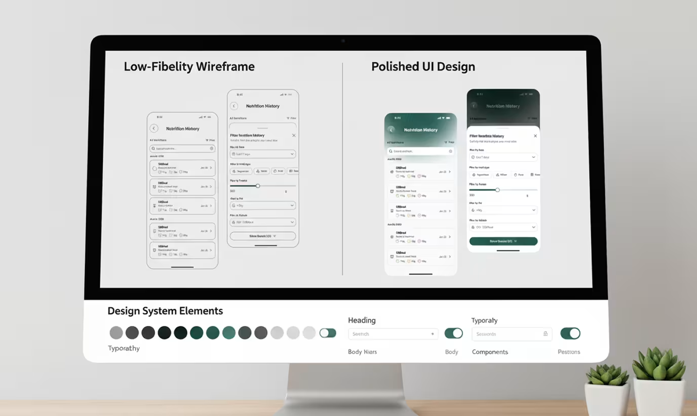
The design language and system should also be defined at this stage. This includes decisions around typography, color palette, spacing, component library, and motion principles. A unified design system ensures consistency across every screen in the application.
Once all of this is in place, break the project into phases with realistic milestones. Think of it as a blueprint that guides both the design and development teams through the rest of the process.
3. Wireframe, Prototype, and Test Early
This is where ideas start to take shape visually. In wireframing, the goal is to fail as fast and as cheaply as possible before investing in high-fidelity design.
Start with rough sketches or basic digital frames using boxes, lines, and placeholder text. These are quick to make and easy to change.
Then take the pain points identified in discovery and design solutions for them at the wireframe stage. Do not just redesign for aesthetics here. Redesign to fix the real problems.
Once the wireframes are validated, move into Figma to build interactive prototypes. Put those prototypes in front of real users and watch where they hesitate, where they tap the wrong thing, and where they get lost.
After identifying the issues, go back and iterate, then test again. Two to three rounds of testing can save weeks of rework after launch.
4. Build, Test, and Catch Issues
Development is where the design becomes real. Developers take the validated prototype and build the actual application. It is a highly collaborative phase where designers and developers work closely together to make sure what gets built matches what was designed.
Development starts with front-end work, translating the high-fidelity designs into actual UI code. This includes implementing components, animations, and transitions across different screens and devices.
After development, each UI component is tested individually. Does it behave correctly? Do modals open and close as designed? Small issues caught here do not snowball later.
After that, a full end-to-end test is done to catch any remaining issues. Designers also do a final review pass before the handoff to development is considered complete.
5. Launch Small and Iterate Fast
Launching is the final step where the redesign meets the real world. It is a continuous process where you monitor, listen to what users have to say, and improve based on what you learn.
Start with a beta launch, releasing to a small percentage of users, around 10 to 20%, to surface any unexpected issues. Platforms like Firebase or TestFlight make controlled rollouts straightforward.
Track the KPIs you set in discovery. Is onboarding being completed faster? Is the drop-off rate lower? Is session duration up? This data tells you whether the redesign actually solved the problem or whether there is still work to do.
Collect qualitative feedback through in-app surveys, app store reviews, and user interviews. Based on what the data and feedback reveal, ship targeted fixes and improvements quickly. This is how the process improves over time, by listening, learning, and acting on real user data.
Handle Technical and Implementation Details
After the design is ready, it is time to make sure it can run smoothly in real conditions. This is where technical decisions start shaping the final product. The redesigned app should load quickly, respond instantly, and handle interactions without delay. Even small lags can break the flow, so implementation needs to be optimized for different devices, network speeds, and usage conditions.
The redesigned screens should also be clearly translated into something developers can actually build. This requires proper specifications, reusable components, and a shared understanding between design and development. Without this, small gaps turn into inconsistent experiences for users.
Modern apps should move towards personalization. This can include adapting content, layouts, or recommendations based on user behavior. From a technical side, this means building systems that can support dynamic experiences without affecting performance.
Use These Helpful Checklists and Templates
After going through the redesign process, it’s easy to miss small details along the way. You may fix the big problems, but smaller issues like unclear actions, inconsistent patterns, or edge cases often remain. These gaps usually show up later as usability issues or inconsistencies across the app.
This is where checklists and templates become useful. They help you step back and review the work with a clear lens instead of relying on memory or assumptions. You can systematically go through each part of the app and make sure nothing important is missed.
A redesign checklist should include:
- Navigation is clear and easy to follow across all screens
- Primary actions stand out from secondary ones
- Design patterns remain consistent throughout the app
- Key user flows work smoothly from start to finish
- Accessibility basics like contrast, readability, and touch targets are covered
- Unnecessary steps or elements have been removed
Templates also bring structure to your process. Things like user personas, journey maps, and wireframe layouts make it easier to think through problems and communicate decisions with your team. They don’t replace thinking. They make sure your thinking stays consistent throughout the redesign.
Avoid Common Redesign Problems
Redesigning a mobile application can improve the overall user experience, but it can also create new problems if done without care. That is why it is important to understand what to avoid alongside what you want to improve.
Here are the common mistakes that often happen during a redesign:
Avoid changing everything at once: If you change everything in the application at once, users will feel overwhelmed. They will need to relearn how the app works, which can disconnect them from the experience. A gradual update helps users adapt without friction.
Balance new ideas with familiarity: New ideas can improve the user experience, but they should not completely replace everything the user already understands. If the application feels entirely different, users will hesitate.
Prevent over-designing the interface: Adding too many animations, elements, or visual details creates clutter and makes it harder for users to focus on what matters.
Always test on real devices: Design always looks clean in tools, but when used in a real application, different screen sizes, performance levels, and conditions can surface issues that are not visible during the design phase.
Budget time for future iterations: Always keep time for future iterations. Design is not a one-time task. Once the app is live, user behavior will reveal new insights that help keep the app aligned with user needs over time.
You Now Have the Complete 2026 Foundation.
At this point, you have a clear idea of how a mobile app design process works. But redesigning is not something you do once and move on from. It is a continuous process that keeps evolving with changing user behavior and new expectations.
That is why the real value of this redesign guide is not just in the steps, but in how you think about the app. So start small and apply what you have learned, because a successful redesign is not the one that looks the best. It is the one that stays easy to use, even when everything around it changes.
Frequently Asked Questions
What is the mobile app redesign cost in 2026?
A mobile app redesign costs between $8,000 and $40,000 for most products. Smaller apps with focused UX fixes stay on the lower end, while complex apps with multiple flows, platforms, and technical constraints can fall on the higher end.
How long does app redesign take?
A typical app redesign takes around 3 to 8 weeks for most products. Focused improvements can be completed faster, while larger apps with multiple user flows, testing rounds, and iterations can extend beyond that depending on the scope.
What is the difference between an app redesign and a rebuild?
An app redesign improves the existing app's UX, UI, and performance without changing its core structure. A rebuild, on the other hand, replaces the entire product from the ground up.
What tools do designers use to redesign mobile apps?
Designers use tools like Figma, Sketch, and Adobe XD for UI and UX design, prototyping, and collaboration. For research and testing, tools like Hotjar, Google Analytics, and UserTesting help understand user behavior and validate redesign decisions.
What is the difference between a mobile app redesign vs rebuild?
A redesign improves what already exists. It focuses on the UX, UI, and performance of the current app without changing its core structure. A rebuild, on the other hand, starts from scratch and replaces the entire product, usually when the existing foundation can no longer support what the app needs to do.