Table of Contents

Every modern business, from early-stage startups to global SaaS companies, runs on data. Yet for many, the challenge isn’t collecting information—it’s making sense of it. That’s where Dashboard UI Design becomes essential. A well-structured dashboard does more than display numbers; it turns raw data into a clear story that drives decisions.
In this article, we’ll explore how thoughtful dashboard design helps product managers, UI/UX designers, data analysts, and business intelligence teams visualize performance, identify opportunities, and act faster. You’ll learn actionable dashboard UX best practices, data visualization UI strategies, and analytics dashboard design principles that ensure your product’s dashboards deliver genuine clarity rather than confusion.
The Role of Dashboard UI Design in Modern Data Strategy
Dashboard UI design sits at the intersection of usability, visualization, and strategy. It is where human understanding meets technical capability. When crafted with intention, a dashboard allows teams to grasp complex patterns and KPIs within seconds instead of hours of manual analysis.
For product managers, dashboards guide decisions about product adoption and retention. For UI/UX designers, they represent the ultimate test of usability and hierarchy. For SaaS and BI teams, dashboards serve as a central hub for tracking performance metrics and real-time data insights. The ability to quickly understand trends and anomalies defines whether an organization is truly data-driven.
Understanding Who You’re Designing For
The success of any dashboard depends on understanding its users. A CEO looking for strategic overviews will not need the same level of detail as a data analyst focused on granular metrics.
Before you start sketching the layout, define the key audience segments. Executives may require simplified KPI dashboards that focus on top-level insights. Product managers might prefer cohort views and feature-usage patterns. Data teams often demand interactive dashboards with filter controls and deep drill-down capability. Recognizing these distinctions prevents one of the most common mistakes—building a dashboard for everyone and satisfying no one.
Map out personas for your primary users. Write down their key goals, what questions they ask most often, and how frequently they will use the dashboard. This user definition sets the foundation for every design choice that follows.
Clarifying the Dashboard’s Purpose
Not all dashboards serve the same function. Some are operational, updating in real time to monitor live activity. Others are analytical, allowing users to explore data in depth. Still others are strategic, summarizing performance at a high level.
Operational dashboards might focus on server uptime, support ticket volume, or daily transactions. Analytical dashboards often support product or marketing teams, providing the ability to segment data by filters and time ranges. Strategic dashboards summarize long-term growth metrics and align leadership around shared goals.
Defining the category helps determine what data to include, how often to refresh it, and how interactive the UI should be. Without this clarity, even beautiful dashboards can become cluttered and confusing.
Dashboard Design Principles that Ensure Clarity
Good dashboards follow universal design principles that prioritize comprehension and focus. The first is simplicity—each screen should communicate only what’s essential. Overloading users with charts and data points leads to cognitive fatigue.
Hierarchy is equally critical. Important metrics should appear at the top or upper-left of the layout, following natural eye-scanning patterns. Consistency in typography, color, and spacing supports familiarity and reduces friction. Every visual element should have a clear purpose; unnecessary decoration distracts from the data story.
Context is also key. A standalone number means little without trend lines, targets, or comparisons. Design for meaning, not just for appearance. Above all, aim for usability. A dashboard that looks good but confuses users fails its purpose.
Laying Out Your Dashboard for Natural Flow
A clear layout guides users intuitively from summary to detail. Use a grid system to align elements and maintain visual balance. Group related metrics together in cards or panels, ensuring whitespace between sections to prevent clutter.
Prioritize the top section of the screen for your most important KPIs. As users scroll or switch tabs, they should uncover supporting metrics that provide context. Keep the first view minimal—usually five to six core data points—so users can focus quickly.
When designing SaaS or fintech dashboards, consider the typical scanning order: users glance at performance summaries first, then dive deeper into specific categories. Maintaining this visual rhythm creates a sense of order and reliability.
Choosing the Right Visualization for Each Metric

Selecting the right chart or component is crucial in analytics dashboard design. Line charts are best for showing changes over time, while bar charts work for category comparisons. Pie or donut charts should be used sparingly and only when proportions are meaningful.
Color carries meaning and should remain consistent across the entire interface—green for positive growth, red for decline, neutral tones for static values. Avoid using more than a few colors per view.
Each visualization should answer a single question clearly. If users must pause to interpret a chart, it’s too complex. Replace decorative or unconventional charts with simple, familiar options that emphasize readability.
Prioritizing Key Metrics
Every organization collects more data than it needs. The art of dashboard UI design lies in filtering that data down to what truly matters. Start by identifying the few metrics that define success for your audience.
Categorize your metrics into three tiers: must-have, nice-to-have, and optional. Only must-have metrics should appear on the main dashboard view. Less critical metrics can be placed in secondary tabs or accessible through drill-down interactions.
This prioritization reduces clutter and ensures that users spend time where it matters most. As a rule, if a metric doesn’t influence a decision, it doesn’t belong on the dashboard.
The Power of Interactivity
Static dashboards are limiting. Interactive dashboards allow users to explore data by adjusting filters, selecting time periods, or drilling into specific data points. This interactivity transforms dashboards from reporting tools into discovery platforms.
However, interactivity must be used with restraint. Too many filters or controls can overwhelm the user and slow performance. Focus on a few meaningful options, such as time ranges or regional filters, that align with the dashboard’s purpose.
Well-implemented interactivity encourages curiosity while maintaining clarity—a balance that defines great data visualization UI.
Real-Time Data and Refresh Strategies
Modern teams often rely on real-time data insights for decision-making. Whether it’s a marketing dashboard tracking campaign performance or a fintech interface monitoring live transactions, timely updates are essential.
Decide how frequently data should refresh: in real time, every few minutes, or once daily. Communicate update frequency clearly so users trust the information. Show timestamps such as “Updated 5 minutes ago” to reinforce transparency.
Balance performance with accuracy. Real-time feeds require more resources, while slower refresh rates may suffice for strategic dashboards. Choose the right cadence for your users’ needs.
Color, Typography, and Visual Consistency
Visual consistency is what ties an entire dashboard together. Color should be purposeful, supporting understanding rather than aesthetics. Assign consistent meanings to colors across the system and avoid using too many hues at once.
Typography should be legible and hierarchical. Larger fonts highlight key numbers or titles, while smaller text is reserved for secondary details. Spacing and alignment reinforce structure, making the design feel intentional and professional.
Consistency builds trust. When users see a predictable design system, they spend less time interpreting visuals and more time interpreting insights.
Mobile and Responsive Dashboard Design
In today’s world, many users view dashboards on tablets or smartphones. Designing responsive dashboards ensures accessibility across devices without compromising usability.
Prioritize essential metrics for mobile views and hide less relevant details behind collapsible sections. Optimize chart types for smaller screens—simple bars or cards are often better than dense line graphs.
Interactive elements should remain touch-friendly with adequate spacing. Testing across screen sizes helps confirm that the dashboard delivers value whether accessed in a meeting room or on the go.
Dashboard Usability Testing
Even the most visually refined dashboard can fail if it’s not tested with real users. Conduct usability tests to observe how people interact with the dashboard. Are they finding the information they need quickly? Are they confused by terminology or layout?
Collect both quantitative feedback (time to find a KPI, number of clicks) and qualitative feedback (user satisfaction, perceived clarity). Iteration based on testing leads to measurable improvements in dashboard usability and overall adoption.
Designers should treat dashboards as living products, evolving with user behavior and feedback.
Balancing Aesthetics and Functionality
A visually pleasing dashboard can enhance engagement, but aesthetics should never overshadow function. Minimalism often works best—clean layouts, neutral backgrounds, and restrained use of animation maintain focus on data.
In SaaS and BI platforms, where users spend hours analyzing data, excessive decoration or motion becomes distracting. Focus on elegance through simplicity: align visuals, maintain proportion, and highlight data as the hero element.
A beautiful dashboard is one that makes complex information effortless to understand.
Storytelling Through Data Visualization
Data storytelling transforms static information into a narrative. A great dashboard guides users through a logical flow—from overview to insight to action. This approach mirrors storytelling principles: context, tension, and resolution.
Provide context by showing trends over time. Create tension by highlighting deviations or anomalies. Offer resolution by suggesting possible actions or next steps. A dashboard that tells a story encourages users to return, explore, and make decisions confidently.
The most successful dashboards don’t just inform—they persuade and inspire action.
Real-World Examples of Effective Dashboards
Looking at practical applications helps connect design principles to real-world outcomes.
SaaS platforms like HubSpot and Amplitude excel at presenting layered data while maintaining clarity. Their dashboards combine KPIs, segmentation tools, and interactive graphs that support both executives and analysts.
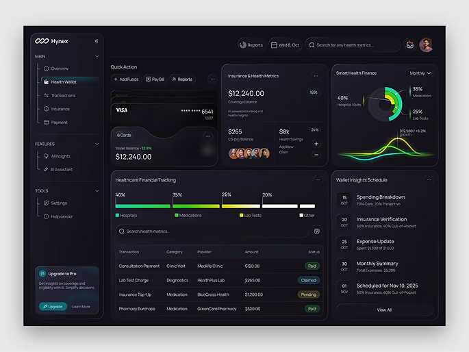
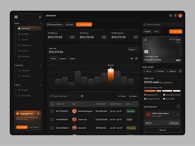
Fintech dashboards, from orbix studio such as those used in investment or payment systems, prioritize real-time performance metrics dashboards and risk indicators. They often use dark mode color palettes to emphasize contrast and reduce visual fatigue.
Analytics tools like Google Data Studio or Power BI exemplify flexibility—users can build custom dashboards that align precisely with business goals while preserving usability and clarity.
These examples highlight how disciplined dashboard design directly improves comprehension and decision-making.
Common Dashboard Design Mistakes
Even experienced teams can fall into pitfalls. Overcomplicating layouts, mixing inconsistent color schemes, and displaying too many metrics are frequent errors. Ignoring data context—showing numbers without benchmarks—leads to misinterpretation.
Another common mistake is neglecting load performance. Slow dashboards frustrate users and discourage engagement. Finally, failing to iterate after deployment leaves dashboards stagnant while user needs evolve.
Avoiding these traps ensures that your dashboards remain valuable and relevant long after launch.
Actionable Steps to Build a Successful Dashboard
To summarize the journey toward a high-impact dashboard UI design:
- Define your audience and their key decisions.
- Determine whether the dashboard is operational, analytical, or strategic.
- Select core metrics that truly matter.
- Choose appropriate visualizations for clarity.
- Apply consistent colors, spacing, and typography.
- Incorporate interactivity wisely.
- Ensure mobile responsiveness and accessibility.
- Test, measure, and refine based on feedback.
This systematic process helps teams move from raw data to meaningful insight, ensuring that dashboards become integral to business decision-making.
Conclusion
Dashboard UI Design is more than an aesthetic exercise—it is an act of translation. It transforms raw data into language that teams can understand and act upon. When executed well, dashboards become silent collaborators that guide daily decisions, track success, and reveal opportunities before they’re missed.
For product managers, UI/UX designers, data analysts, SaaS founders, and BI teams, mastering dashboard UX best practices means bridging the gap between complexity and clarity. By following sound design principles, focusing on user needs, and learning from successful examples in analytics and fintech, you can build dashboards that truly deliver insight—not just information.
In the end, clarity drives confidence. And in a data-driven world, confidence is what leads to better, faster, and smarter decisions.
Frequently Asked Questions (FAQ)
1. What is Dashboard UI Design?
Dashboard UI Design is the process of creating user interfaces that present complex data in a clear, organized, and interactive way. It focuses on usability, hierarchy, and visual storytelling to help users understand key performance indicators (KPIs), identify trends, and make data-driven decisions efficiently.
2. Why is Dashboard UI Design important for SaaS and tech companies?
In SaaS and technology-driven environments, teams rely on dashboards to monitor product performance, user engagement, and business growth. Well-designed dashboards provide real-time data insights, simplify analytics visualization, and support faster decision-making. Poor design, on the other hand, leads to confusion, missed signals, and reduced adoption.
3. What are the key principles of good Dashboard UI Design?
Effective dashboards follow essential principles such as clarity, simplicity, visual hierarchy, and context. They use consistent colors and typography, limit the number of metrics displayed, and emphasize usability through interactivity. Following dashboard UX best practices ensures the design communicates insights instead of overwhelming users.
4. How can I make a dashboard more user-friendly?
To create user-friendly dashboards, focus on your target audience’s goals. Keep layouts clean, use clear labels, and group related metrics. Incorporate interactive elements like filters and drill-down options for exploration, but don’t overcomplicate. Testing with real users helps identify where confusion occurs and guides improvements in dashboard usability.
5. What are some examples of strong Dashboard UI Design?
Popular examples include analytics tools such as Google Data Studio, Tableau, and Power BI, which balance flexibility and simplicity. Fintech dashboards like those used by Revolut or Robinhood emphasize real-time data visualization and clear performance metrics. SaaS platforms like HubSpot and Mixpanel also demonstrate how interactive dashboards can support both executives and analysts.
6. What’s the difference between operational, analytical, and strategic dashboards?
Operational dashboards track real-time performance metrics like uptime, transactions, or active users. Analytical dashboards allow deeper exploration, using filters and segmentation tools for insights. Strategic dashboards summarize high-level KPIs and long-term trends to support leadership decisions. Each type serves a distinct purpose within a business intelligence UI ecosystem.
7. How can dashboard designers handle large or complex data sets?
When visualizing complex data, focus on storytelling and progressive disclosure. Start with summary views that highlight key KPIs, then allow users to drill into detailed data. Use interactive filters and charts to manage complexity without overwhelming the screen. Data visualization UI should prioritize clarity, not quantity.

Fresh UI/UX Ideas, Straight to Your Inbox