Table of Contents
 Understanding Bento Grid Design in Dashboards
- Why Bento Grids Excel in Modern Dashboard UI
- Essential Principles for Balancing Aesthetics and Functionality
- Common Bento Grid Dashboard Design Mistakes
- Real-World Bento Grid Dashboard Examples
- Measuring Dashboard Design Success
- Tools and Technologies for Bento Grid Implementation
- Conclusion: The Future of Dashboard Aesthetics
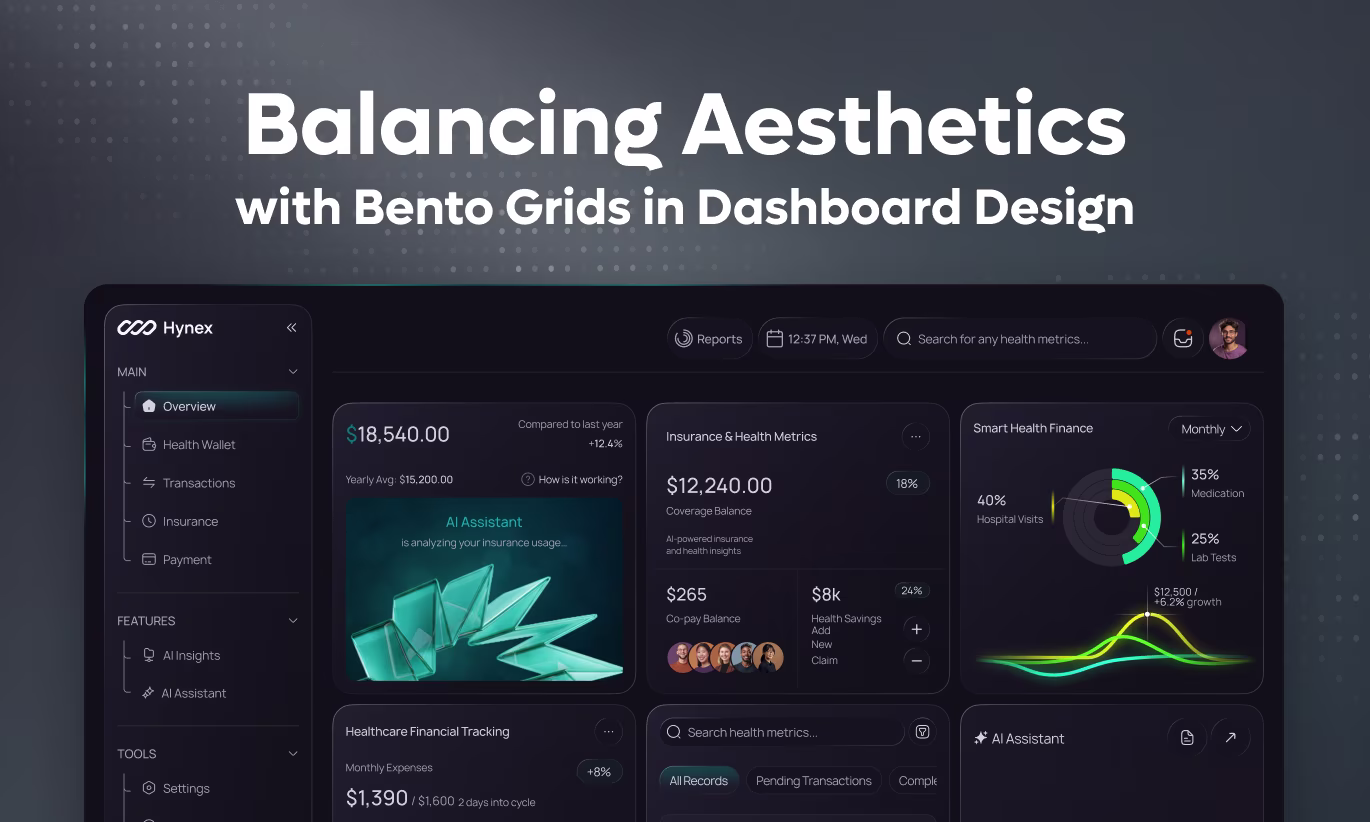
Dashboard design has evolved dramatically from cluttered, overwhelming interfaces to sleek, organized experiences that balance beauty with functionality. At the forefront of this evolution is the bento grid layout—a design pattern inspired by Japanese bento boxes that transforms complex data into visually appealing, easily digestible arrangements. Named after the compartmentalized Japanese lunch boxes, bento grid design creates harmony between aesthetics and usability in modern dashboard UI.
As businesses increasingly rely on data-driven decision making, dashboard aesthetics matter more than ever. Studies show that well-designed dashboards improve user engagement by 42% and reduce time-to-insight by 35%. The bento grid layout has emerged as the gold standard for achieving this balance, offering flexibility, visual hierarchy, and stunning aesthetics without sacrificing functionality.
Understanding Bento Grid Design in Dashboards
Bento grid layout refers to a modular, card-based design system where dashboard components are arranged in asymmetric, varied-size containers—much like compartments in a bento box. Unlike traditional rigid grid systems, bento grids embrace dynamic sizing, creating visual interest while maintaining organized structure.
Key characteristics of bento grid design:
- Varied card sizes creating visual rhythm and hierarchy
- Clean white space between components preventing visual clutter
- Modular, self-contained widgets that can be rearranged
- Asymmetric layouts that feel organic yet organized
- Clear visual separation between data categories
- Responsive behavior adapting to different screen sizes
The appeal of bento grid layouts in dashboard design lies in their ability to present complex information hierarchy intuitively. Larger cards naturally draw attention to primary metrics, while smaller cards display secondary data—all within a cohesive, aesthetically pleasing framework.
Why Bento Grids Excel in Modern Dashboard UI
Traditional dashboard layouts often fall into two extremes: overly structured grids that feel monotonous, or chaotic arrangements that overwhelm users. Bento grid design solves this by introducing organized flexibility.
Advantages for dashboard aesthetics:
- Creates visual interest through varied card proportions
- Reduces cognitive load by grouping related information
- Highlights priority metrics through intentional sizing
- Feels modern and sophisticated without appearing cluttered
- Provides breathing room through thoughtful white space
- Adapts gracefully across desktop, tablet, and mobile
Functional benefits for data visualization:
- Different card sizes accommodate various data types naturally
- Modular structure allows easy customization and personalization
- Drag-and-drop rearrangement becomes intuitive
- Progressive disclosure prevents information overload
- Real-time updates don't disrupt overall layout
- Easier to scan and comprehend than dense tables
Essential Principles for Balancing Aesthetics and Functionality
1. Establish Clear Visual Hierarchy
The foundation of effective bento grid dashboard design is visual hierarchy that guides users to the most important information first.
Hierarchy techniques:
- Size largest cards (2x2 or larger) for KPIs and primary metrics
- Use medium cards (1x2 or 2x1) for secondary data and trends
- Reserve smallest cards (1x1) for status indicators and quick stats
- Position critical metrics in top-left or center-top locations
- Use color strategically to emphasize important data points
- Apply subtle elevation (shadows) to draw attention to active elements
Implementation tip: Map your data importance before designing. Not everything deserves equal space. Primary KPIs tracking revenue, conversions, or critical metrics should dominate, while supplementary data can occupy smaller real estate.
2. Master the Art of White Space
White space—or negative space—is what transforms cluttered dashboards into elegant bento grid layouts. It's not empty space; it's breathing room that improves comprehension.
White space best practices:
- Maintain consistent gaps between cards (typically 16-24px)
- Leave padding within cards (minimum 20px) for content breathing room
- Avoid filling every pixel—empty space reduces cognitive load
- Use white space to gr oup related cards visually
- Increase spacing around high-priority elements for emphasis
- Ensure adequate margin around dashboard edges
Studies in data visualization design show that dashboards with 30-40% white space see significantly higher user satisfaction and faster task completion than densely packed alternatives.
3. Create Cohesive Card Design Systems
Consistency within variety is key to successful bento grid design. Each card should feel part of a unified system while serving distinct purposes.
Card design elements:
- Consistent corner radius across all cards (typically 8-16px)
- Unified shadow or border treatments for depth perception
- Standardized header areas with clear titles and icons
- Consistent typography hierarchy (title, value, label, description)
- Color coding that's meaningful and accessible
- Interactive states (hover, active, selected) that feel responsive
- Loading states that maintain layout stability
Card anatomy best practices:
- Title/label at top clearly identifying metric
- Primary data prominently displayed (large, bold numbers)
- Supporting context (percentage change, sparkline, trend indicator)
- Timestamp or data freshness indicator
- Optional action menu (more info, customize, export)
4. Implement Strategic Data Visualization
Not all dashboard data belongs in charts. Bento grid layouts excel because they accommodate diverse data visualization types within a cohesive framework.
Choosing visualization by card size:
- Large cards ($2\times2$ or bigger) suit complex visualizations including line charts showing trends over time, bar charts comparing categories, area charts for cumulative data, and interactive maps for geographic data.
- Medium cards ($1\times2$ or $2\times1$) work well for simplified charts like sparklines showing mini trends, donut charts for proportions, horizontal bar charts, and small tables with key data points.
- Small cards ($1\times1$) are perfect for single metrics including large numbers with trend arrows, percentage indicators with color coding, status icons with labels, and progress indicators or gauges.
Visualization best practices:
- Remove unnecessary chart elements (excessive gridlines, decorative effects)
- Use color purposefully—not just for decoration
- Ensure readable labels even when cards resize
- Provide interactive tooltips for detailed information
- Animate transitions smoothly when data updates
- Maintain consistent color schemes across related visualizations
5. Design Responsive Bento Grid Layouts
Modern dashboard UI must work flawlessly across devices. Bento grids' modular nature makes responsive design more manageable than traditional layouts.
Responsive strategies:
- Desktop (1200px+): Display full bento grid with asymmetric layouts, show 3-4 columns of varied-size cards, allow side-by-side comparisons, and enable drag-and-drop customization.
- Tablet (768-1199px): Reduce to 2-3 columns, stack some cards vertically, maintain priority metrics visible, and adjust card proportions for narrower screens.
- Mobile (below 768px): Convert to single-column stacked layout, reorder cards by importance, simplify visualizations for small screens, and implement progressive disclosure (tap to expand).
Implementation tip: Use CSS Grid with named grid areas for ultimate flexibility. Define breakpoints that feel natural rather than arbitrary, and test with real content at every viewport size.
6. Embrace Purposeful Color in Dashboard Aesthetics
Color in dashboard design serves three purposes: branding, categorization, and indication. Bento grid layouts provide perfect opportunities for strategic color use.
Color strategy for bento grids:
- Neutral backgrounds (white, light gray) for cards maintain focus on data
- Brand accent colors highlight primary metrics sparingly
- Status colors (green/red/yellow) indicate performance vs. targets
- Category colors group related metrics visually
- Subtle gradients add depth without distraction
- Dark mode alternatives for user preference
Accessibility considerations:
- Maintain 4.5:1 contrast ratio minimum for text
- Never rely on color alone to convey information
- Test color blindness compatibility (especially red/green)
- Provide alternative indicators (icons, patterns, labels)
- Use colorblind-safe palettes for data visualization
7. Add Micro-Interactions for Engagement
Static dashboards feel lifeless. Subtle animations and interactions transform bento grid dashboard design from functional to delightful.
Effective micro-interactions:
- Card hover states with subtle lift and shadow increase
- Smooth number counting animations when data updates
- Skeleton loading states maintaining layout during data fetch
- Expand/collapse animations for detailed views
- Drag-and-drop feedback during customization
- Smooth transitions when filtering or changing time ranges
- Tooltip appearances with brief delays preventing flicker
Animation guidelines:
- Keep durations short (150-300ms for most interactions)
- Use easing functions (ease-in-out) for natural movement
- Ensure animations don't delay critical information display
- Provide "reduce motion" accessibility option
- Test performance on lower-end devices
8. Design for Customization and Personalization
One of bento grid design's greatest strengths is flexibility. Users should be able to personalize their dashboard experience.
Customization features:
- Drag-and-drop card repositioning
- Add/remove cards based on user roles or preferences
- Resize cards within grid constraints
- Save multiple dashboard views or templates
- Filter time ranges affecting all relevant cards
- Export individual cards or entire dashboard
- Share configured views with team members
Implementation balance:
- Provide sensible defaults for first-time users
- Make customization discoverable but not intrusive
- Save preferences automatically or prompt to save
- Allow reset to default if users break their layout
- Consider role-based default configurations
Common Bento Grid Dashboard Design Mistakes
Avoid these pitfalls that compromise both aesthetics and functionality:
- Over-designing cards: Too many colors, shadows, borders, or effects create visual chaos. Keep card design minimal and let data shine.
- Ignoring alignment: Even in asymmetric layouts, cards should align to a consistent grid. Misalignment looks sloppy and unprofessional.
- Information overload: Cramming too much into single cards defeats the purpose. One primary metric per card maintains clarity.
- Inconsistent spacing: Variable gaps between cards appear amateurish. Maintain consistent spacing throughout.
- Poor contrast: Low contrast between cards and backgrounds reduces readability. Ensure clear visual separation.
- Neglecting empty states: When no data exists, cards shouldn't show error messages or appear broken. Design elegant empty states.
- Forgetting mobile: Designing only for desktop creates poor mobile experiences. Consider mobile from the start.
Real-World Bento Grid Dashboard Examples
- Analytics dashboards use large cards for pageviews and conversion rate trends, medium cards for traffic sources and top pages, and small cards for bounce rate and session duration.
- Sales dashboards feature large cards for revenue and pipeline value, medium cards for sales by region and top deals, and small cards for deals closed and quota attainment.
- Project management dashboards display large cards for project timeline and task completion, medium cards for team workload and upcoming milestones, and small cards for overdue tasks and active projects.
- Finance dashboards showcase large cards for cash flow and P&L summary, medium cards for expenses by category and revenue streams, and small cards for AR/AP balances and runway months.
Measuring Dashboard Design Success
Track these metrics to evaluate your bento grid dashboard effectiveness:
Usability metrics:
- Time to find specific information (target: under 5 seconds)
- Task completion rate for dashboard actions (target: 95%+)
- Error rate when interpreting data (target: under 5%)
- User satisfaction scores (target: 4.5/5)
Engagement metrics:
- Daily active users viewing dashboard
- Average session duration (target: 3+ minutes)
- Customization adoption rate
- Most viewed cards (prioritize these in defaults)
Business impact:
- Decisions made using dashboard data
- Time saved vs. manual reporting
- Accuracy improvements in data-driven decisions
- Adoption rate across intended user base
Tools and Technologies for Bento Grid Implementation
Design tools:
- Figma with Auto Layout for responsive bento grids
- Adobe XD with responsive resize features
- Sketch with layout constraints
Development frameworks:
- CSS Grid for native bento grid layouts
- React Grid Layout for drag-and-drop functionality
- Gridstack.js for dashboard builders
- Muuri for animated responsive grids
Dashboard libraries:
- Recharts for React visualizations
- D3.js for custom data visualization
- Chart.js for simpler chart needs
- Tremor for pre-built dashboard components
Conclusion: The Future of Dashboard Aesthetics
Bento grid design represents the maturation of dashboard UI—moving beyond purely functional interfaces to experiences that are both beautiful and effective. By balancing aesthetics with usability, bento grid layouts help users make faster, better-informed decisions while enjoying the process.
The most successful dashboard designs embrace bento grid principles: clear hierarchy, generous white space, cohesive card systems, strategic data visualization, and thoughtful interactions. When implemented well, these dashboards don't just display data—they tell stories, reveal insights, and empower users.
As data visualization continues evolving, bento grid layouts will remain central to modern dashboard design, offering the perfect foundation for presenting increasingly complex information in accessible, visually appealing ways.
At Orbix Studio, we specialize in creating data-rich dashboard experiences that users actually want to interact with. Our bento grid dashboard designs balance stunning aesthetics with intuitive functionality, helping businesses transform raw data into actionable insights through beautifully crafted interfaces.

Fresh UI/UX Ideas, Straight to Your Inbox