

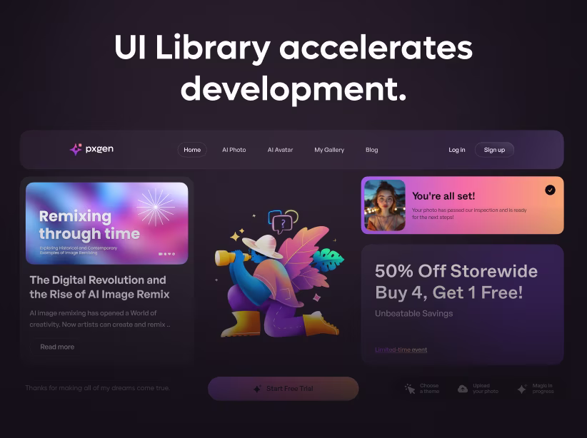
In the fast-evolving world of web design, staying ahead means embracing trends that not only look stunning but also prioritize user satisfaction. As we step into 2025, one such trend dominating the UI/UX landscape is the Bento grid layout. Inspired by the compartmentalized elegance of Japanese bento boxes, these grids organize content into modular, rectangular blocks of varying sizes, creating a visually balanced and intuitive interface. Imagine your website as a neatly packed lunchbox—each section holds a distinct element like text, images, or calls-to-action (CTAs), making navigation effortless and engaging.
But why the buzz in 2025? With users demanding seamless experiences across devices, Bento grids offer a fresh alternative to traditional linear layouts. They blend minimalism with functionality, reducing cognitive load and boosting retention rates. According to recent design insights, this approach can increase user engagement by up to 30% by guiding eyes naturally through prioritized content. Whether you're running an e-commerce site, a portfolio, or a SaaS dashboard, Bento grids can revolutionize how visitors interact with your platform. In this blog, we'll explore their origins, benefits, implementation, and real-world impact—equipping you to transform your site's UX for the year ahead.
What Are Bento Grids?
At their core, Bento grids are a modular layout system where content is divided into clean, asymmetrical blocks arranged in a grid format. Unlike rigid uniform grids, these allow for flexibility—larger blocks for hero images or key features, smaller ones for supporting details like testimonials or buttons. This creates a harmonious yet dynamic visual hierarchy, drawing from the Japanese bento box's principle of balanced compartments.
The trend's roots trace back to influences like Apple's promotional videos, which showcased product specs in grid-style formats, or Microsoft's Metro design language from Windows Phone 7. By 2025, Bento grids have evolved beyond dashboards into full websites and apps, emphasizing content prioritization without distractions. They're not just aesthetic; they're strategic, ensuring every element serves a purpose in the user's journey.
The Evolution and Rise of Bento Grids in 2025
Bento grids gained traction in the early 2020s but exploded in popularity by 2025, driven by the need for responsive, user-centric designs. In a post-pandemic digital era, where screen time spans mobiles, tablets, and desktops, traditional layouts often feel cluttered or unresponsive. Bento grids address this by adapting seamlessly to any screen size, maintaining integrity and appeal.
This year, they're intertwined with broader UX/UI trends like immersive 3D elements, kinetic typography, and low-light modes. For instance, combining Bento grids with AI-driven animations adds interactivity, making static pages feel alive. Designers are also incorporating blur effects and grainy textures for a tactile feel, enhancing the organic quality of these layouts.
As web technology advances—with faster browsers and AR/VR integration—Bento grids position sites as immersive experiences rather than mere information hubs. Tech giants like Apple and Notion have popularized them, proving their versatility for everything from branding to e-commerce. In 2025, expect Bento grids to integrate with biometric authentication and wearable tech, further personalizing user paths.
Key Benefits for User Experience
The true power of Bento grids lies in their UX transformations. First, they enhance navigation by compartmentalizing content, reducing overwhelm. Users can scan and absorb information quickly—ideal for attention spans averaging just 8 seconds. For example, clear visual hierarchies guide eyes from larger feature blocks to smaller CTAs, improving flow and conversion rates.
Second, engagement soars through minimalism and interactivity. By stripping away excess, Bento grids create distraction-free zones, as seen in Literal's design with bold typography and whitespace. Adding micro-animations—like hover effects or transitions—makes interactions delightful, encouraging exploration. This is crucial in 2025, where personalized content reigns; grids allow dynamic storytelling, turning passive scrolling into active discovery.
Third, responsiveness is baked in. Bento grids fluidly rearrange for mobile, ensuring consistent experiences across devices—a must as mobile traffic hits 60% globally. This adaptability boosts accessibility, with semantic HTML and ARIA labels making sites inclusive for all users, including those with disabilities.
Moreover, Bento grids foster emotional resonance. Their clean aesthetics evoke calm and organization, aligning with digital well-being trends like low-contrast designs. For e-commerce, this means higher dwell times and lower bounce rates; for portfolios, it showcases work professionally without chaos. Overall, these layouts can elevate user satisfaction scores, turning one-time visitors into loyal advocates.
How to Implement Bento Grids on Your Website
Implementing Bento grids doesn't require a complete overhaul—start small for big impact. Begin by mapping content: Identify priorities like hero sections or products, then sketch layouts in tools like Figma or Adobe XD. Use visual hierarchy—place main elements in larger blocks, secondary in smaller ones.
Choose platforms wisely: Webflow, Framer, or Elementor offer drag-and-drop for beginners, while Tailwind CSS or Bootstrap suits coders. A simple Tailwind example:
<div class="grid grid-cols-1 md:grid-cols-3 gap-4 p-4">
  <div class="col-span-2 bg-gray-100 p-6 rounded-lg">Main Feature</div>
  <div class="bg-gray-100 p-6 rounded-lg">Secondary Content</div>
</div>
Ensure responsiveness with media queries, and add animations via CSS or GSAP for polish. Test for performance—lazy load images and use structured data for SEO. Balance asymmetry with consistent spacing (16-24px gaps) and 4-8 compartments to avoid clutter. Iterate based on user feedback using tools like Hotjar.
Real-World Examples of Bento Grids in Action
Bento grids shine in practice. Apple's site uses them for product storytelling, with grids turning specs into engaging narratives. Notion organizes workspaces visually, helping users explore templates effortlessly. Halcyon Logistics Branding assembles logos and imagery coherently, while Procreate highlights art themes in balanced blocks. These examples demonstrate how Bento grids make complex info accessible, boosting UX across industries.
Potential Challenges and Solutions
While powerful, Bento grids aren't flawless. Overloading blocks can lead to clutter—solve by limiting sections and prioritizing content. Responsiveness issues on older devices? Use modern frameworks and test rigorously. Accessibility pitfalls, like poor contrast, are mitigated with WCAG guidelines.
Conclusion: Embrace Bento Grids for a Future-Proof UX
In 2025, Bento grids aren't just a trend—they're a UX game-changer, blending aesthetics with functionality to create memorable websites. By enhancing navigation, engagement, and responsiveness, they help sites stand out in a crowded digital space.
Ready to transform yours? Start sketching today and watch user satisfaction soar. For more design insights, explore tools like Figma or consult a UI expert.

Schedule Your Free SaaS Design Consultation
Let's discuss your product, challenges, and goals.
Fresh UI/UX Ideas, Straight to Your Inbox