
Table of Contents
- What Is UX Design and Why Does It Matter for Mobile Apps
- What Are the 7 Pillars of UX Design
- How the 7 Pillars of UX Design Work Together
- How to Apply the 7 Pillars of UX Design in Figma
- Common UX Design Mistakes That Violate These Pillars
- How the 7 Pillars of UX Design Improve Design-to-Development Handoff
- Conclusion
- Frequently Asked Questions

The 7 pillars of UX design are useful, usable, findable, credible, desirable, accessible, and valuable. Together, these seven principles are known as the UX Honeycomb.
The UX Honeycomb principles were introduced by Peter Morville almost 20 years ago. Yet these principles remain highly relevant today, guiding designers to make better decisions and keep users at the center of the experience.
In this blog, we’ll explain these seven principles with practical examples to help you understand how they apply to real design work. Over time, this understanding can help improve your design thinking and decision-making.
Why Some Products Feel Effortless While Others Don’t
Imagine you want to go somewhere, and you need to book a cab. You enter your destination, see the available rides, and tap “Book.” Done! You booked a cab easily in 10 seconds. You didn't think, you didn’t hesitate, you just acted and it felt effortless.
Now think of a different scenario: you open the app to do the same thing, but you can’t find the search bar, the map loads slowly, and the buttons look confusing. All of this would probably make you confused, and hesitate to take the next step.
In both of the scenarios, the main goal is to book a cab, but the results are different. And the main reason for this difference is user experience. User experience determines how a product works, understands its users’ needs and designs interfaces according to that.
This is important because people have a very short attention span. So, if a product feels confusing or difficult, users might hesitate, and switch to another product, with the same capabilities.
By following these 7 user experience principles, designers can make the product feel effortless, and simple to use. So, users can find what they’re looking for and initially, trust the product they are using.

What Are the 7 Pillars of UX Design

These seven pillars come from Peter Morville’s User Experience Honeycomb concept. It is a framework he developed while working in the field of information architecture. Each pillar represents a different dimension of how users perceive and interact with a product.
Here is each pillar, what it means, and how it applies to mobile app design.
1. Usefulness
This is the first principle of the UX Honeycomb: useful. Before thinking about the colors, buttons, or layouts of the design, the designers must ask a simple question:
Does this product actually help the users perform the task they are trying to accomplish?
If the answer is no, then the design will not matter. A product that looks beautiful but does not solve problems will not survive.
So think about the reason why people open the apps. Usually they use apps to solve a problem. This problem can be anything like:
- Google Maps for finding directions
- Uber for getting a ride
- Spotify for listening to music
- Notion for organizing information
These products succeed because they solve clear user problems and make the task easier, and faster. And that’s exactly what a useful product should do.
2. Usability
After making sure that the product design is useful to the users, the next step is to make sure it’s usable as well. Start by answering this simple question:
Can users actually use the product without struggling?
A product can solve a real problem, but if users cannot figure out how to use it, the experience will fail. To make sure your products are usable, you have to make sure the users:
- Understand the interface
- Complete tasks without confusion
- Make fewer mistakes
- Moves through steps quickly
Good usability means users spend less time and effort figuring out how the product works. For example, imagine you are ordering food from a mobile app. A usable design might follow this process:
Search for food > choose an item > add to cart> checkout
Each step is easy to follow, so users don’t need any instructions. They just simply follow the flow. Now think about a design with poor usability. When you open the mobile app, you might see issues like:
- Unclear icons
- Too many buttons
- Confusing menus
And soon, the users will end up asking, where do I tap? When a design makes users think too much about what to do next, the product loses its usability.
3. Findability
So, now the users can see your product as useful, and usable, then there comes the third principle of UX:
Can users quickly find what they’re looking for?
This is called the findable principle of user experience. In this rule, even if the product has great features, if users cannot locate them easily, the experience will fail.
A findable product helps the users to locate:
- Features
- Information
- Actions
Without the users searching for too long. The users shouldn’t feel lost in the screens. Instead, the product should guide them toward what they need to find.
For example, using a findable design might look like this:
Home → Electronics → Headphones → Product page
Everything feels easy, and simple to navigate here. Now think of a different situation where the app has confusing navigation, and you cannot find common navigation tools like:
- Categories
- Search options
- Filters
This is a sign of poor findability, where users struggle to find and locate a product or feature. A product can be useful, but without findability, users might never reach the features the product has.
4. Credibility
Even when a product is useful, usable, and easy to find, users are still curious whether they should trust this product or not. This is where the credibility principle of UX comes in.
You can determine whether your product is credible by answering a simple question:
Do users trust the product?
This is what your credible principle is all about. If the users don’t trust the product, they will hesitate to take action. And when people hesitate to take action, they often stop using the application.
Credibility builds the users trust in the product. The users should feel that:
- The product works correctly
- Their information is safe
- The system is honest
- The results are accurate
And these factors influence whether a user will continue using this product or not. Let’s see an example for that. When you’re building an online product, a credible website shows you:
- Product review
- Ratings
- Secure payment icons
- Clear pricing
- Return policies
These signals make the users trust the product, and reduces hesitation when they’re trying to decide on a purchase.
Now imagine a product site with zero reviews, unclear pricing, and strange pop-ups that keep showing up.
Which product would you choose?
Most users would choose the first one. Why? Because it feels more credible, and that’s the magic of credibility. It encourages the users to make more purchases, return to the product and recommend it to others.
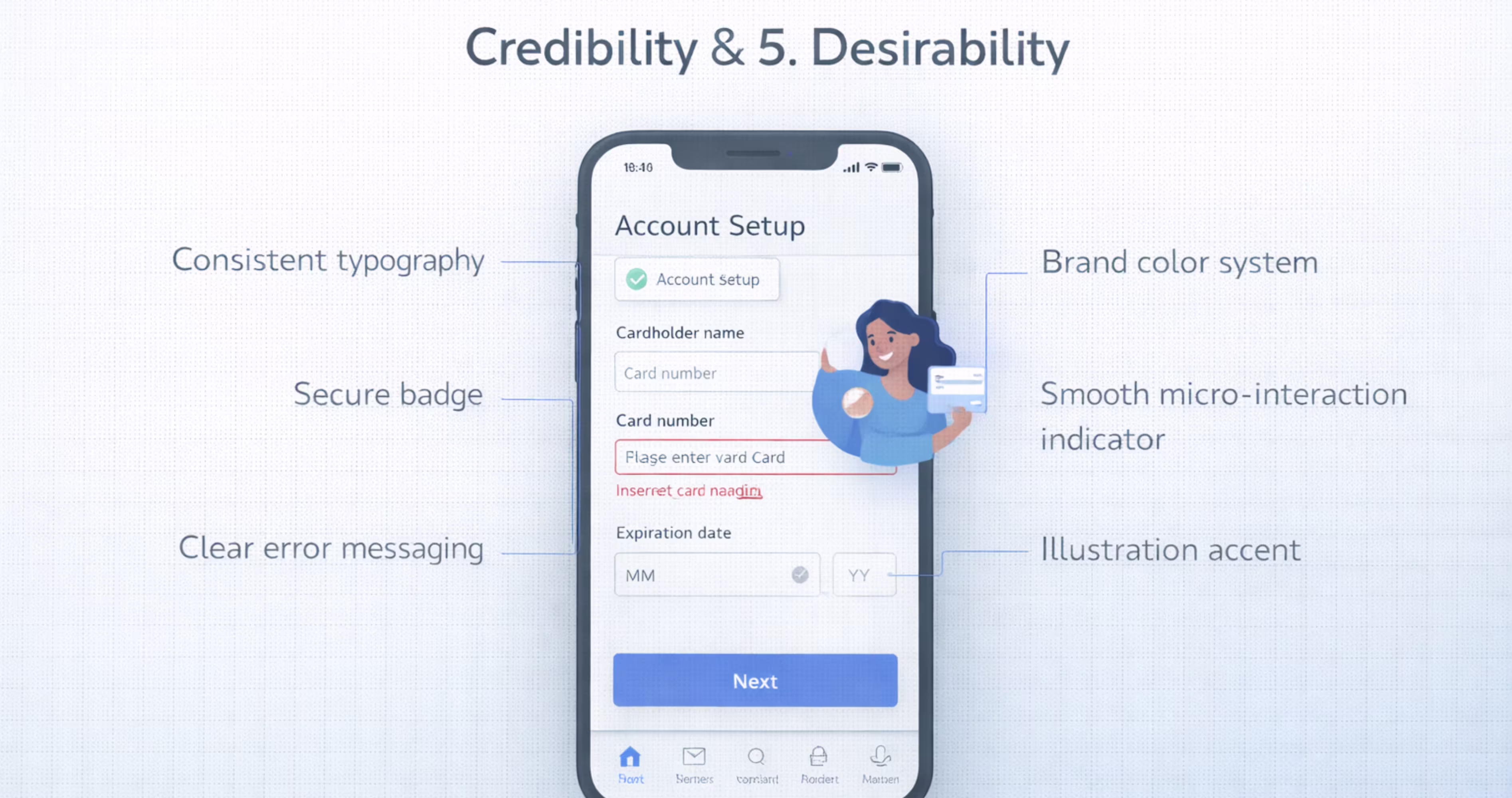
5. Desirability
The desirable simple means, the experience of the overall product. Does this create a positive emotion while interacting with the product, it’s a sign of desirable. A desirable product makes the users enjoy the experience of using it.
Designable products can attract the user through visual designs, personality, and emotional appeal. It answers a simple question:
Do users like using this product?
A desirable UX should make users feel comfortable, confident and satisfied. For example, when a user opens an app for the first time, they immediately noticed things like:
- Color
- Typography
- Layout
- Animation
- Icons
These are the first impressions that make the interface feel professional and polished. For example, application might have things like:
- Clear layouts
- Pleasant colors
- Smooth animations
- Modern typography
These are signs that make an application feel enjoyable to use. And if you're looking to make your application more desirable, you can explore the UI/UX services provided by Orbix Studio. They are a team that helps turn design concepts into user-friendly digital experiences.
6. Accessibility
A good product not only works for some people, it works for people with different abilities or limitations. And this idea of being able to be used by all the people is accessible.
Accessibility in UX means to design a product in a way that all the users can understand and use regardless of their physical, visual or cognitive abilities.
An accessible product can be used by people who may have:
- Vision impairments
- Hearing limitations
- Motor difficulties
- Cognitive challenges
For example, a user with low vision may need to make the text larger or adjust display settings depending on their needs. Accessibility is not only helpful for people with disabilities. It also helps people who are:
- Using phones in bright light
- Holding a device with one hand
- Using slow internet connections
- Experience temporary limitations (like a broken arm)
Accessible design improves usability for everyone. In fact, many countries require digital products to follow accessibility standards to make sure that services can be used by all people.
7. Value
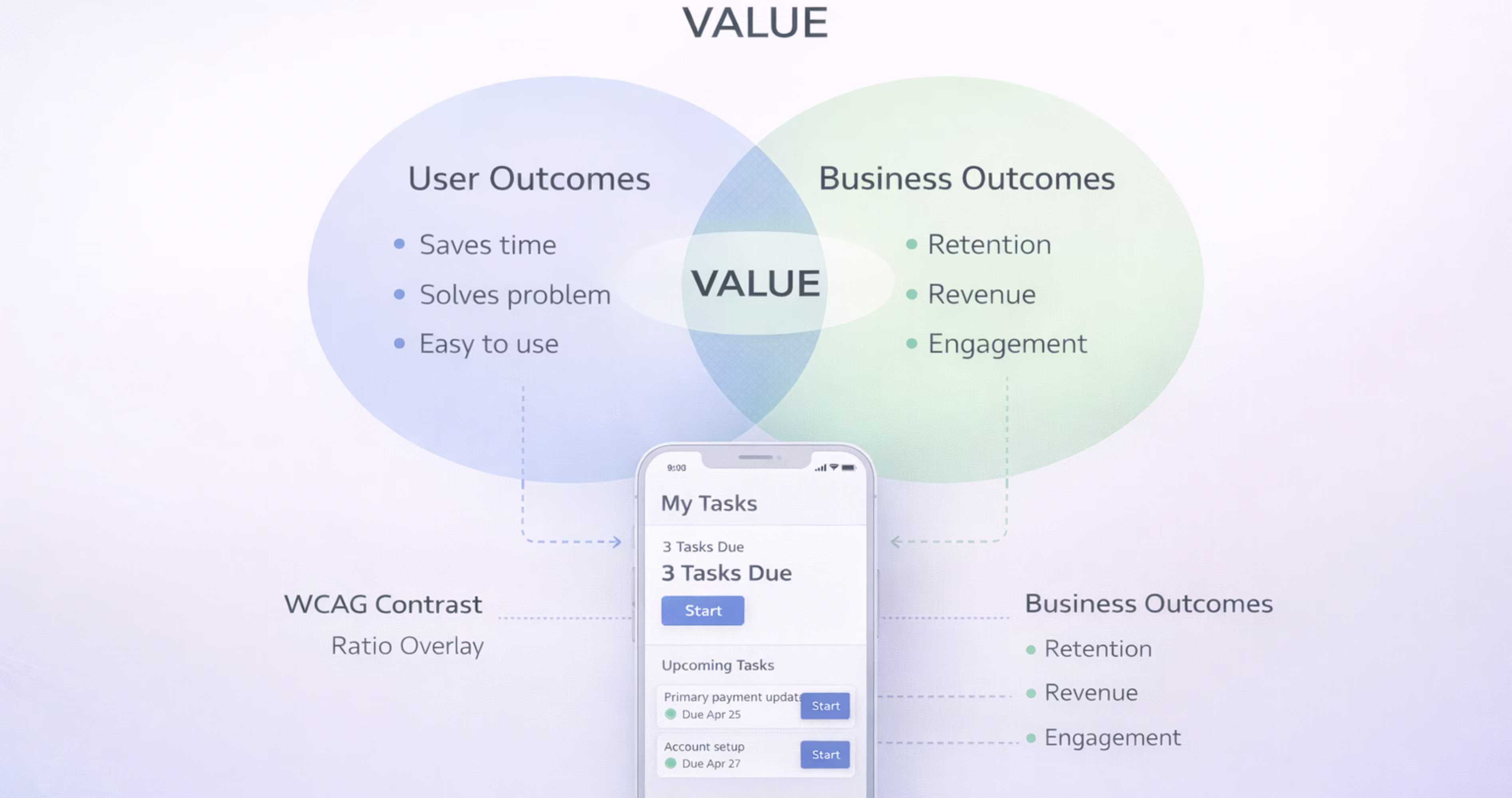
This is the final principle of the honeycomb user experience design principles. A product should not only help the users, or the business. But it should create value for both the users and the organization.
In other words, a good UX must benefit both the user side and the business side. If only one of these sides benefits, the product cannot sustain for long. The valuable products usually create a mutual exchange that helps users with :
- Solving a problem
- Saving time
- Providing an enjoyable experience
- Giving access to useful services
At the same time, the business can gain benefits such as:
- Revenue
- Engagement
- Growth
- Customer loyalty
When both sides benefit from the product, the system becomes sustainable. A great UX design always aims to balance the needs of users with the goals of the business.
How the 7 Pillars of UX Design Work Together
The Relationship Between Usability, Usefulness, and Value
No single pillar operates in isolation. Usefulness without usability creates a frustrating product. Usability without usefulness creates a smooth but pointless experience. Both must be present for the product to deliver value.
Consider a mobile banking app. It is useful because it lets users manage finances on the go. But if transferring money requires seven taps and two confirmation screens with confusing labels, usability fails. The app is useful in theory but painful in practice. Value drops.
The strongest products nail the intersection. They solve real problems through interfaces that feel effortless. When you design in Figma, evaluate each screen against both usefulness and usability simultaneously. Ask: does this screen help the user accomplish their goal, and can they do it without friction?
Balancing All Seven Pillars in a Single Product
Perfect balance across all seven pillars is rare. Every product makes tradeoffs. A medical app might prioritize credibility and accessibility over desirability. A social media app might lean heavily into desirability and findability.
The key is intentional prioritization based on your users and your product's context. Know which pillars matter most for your specific audience and use case. Then design accordingly.
In Figma, this means your design reviews should evaluate work against all seven pillars, not just visual aesthetics. Create a simple checklist or scoring rubric that your team uses during design critiques. Rate each screen or flow against each pillar. This practice surfaces blind spots early and keeps the team aligned on what "good UX" actually means for your product.
How to Apply the 7 Pillars of UX Design in Figma
Mapping Each Pillar to Your Figma Design Workflow
Each pillar connects to specific stages of your Figma workflow:
Usefulness maps to your user research synthesis and feature definition. Before designing screens, create user journey maps and task flows in Figma that validate you are solving the right problems.
Usability maps to wireframing and interaction design. Build low-fidelity wireframes first. Test navigation patterns and screen flows before investing in visual design.
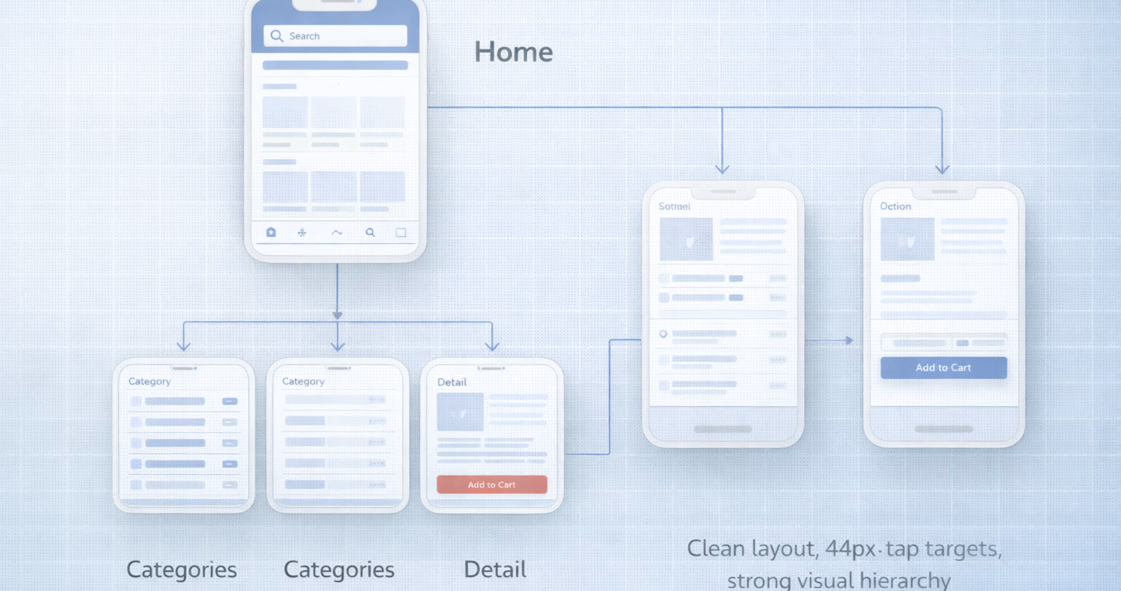
Findability maps to information architecture. Use Figma's FigJam or dedicated frames to map your app's sitemap, navigation hierarchy, and content structure.
Credibility maps to your design system. Build a component library with consistent styles, standardized spacing, and cohesive visual language.
Desirability maps to visual design and motion. Apply your brand identity through color, typography, illustration, and micro-interactions in high-fidelity mockups.
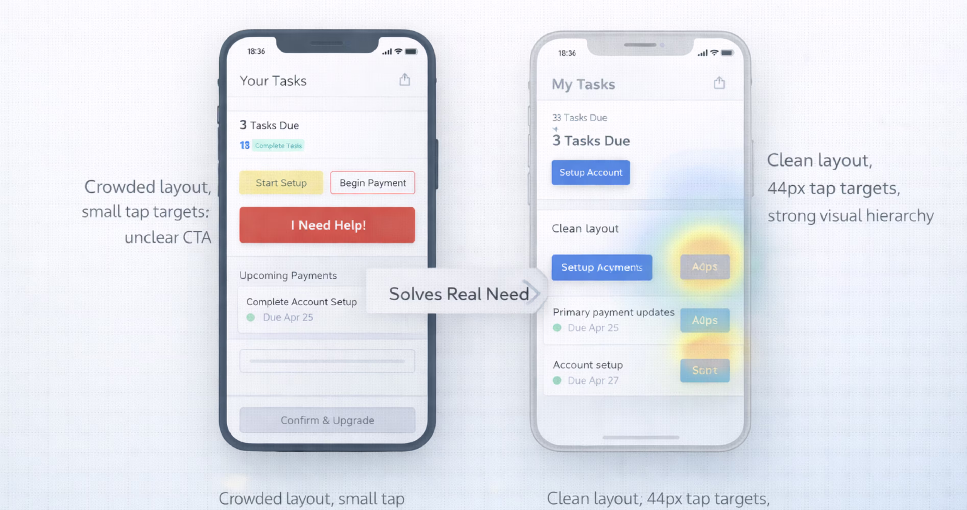
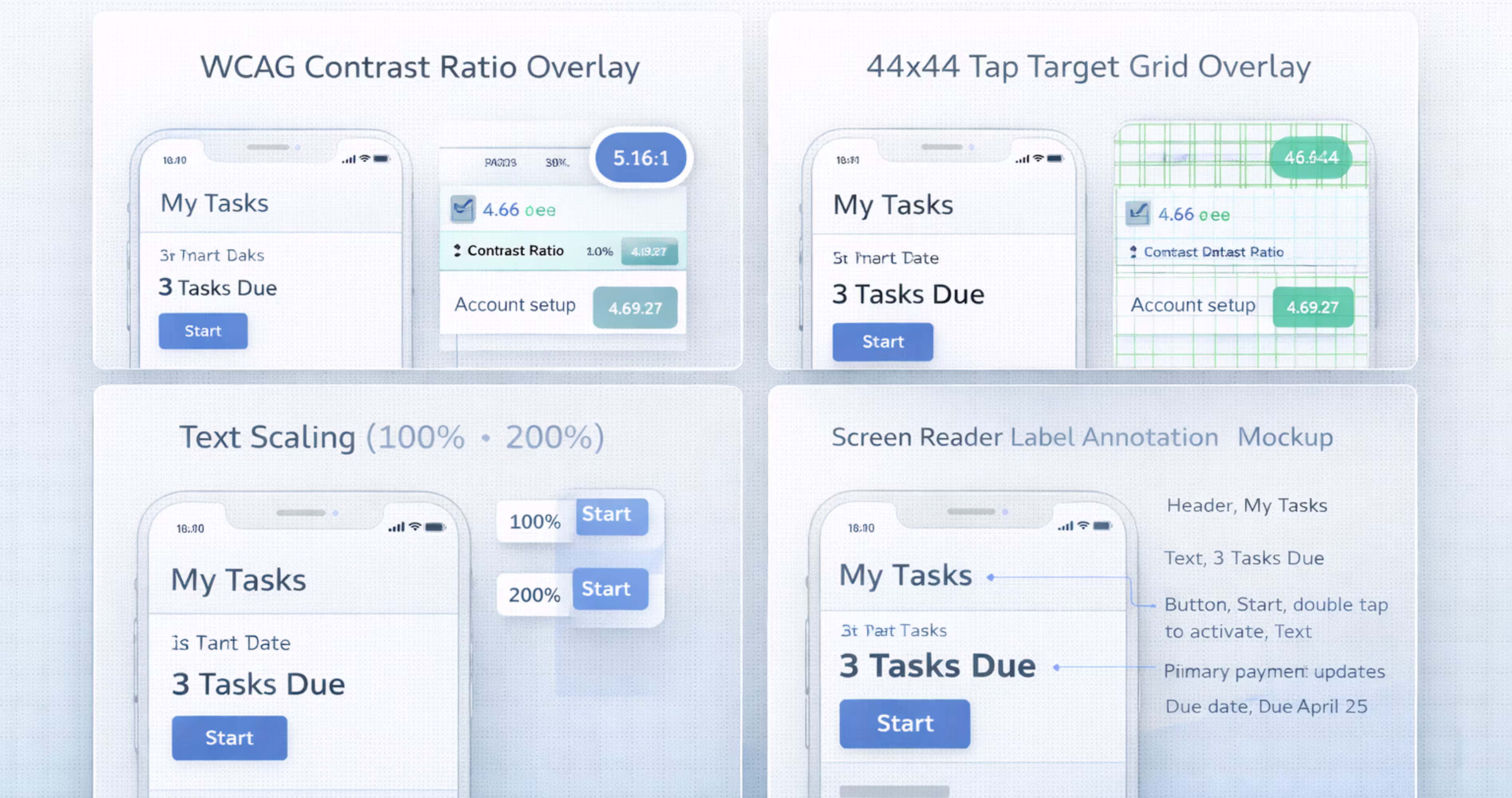
Accessibility maps to component specifications. Define contrast ratios, minimum touch targets (at least 44x44 points for iOS, 48x48 dp for Android), and text scaling behavior in your design system documentation.
Value maps to prototyping and validation. Build interactive prototypes in Figma and test them with real users to confirm the product delivers on its promise.
Using Design Systems and Components to Reinforce UX Pillars
A well-built Figma design system is the most powerful tool for maintaining UX pillar alignment across your entire product.
Your component library enforces usability through consistent interaction patterns. Your style guide enforces credibility through visual consistency. Your accessibility annotations enforce inclusive design standards. Your brand tokens enforce desirability through cohesive aesthetics.
Build your design system with the seven pillars in mind. For each component, document not just how it looks and behaves, but which pillars it serves. A button component, for example, serves usability (clear affordance, appropriate size), accessibility (contrast ratio, focus state), credibility (consistent styling), and findability (clear labeling).
When every component in your library is pillar-aligned, every screen you build from those components inherits that alignment automatically.
Prototyping and Testing Against Each Pillar
Figma's prototyping features let you validate pillar alignment before development begins. Build interactive prototypes that simulate real user flows, then test them against specific pillar criteria.
For usability testing, observe whether users can complete key tasks without confusion. For findability testing, ask users to locate specific features or content. For credibility testing, ask users about their trust level and what influenced it. For desirability testing, use reaction cards or preference tests to gauge emotional response.
Document your test findings in Figma using annotation layers or linked FigJam boards. Map each finding back to the specific pillar it relates to. This creates a clear record of design decisions and their UX rationale, which is invaluable during design reviews and developer handoff.
Common UX Design Mistakes That Violate These Pillars
Prioritizing Aesthetics Over Usability
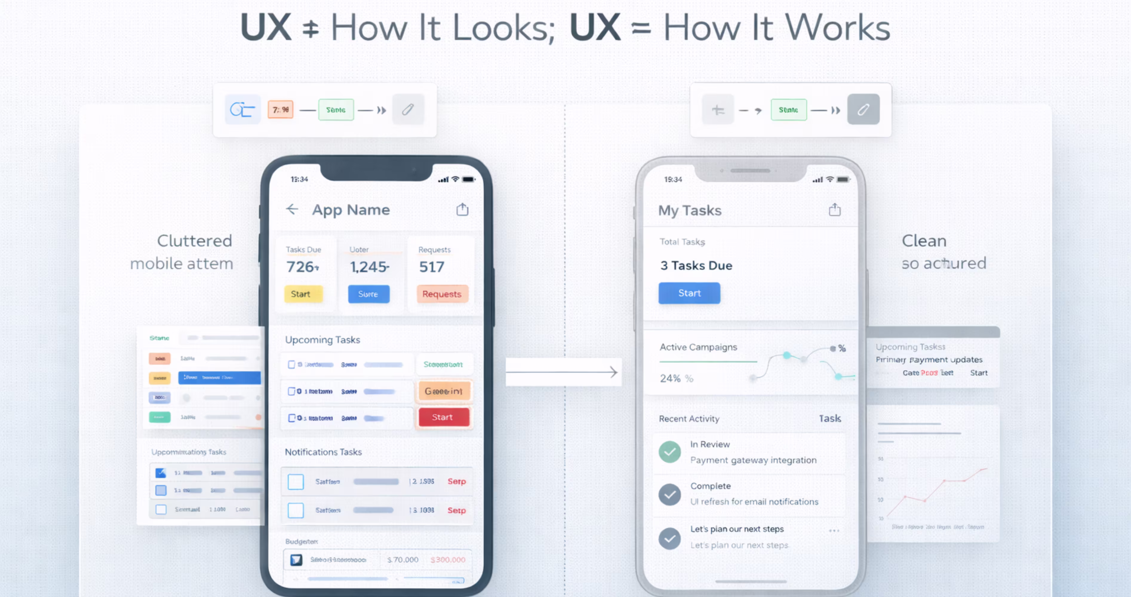
This is the most common mistake, especially among early-stage teams and designers new to product work. A screen can look stunning in a Dribbble shot and completely fail in a user's hands.
Light gray text on white backgrounds sacrifices readability for minimalism. Custom navigation patterns confuse users who expect standard mobile conventions. Decorative animations that delay task completion prioritize desirability at the expense of usability.
The fix is simple: test with real users early and often. If your Figma prototype looks beautiful but users cannot complete basic tasks, the design is failing at its core purpose.
Ignoring Accessibility Standards
Accessibility is frequently treated as an afterthought, something to "add later" before launch. This approach is both ethically wrong and practically expensive. Retrofitting accessibility into a finished design requires reworking components, layouts, and interaction patterns that should have been built correctly from the start.
Common violations include insufficient color contrast, touch targets smaller than platform minimums, missing alternative text, and interfaces that cannot be navigated with assistive technologies.
In Figma, use accessibility plugins during design, not after. Check contrast ratios as you select colors. Verify touch target sizes as you build components. Annotate screen reader order in your design specs. Make accessibility a design requirement, not a QA checkbox.
Skipping User Research and Validation
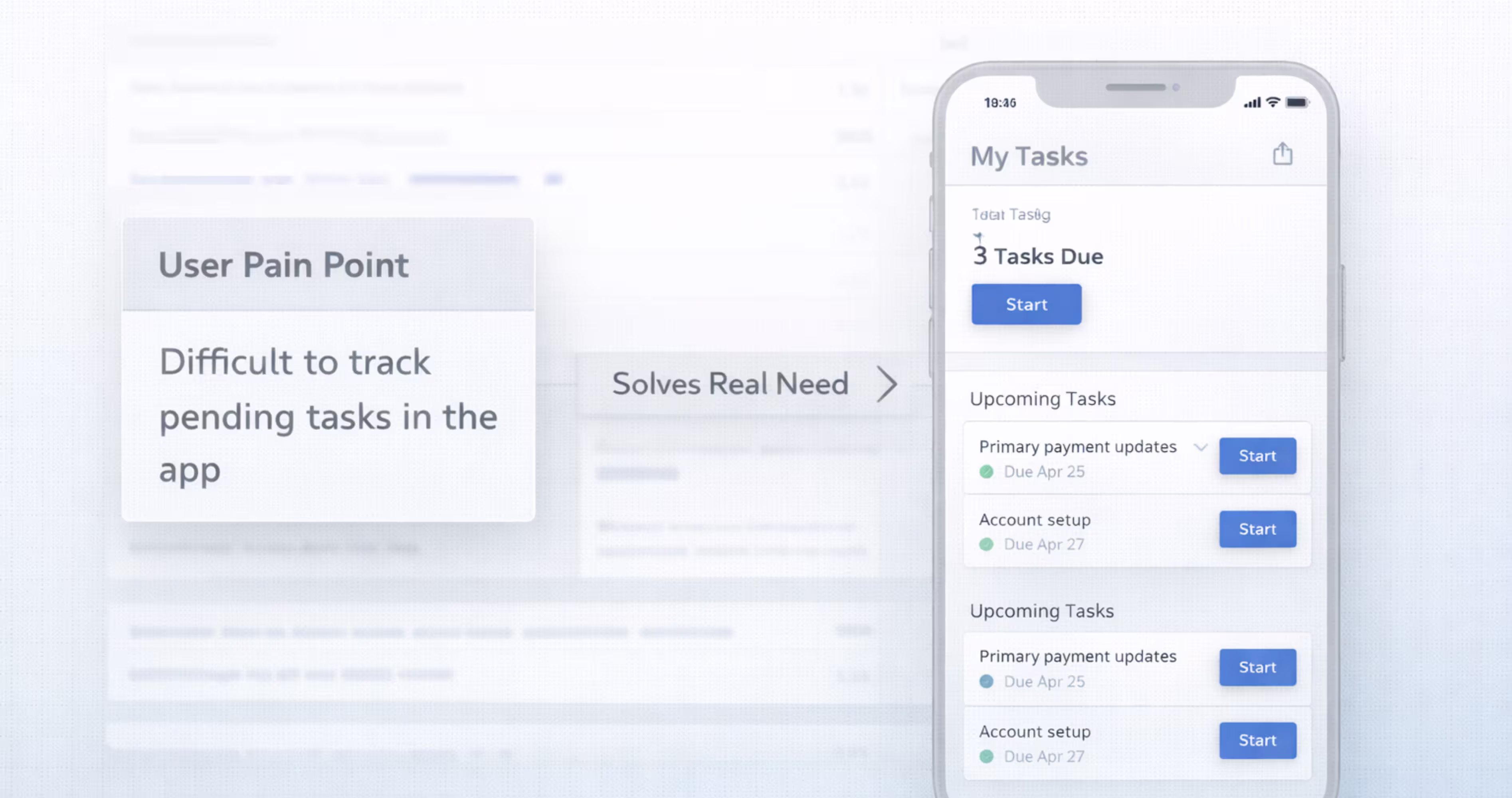
Designing without user research means guessing. You might guess correctly sometimes, but you will miss critical insights about what users actually need (usefulness), how they expect to navigate (findability), and what builds their trust (credibility).
Even lightweight research makes a significant difference. Five user interviews can reveal patterns that reshape your entire information architecture. A quick usability test on a Figma prototype can catch navigation problems that would have cost weeks of development time to fix.
The 7 pillars give you a framework for what to research. Usefulness research validates the problem. Usability research validates the solution. Credibility research validates the trust signals. Each pillar points to specific questions you should be asking your users.
How the 7 Pillars of UX Design Improve Design-to-Development Handoff
Why UX Clarity Reduces Development Friction
When designers understand and apply the 7 pillars, their design decisions become more intentional and easier to communicate. Developers do not just receive pixel-perfect mockups. They receive designs with clear rationale.
A button is not just "blue and 48px tall." It is blue for brand consistency (credibility and desirability), 48px tall for touch accessibility (accessibility), and placed in the primary action position for task completion (usability and findability). When developers understand the why behind design decisions, they make better implementation choices and push back on the right things.
Pillar-aligned design also reduces ambiguity. When every component has documented behavior, accessibility specs, and interaction states, developers spend less time guessing and more time building.
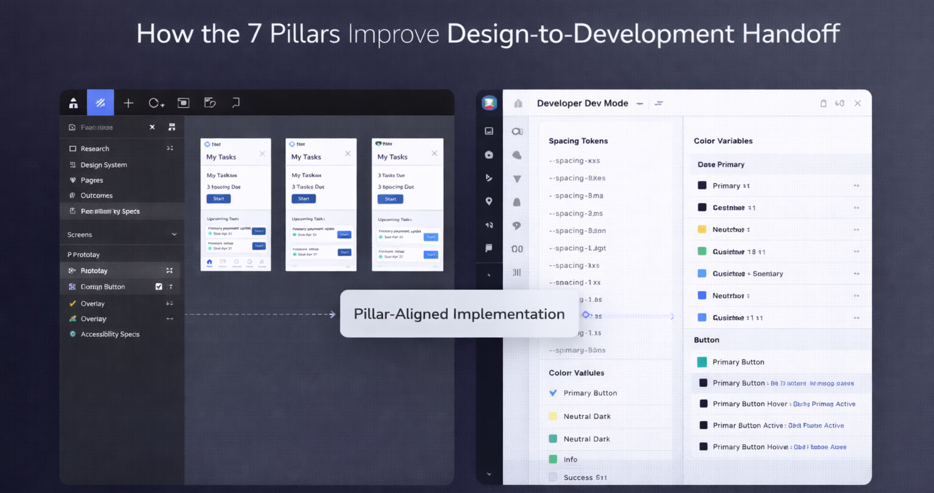
Structuring Figma Files for Pillar-Aligned Handoff
Organize your Figma files to make pillar alignment visible to developers:
Create an accessibility annotation layer that documents contrast ratios, touch target sizes, screen reader order, and alternative text for every screen. This makes the accessibility pillar tangible and measurable for developers.
Include interaction specifications that document hover states, focus states, error states, loading states, and empty states. These specs serve usability and credibility by ensuring the product behaves predictably in every scenario.
Link to your design system documentation from every page. When developers can trace a component back to its design system definition, including its pillar alignment notes, they build with greater consistency.
Add a "Design Rationale" section to your handoff documentation. For key screens and flows, briefly explain which pillars drove the major design decisions. This context helps developers prioritize what matters during implementation and prevents well-intentioned "improvements" that accidentally violate UX principles.
Conclusion
The 7 pillars of UX design, usefulness, usability, findability, credibility, desirability, accessibility, and value, provide a complete framework for evaluating and improving every digital product you build. They move UX conversations beyond subjective opinions and into structured, measurable criteria that designers, founders, and developers can all align around.
For teams designing mobile apps in Figma, these pillars are practical tools, not academic concepts. They inform your research, shape your components, guide your prototypes, and strengthen your handoff. When every design decision maps back to a clear UX principle, the entire product development process becomes more focused and more effective.
We build mobile apps grounded in these principles every day. At Orbix Studio, we help startups and product teams turn ideas into polished, user-centric digital experiences, from brand identity and UX strategy through Figma design, prototyping, and production-ready development. If you are ready to build a mobile app that gets the fundamentals right, let's talk.
Frequently Asked Questions
What are the 7 pillars of UX design in simple terms?
The 7 pillars are usefulness, usability, findability, credibility, desirability, accessibility, and value. Each one represents a quality your product must have to deliver a complete user experience. Together, they ensure your product solves real problems, is easy to use, and earns user trust.
Who created the 7 pillars of UX design?
The framework originates from Peter Morville, a pioneer in information architecture and user experience. He developed the User Experience Honeycomb to illustrate the seven facets that define meaningful, valuable user experiences in digital products.
How do the 7 UX pillars apply to mobile app design?
Every pillar directly impacts mobile app quality. Usability determines whether users can navigate small screens efficiently. Accessibility ensures the app works for users with disabilities. Findability governs how quickly users locate features. Applying all seven pillars during mobile design prevents common usability failures.
What is the difference between usability and usefulness in UX?
Usefulness means the product solves a real problem or fulfills a genuine need. Usability means the product is easy and efficient to use. A product can be useful but hard to use, or easy to use but pointless. Both must be present for a good user experience.
How can I apply UX design pillars in Figma?
Map each pillar to a stage in your Figma workflow. Use journey maps for usefulness, wireframes for usability, sitemaps for findability, design systems for credibility, visual design for desirability, accessibility plugins for accessibility, and user testing on prototypes for value.
Why is accessibility considered a pillar of UX design?
Accessibility ensures that people with visual, auditory, motor, or cognitive disabilities can use your product. It is a fundamental quality of good UX because excluding users based on ability is both an ethical failure and a business limitation. Accessible design also improves usability for all users.
How do the 7 pillars of UX design affect product value?
Value is the outcome of getting the other six pillars right. When a product is useful, usable, findable, credible, desirable, and accessible, it delivers meaningful value to users and achieves business objectives. Neglecting any single pillar reduces the overall value the product provide.


