
Table of Contents

Imagine walking into a small room where every single wall is painted a bright red. Your eyes would hurt and you would want to leave immediately. That is exactly what happens to users when you fill your screen with too many loud colors.
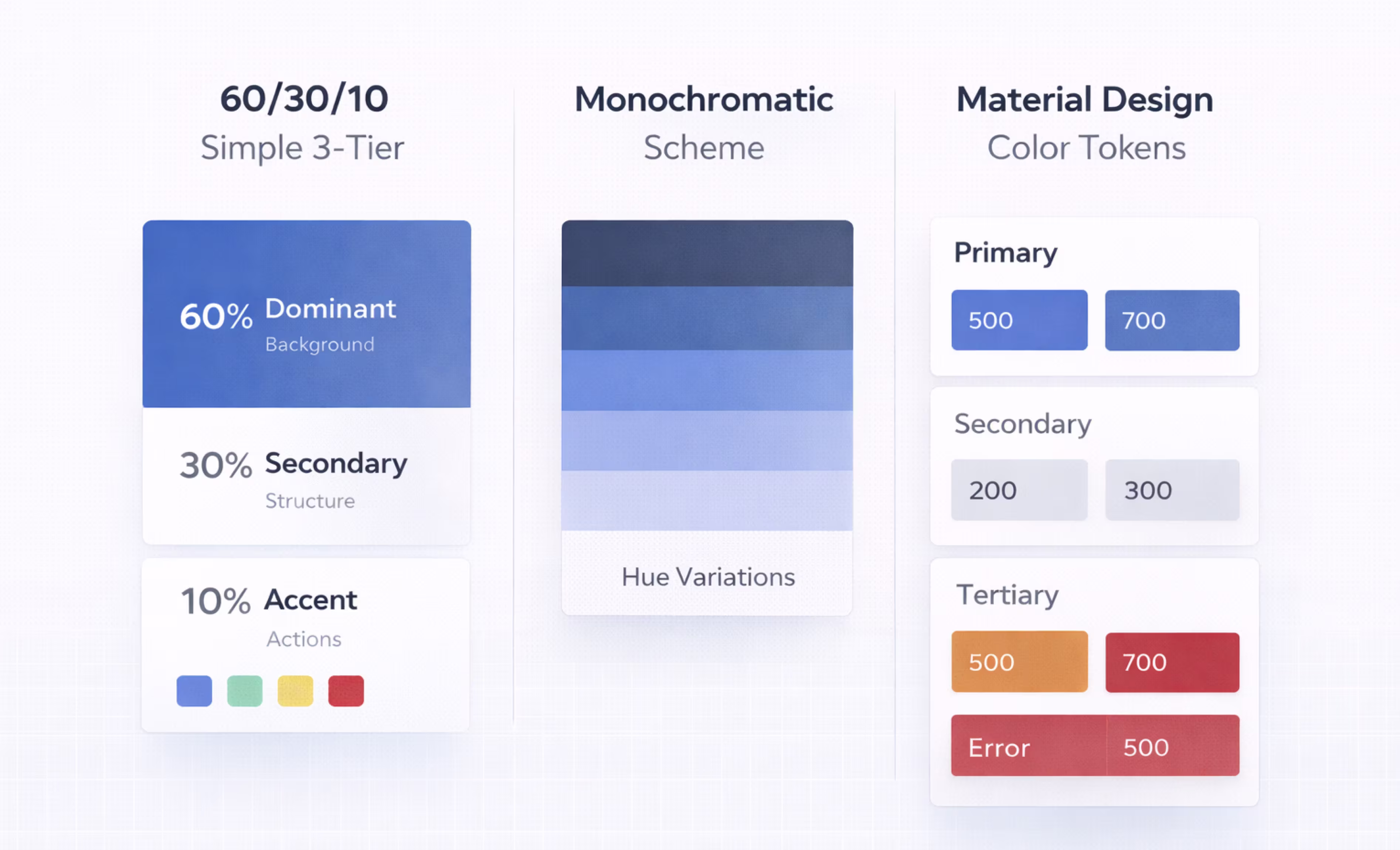
Finding the right balance in your interface is important. Professional designers do not guess where to put colors; they use the 60/30/10 rule. This means using your main color for most of the space, a secondary color for support, and a bright accent only for important buttons.
Today, we will talk about how to use the 60/30/10 rule in UX design. You will know exactly how much color to use so your interface looks clean and professional.
What is the 60/30/10 Rule in UI/UX?

The 60/30/10 rule is a simple ratio that balances your interface so users know exactly where to look. You divide your screen into three distinct color buckets, making sure that nothing competes for attention. This concept actually comes from interior design, but it works even better for digital interfaces where attention spans are short.
When you stick to this ratio, you create a clear visual hierarchy without even trying. The dominant color recedes into the background, letting the secondary color define the layout, while the accent color pops out to guide the user. It is the most reliable way to make a screen look professional and intentional.
Here is exactly how the breakdown works in a modern UI:
- 60% dominant color: This is usually a neutral shade like white, light gray, or black. It covers the background and large empty areas to act as a clean canvas.
- 30% secondary color: Typically includes your cards, sidebars, text, and subheaders that give structure to the page.
- 10% accent color: Use your bright brand color exclusively for buttons, links, and notifications that need immediate action.

Why 60/30/10 Rule Actually Works
You know that feeling when you open a design and your eyes just bounce around? You look at the button, then the sidebar, then the header, and you have no idea where to click first. That is visual noise. Every element on the screen is shouting for attention, so your brain just tunes it all out.
This happens when you treat every color like it is equally important.
The 60/30/10 rule fixes this by forcing a clear pecking order. It tells the user what matters most without making them think. Think of your interface like a theater production.
If you shine a spotlight on everyone, nobody stands out.
Nielsen Norman Group actually points out that users tend to ignore large blocks of color that look like ads or banners. If you make your whole header bright orange because it is "on brand," users might subconsciously skip right over it to get to the content.
Apple News is a great example of this working well. They use plenty of white space and subtle grays to let the article images and headlines really pop. In contrast, look at older versions of the UberEats interface, where bright greens and heavy blacks fought for space and made the menu hard to scan.
When you restrict your bright accent color to just 10% of the screen, you create a clear path. The user’s eye lands on the button because it is the only bright thing in a calm sea of neutrals. That is the secret sauce.
Applying the 60/30/10 Rule to UI Design
Let’s break down exactly where these colors live in your design. It is not just about picking three swatches and calling it a day. You have to assign them to the right parts of your interface.
Here is how you do it.
The 60 Percent: Dominant Color

The 60% is the biggest chunk of your screen. It is the background color that sits behind everything else. Think of it as the canvas of a painting. If the canvas is loud or messy, the painting on top of it will never look good.
Most of the time, this color is boring. Really boring. I am talking about white, light gray, or maybe a soft cream.
Why is it so boring?
Because if the background is exciting, nothing else can be. Imagine trying to read a book where every page is neon green. Your eyes would hurt after five minutes. In UI design, we call this visual fatigue. You want the user to look at your app for hours, not seconds.
So, we pick a neutral color that recedes. It steps back and lets the important stuff come forward.
Look at your screen right now. The giant empty space behind your content? That is 60%. The gaps between your cards? That is 60% too.
You use it for the main canvas behind your text, the breathing room between elements, and the structure around the main content. These areas are not "empty." They are active. They act as a container that holds your design together.
Stick to true neutrals for your 60%. Let the background be an invisible stage. Save the personality for the actors.
The 30 Percent: Secondary Color

If the 60% is the stage, the 30% is the set design. This color covers about a third of your screen, and its job is to build the structure. You use this color for cards, sidebars, navigation bars, and the blocks of text that hold your content together.
Think of a typical dashboard. The big white space behind everything is your 60%. The gray box that holds your user profile, the dark bar on the left with your menu links, and the blocks containing your charts? That is all your 30%.
This color usually comes from your brand, but you turn the volume down. Instead of using your bright, electric brand blue, you might use a desaturated navy or a deep charcoal. It still looks like you, but it is not screaming for attention.
The main job of the 30% is to answer the question, "Where am I?" When a user opens your app, they need to understand the layout immediately. They see a dark sidebar and they know, "Okay, that is navigation." They see a light gray card and they know, "That is where the content lives."
By using the same color for these structural elements over and over, you create a predictable pattern. Users do not have to relearn your interface on every screen. They see the color, they recognize the shape, and they know what to do. It turns a confusing page into a familiar map.
Just remember, this color is a helper, not the hero. It supports the content inside it, but it never fights with the buttons on top.
The 10 Percent: Accent Color

This is the star of the show. The 10% is your most powerful color, precisely because you use it the least. Think of it like a highlighter pen. You do not highlight the whole page, or nothing stands out. You just highlight the one thing that matters.
In your interface, this is your bright brand color. It is the hot pink, the electric blue, or the vibrant orange. You reserve this color for the things you want the user to click. I am talking about your primary Call to Action (CTA) buttons, notification badges, active links, and important error messages.
When you restrict this color to just 10% of the screen, it creates a magnet for the user's eyes. They see a splash of color and they know, "Oh, that is the button I need to press."
But there is a strict rule you have to follow here.
Your accent color must be easy to see. I am not just talking about aesthetics; I am talking about accessibility. You need to check that your color passes the WCAG standards. Specifically, you want a contrast ratio of at least 4.5:1 against your background.
If your accent color is too light, or if it blends in too much, it fails. An accent that people cannot see is not an accent at all. It is just a design flaw. Make it pop, make it bright, but make sure everyone can use it.
5 Tested 60/30/10 Palettes WCAG AA Verified
Choosing colors is hard. You have to guess if they look good together, and then you have to check if they are actually readable. To save you the headache, I put together five proven palettes that work right now.
These are not just random colors I picked. They have all been tested against the WebAIM contrast checker. Every single one passes the strict WCAG 2.2 AA standards. That means your users will be able to read your text and see your buttons without squinting.
Pick the vibe that matches your project and start designing.
Implementing the 60/30/10 Rule in Figma
Ready to fix your screen? Do not just read this - open Figma and follow along. This workflow takes about ten minutes, but it will save you hours of tweaking later.
Step 1: Set Up Your Variables
Go to your Variables panel in Figma. Create three collections: Dominant, Secondary, and Accent. For each collection, add the main color plus a few tints or shades. You need these for hover states and disabled buttons. Trust me, in the future you will be grateful you did this now.
Step 2: Paint the Background
Select your main frames and large surface areas. Fill them with your Dominant variable. This is usually your light gray or white. Immediately, your screen will feel less chaotic. You are clearing the stage so the actors can step in.
Step 3: Build the Structure
Now grab your Secondary variable. Apply this to your cards, sidebars, and navigation bars. You want to define the layout boundaries. When you do this, the user's eye should start to recognize where the content lives and where the controls are.
Step 4: Place the Spotlight
Here is the fun part. Take your Accent variable. Apply it only to the things you want people to click. This means your primary "Submit" button, notification badges, and active links. If you catch yourself using it on a border or a random icon, stop. That color is for action only.
Step 5: The Squint Test
Zoom out and squint at your screen until it goes blurry. Do you see a small, bright spot where your button is? Or is the whole screen glowing? If it is the latter, you have too much of an accent. Go back and swap some of those accents back to secondary.
Common Mistakes When Applying the 60/30/10 Rule

Even with a simple rule, it is easy to slip up. I see these same mistakes pop up in Figma files all the time. Here is how to avoid them so your designs stay clean.
Making the Background Too Loud
The 60% needs to be neutral. That is the rule. But I often see designers grab their bright brand color and paste it all over the background because they think it looks "on brand."
It does not. It just hurts to look at.
When you use a saturated color for such a large area, the user's eyes get tired fast. This is called visual fatigue. You want the user to stay on your page, not run away from it because the background is vibrating. Save the bright, saturated colors for your smaller elements. Keep the background quiet.
Highlighting Everything
This is the "boy who cried wolf" problem. If you highlight every single button, icon, and link with your accent color, nothing stands out.
When everything is special, nothing is.
Be ruthless with your 10%. Pick the one thing you want the user to do - usually the "Buy Now" or "Sign Up" button, and make that the star. Everything else can take a backseat. If you need to emphasize other things, use a darker shade of your secondary color. Do not reach for the accent color again.
Forgetting Dark Mode
Dark mode is not just "turning the lights off." The 60/30/10 rule still applies, but the colors have to change.
You cannot just use the exact same palette you used for light mode. A bright yellow background that looks fine in the daytime will blind someone in a dark room.
In dark mode, your dominant color needs to be a deep, soft navy or charcoal. Your accent color might need to be a bit brighter to glow against that dark background. Keep the ratios the same, but adjust the values to fit the mood.
Final Thoughts
The 60/30/10 rule is simple to understand. The hard part is keeping it that way.
When you launch a product, you start with one screen. It is easy to make that look good. But what happens after six months? What happens when you have fifty screens, three new features, and a team of five designers all adding new components? Color drift can happen.
Every time someone adds a new button style or picks a slightly different blue for a chart, the proportions break. Without someone watching the shop, your clean 60/30/10 system erodes. You end up right back where you started: with a messy, loud interface.
You do not have to police this alone. Orbix Studio offers a subscription model at $2,999 per month that handles design system governance for you. We make sure your color ratios stay balanced as your product grows.
Frequently Asked Questions
What is the 60/30/10 rule in UI design?
It is a color formula that balances your screen. You use 60% neutral for backgrounds, 30% secondary for structure, and 10% accent for actions. This creates a clear visual hierarchy so users know exactly where to look.
How do I apply the 60/30/10 rule in Figma?
Create three color variables for dominant, secondary, and accent. Apply dominant to backgrounds, secondary to cards and sidebars, and accent only to buttons. Zoom out to check if the visual balance looks right.
Does the 60/30/10 rule work for dark mode?
Yes, the ratios stay the same but the colors change. Use a dark neutral for the 60%, a lighter gray for 30%, and a vibrant color for 10% so it glows against the dark background.
What colors work best for the 10 percent accent?
Choose bright, high-contrast colors like electric blue, coral, or orange. Ensure they pass WCAG accessibility standards against your background. This makes your buttons and notifications pop without straining the user's eyes.
Can I use more than 3 colors with the 60/30/10 rule?
Yes, but stick to the ratio. Use shades of your main three colors rather than adding entirely new hues. Adding random colors breaks the balance and makes the interface look messy. Keep it simple.
Can I apply the 60/30/10 rule in Figma design systems?
Yes. Define your three color tiers as Figma color styles or variables. Assign them to components at the design system level so every new screen automatically inherits the correct proportions.
What is the difference between the 60/30/10 rule and color theory?
Color theory is a broad discipline covering hue relationships, contrast, harmony, and psychology. The 60/30/10 rule is a specific proportional guideline within that discipline. It tells you how much of each color to use, not which colors to pick.


.avif)