Upmatch — Responsive Job Portal Website Design
Connecting job seekers and employers through a seamless, modern web experience.
About the project
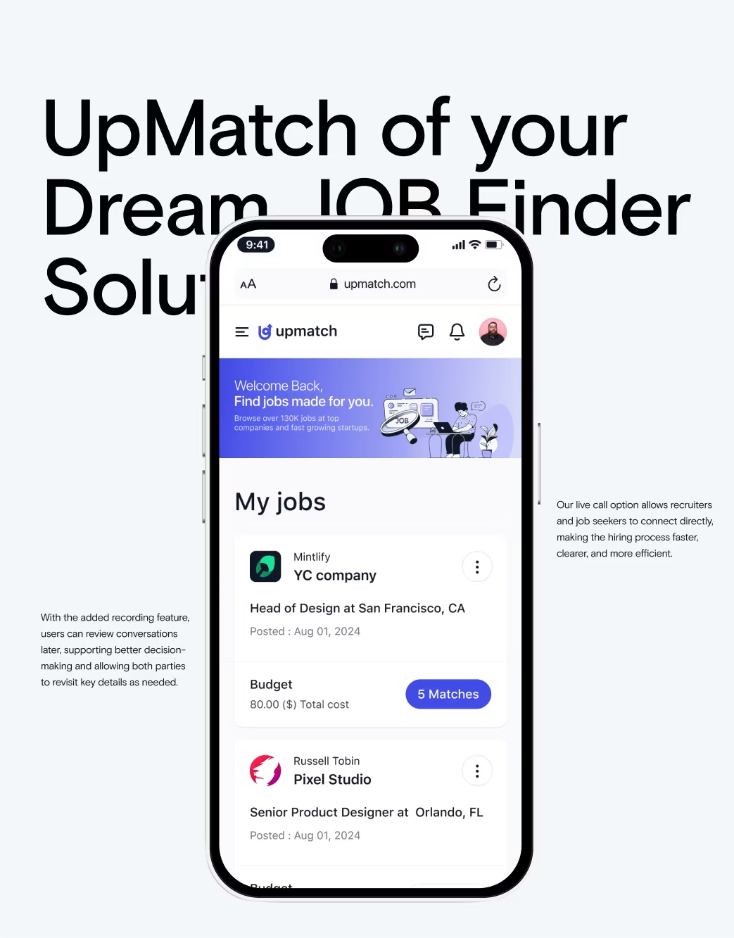
Upmatch is a recruitment startup that bridges the gap between professionals and hiring teams. The goal was to create a scalable job portal that simplifies job discovery, enhances user experience, and increases employer visibility.
The Challenges
Upmatch’s previous MVP had usability issues — slow filtering, poor onboarding flow, and unbalanced employer-brand visuals. The biggest challenge was designing a system that feels intuitive to both job seekers and recruiters.
Our Approach
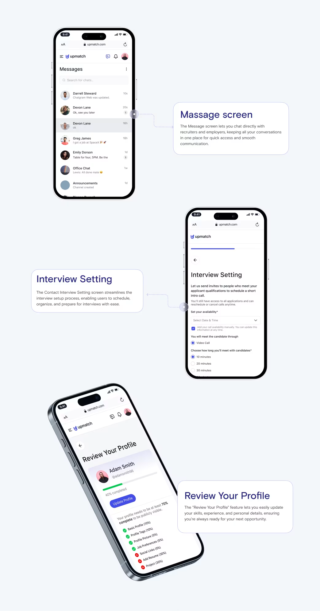
Orbix Studio redesigned the platform with a dual-experience mindset. Our UX team focused on:
- Simplifying job search & filter flows
- Crafting intuitive employer dashboards
- Building a responsive interface compatible with mobile-first behavior
Figma and Webflow were used to align design and front-end structure seamlessly.
Our Approach


Website Structure
Key sections:
- Landing Page
- Job Listings & Filters
- Employer Dashboard
- Candidate Profile Pages
- Blog / Resources
This structure ensured clarity, engagement, and easy conversion for all user types.

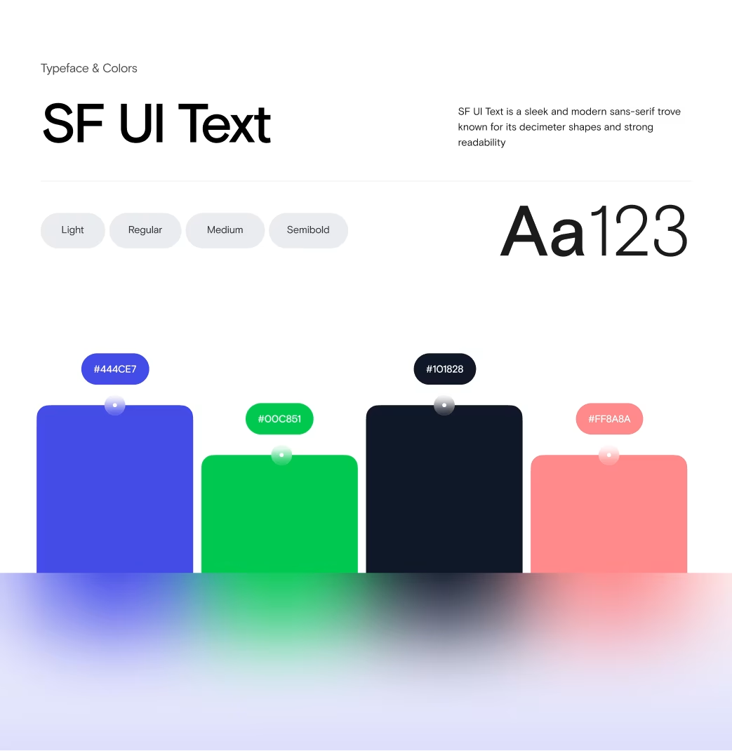
Design System
Color palette: Neutral blues & whites representing trust and professionalism.
Typography: Modern sans-serif for accessibility.
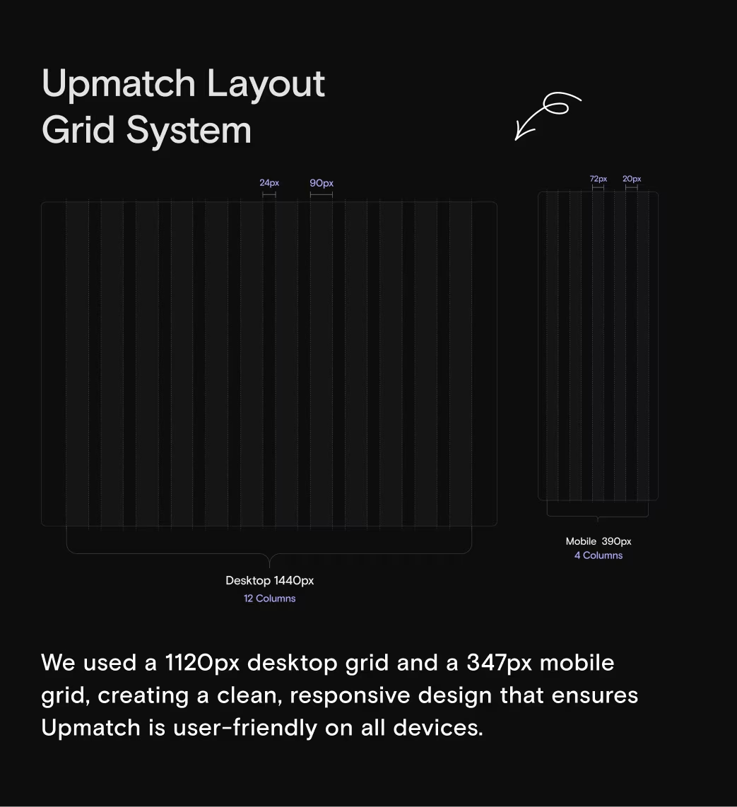
Grid: 12-column modular layout for flexibility and scalability.
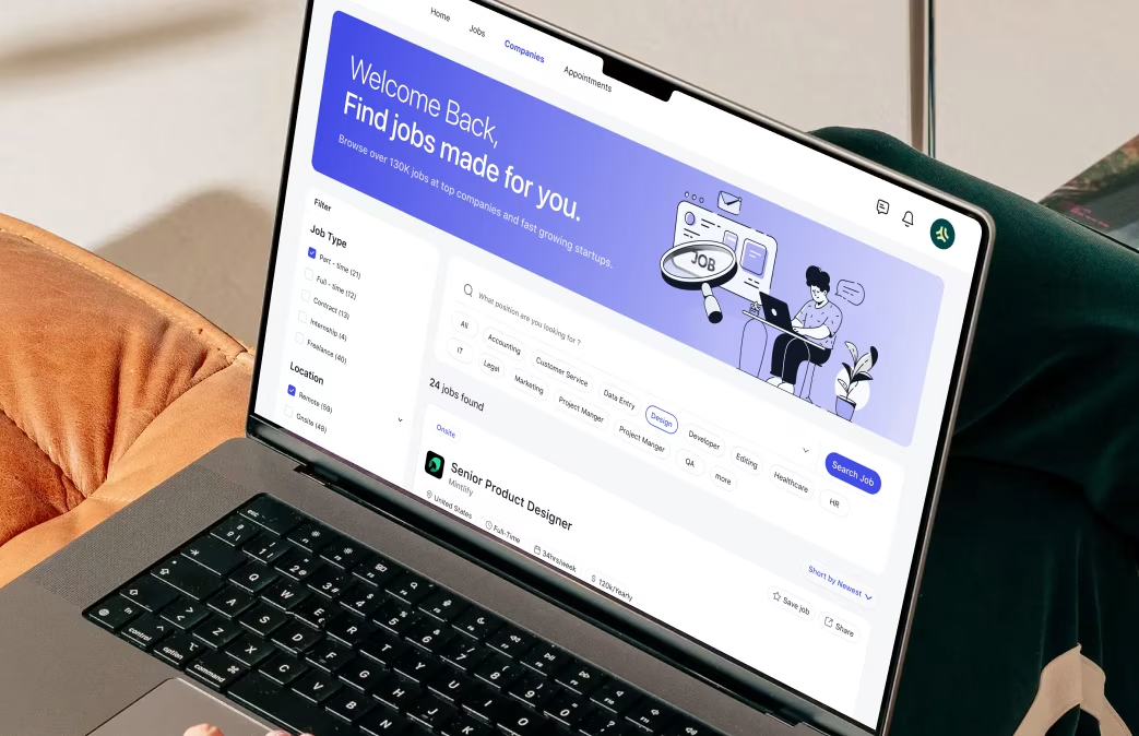
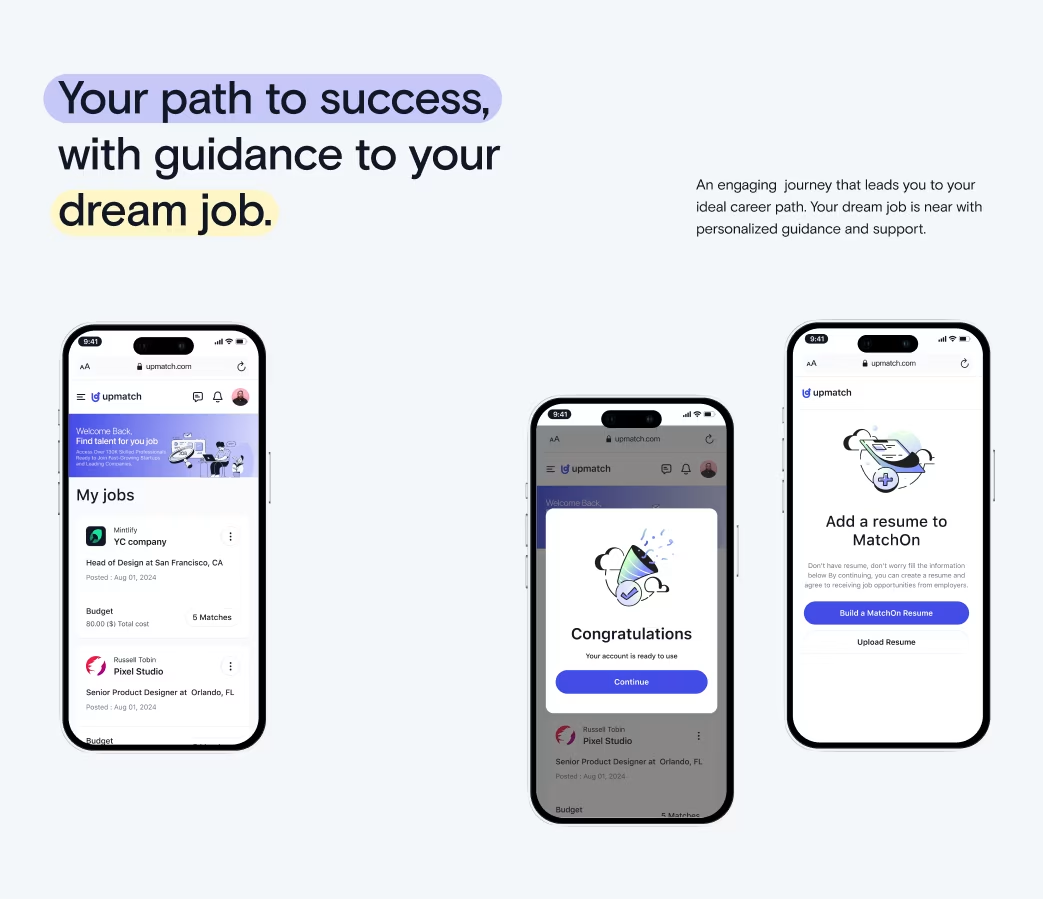
Homepage & Core UI
Focused on quick access to jobs, onboarding clarity, and credibility through testimonials and stats.
Interactions & Micro-motions
Subtle animations for hover, card expansion, and transitions improved engagement by +27% (based on post-launch tracking).

Responsive Design
Optimized across all screen sizes with adaptive card components and minimal load times.
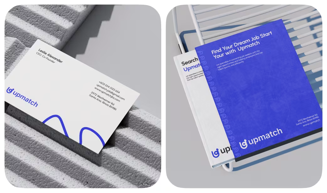
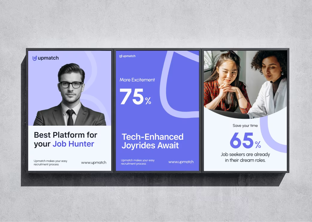
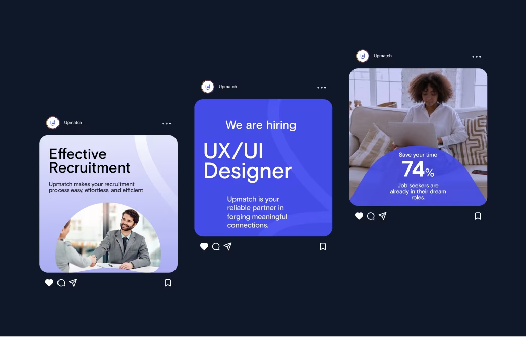
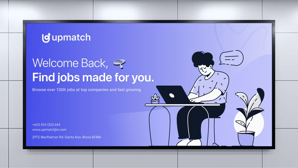
Visual Identity and Brand Story
The design embodies collaboration, learning, and community. Rounded edges, warm tones, and dynamic visuals evoke inclusivity and mentorship. The interface feels personal and inspiring — like a conversation with a friend.

Results & Outcomes
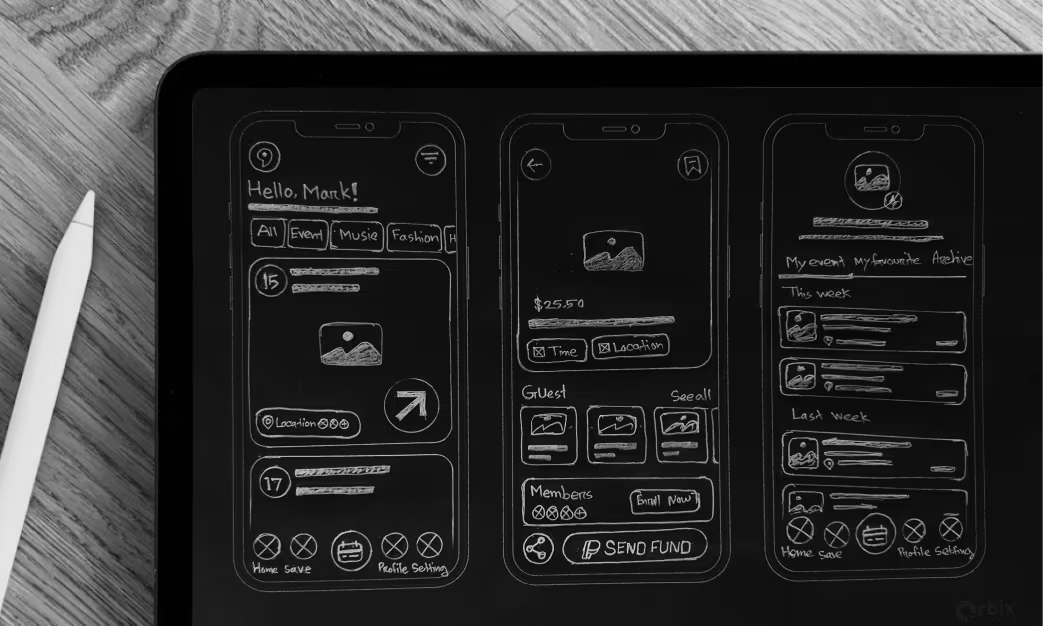
Our digital wireframes and final design iterations focused on clarity, performance, and intuitive navigation. We validated the experience with multiple usability tests to ensure that users could complete key actions — from discovery to conversion — with minimal friction. The outcome is a high-performing digital product that feels effortless, engaging, and reliable across all touchpoints.
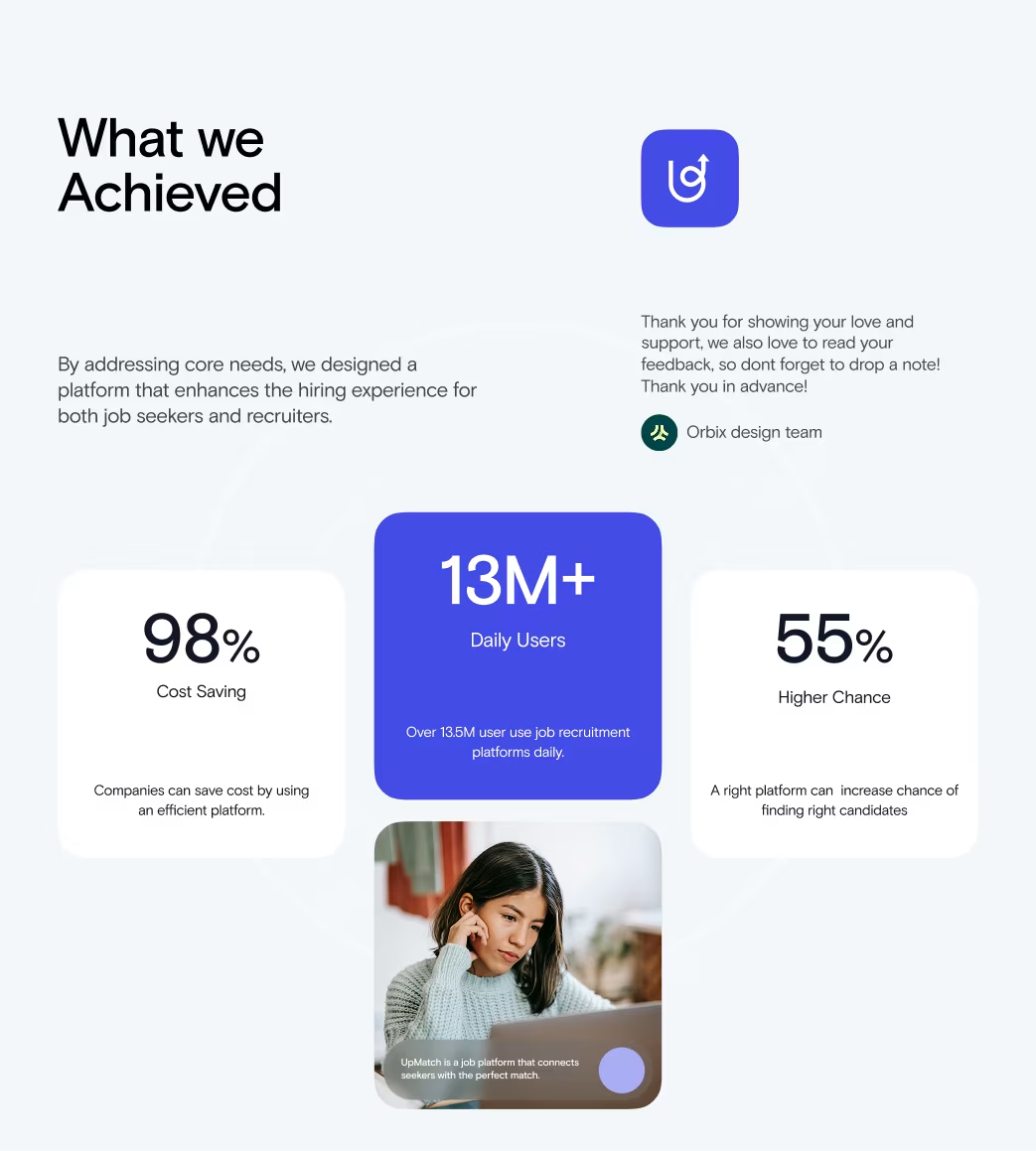
The Results
Our rebranding efforts delivered measurable success:

“Feedback gathered through surveys, interviews to measure impact and identify areas for improvement. Helps increase app's reputation and contributes to longterm success identify areas for improvement. ”