SwipeDrinks – Soft Drinks Mobile App UI/UX
Turning beverage sharing into a swipe-powered social experience with a dynamic mobile UI.
About the project
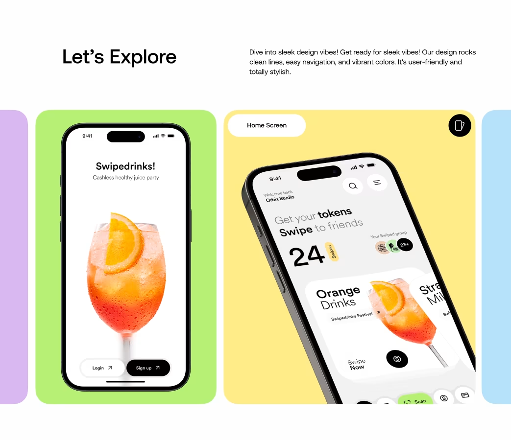
SwipeDrinks is a mobile app designed to make the act of discovering, sharing and enjoying soft drinks a fun and social experience. Orbix Studio partnered with the product team to design an interface that blends social interaction with beverage discovery, enabling users to swipe through drink options, share their favorites with friends, and explore fresh menu choices — all through an engaging, intuitive UI. Delivered as a full mobile experience, the project showcases Orbix Studio’s expertise in mobile app UI/UX for lifestyle & social platforms.
Problems
- Existing beverage‐sharing apps were static, lacked social connectivity and didn’t actively engage users.
- Users struggled with discovering new drinks and sharing their choices with friends in real time.
- The UI lacked playful interactions, leading to low retention and minimal user referrals.
The Challenge
Orbix Studio’s challenge was to create a mobile drinks app that elevates sharing from mere functionality to social experience. The aim: a UI that feels playful yet reliable, enables discovery of soft drinks for users and sharers, and uses swipe interactions to create a sense of exploration and spontaneity.
Our Approach
We started by mapping user journeys around drink discovery and sharing. Through research we identified that users value ease, novelty and social proof.
From there:
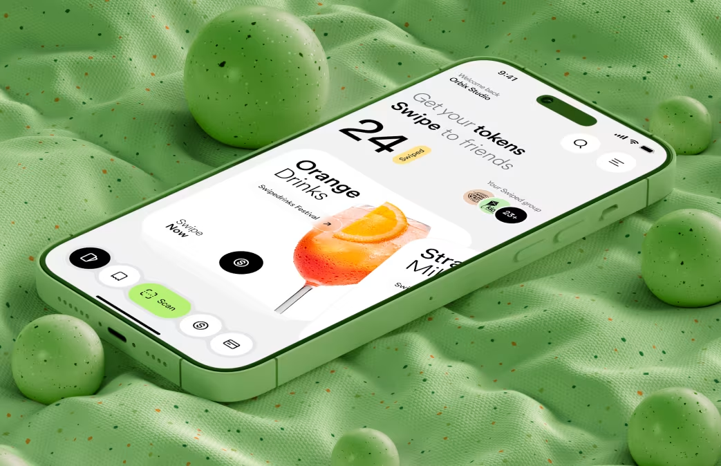
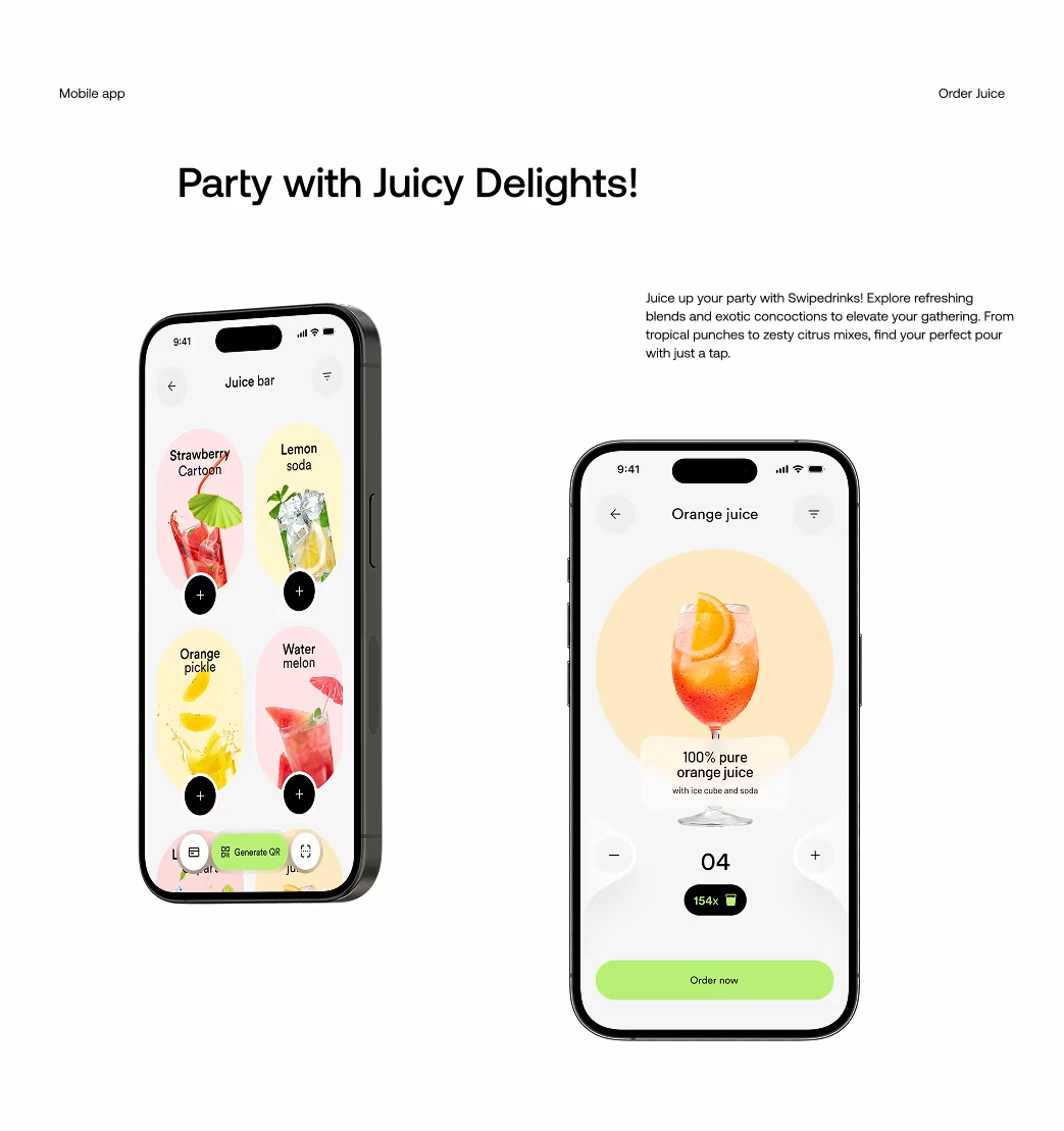
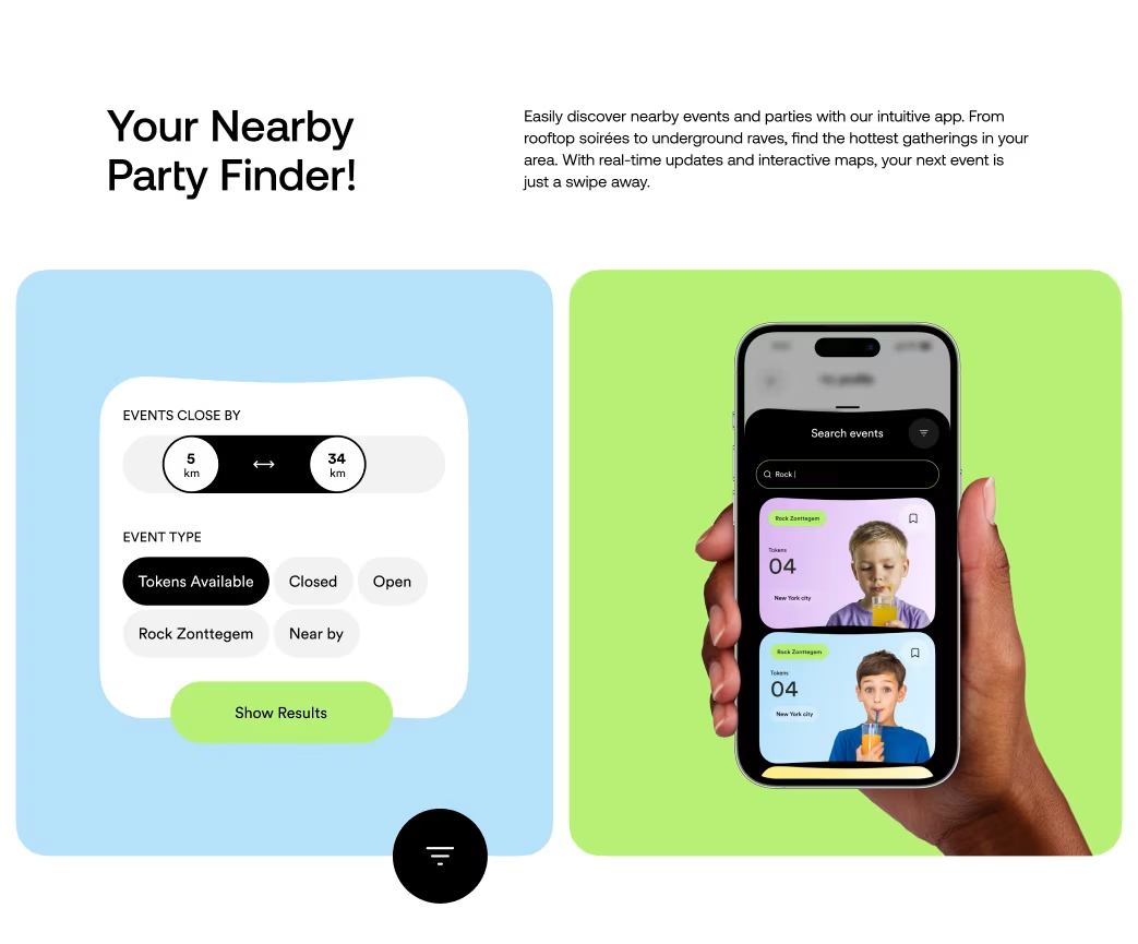
- Introduced a swipe-based navigation so users browse drink cards quickly and intuitively.
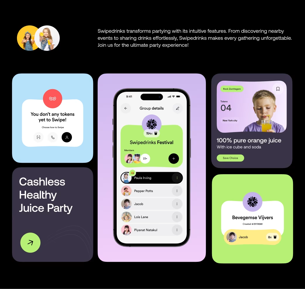
- Built a share-with-friends flow: select favourite drinks → tap “Share” → notify friend → enjoy together.
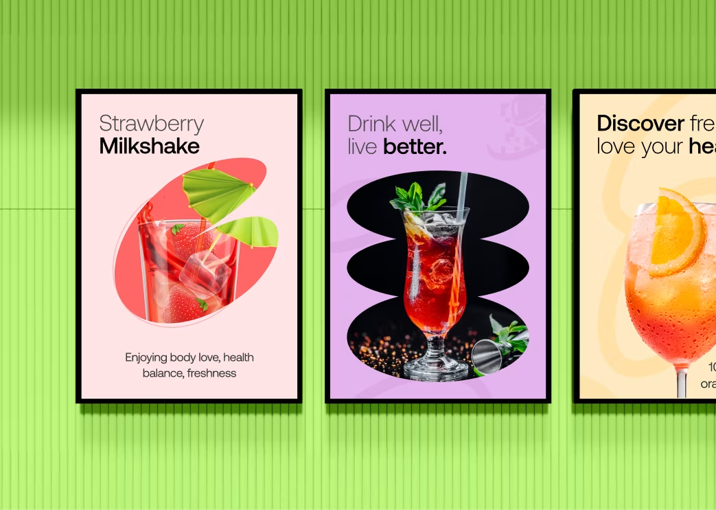
- Employed a vibrant, playful colour palette and animative micro-interactions to reflect the fun of beverage discovery.
- Focused on quick onboarding and frictionless sharing to maximize social engagement.
- Tools used: Figma for interface design, Protopie / After Effects for motion prototyping.
Our Approach


Project Timeline
Phase 1: Research & User Journey Mapping – 2 weeks
Phase 2: Wireframes & Interaction Flow – 1 week
Phase 3: UI Design & Motion Prototypes – 3 weeks
Phase 4: Final Handoff & Developer Collaboration – 1 week
Total Duration: ~7 weeks

Sketch
Initial sketch concepts explored drink-card swipes, share prompts, and feed views of “your drink invites”. The sketches focused on minimal layout, large imagery of drinks and intuitive gestures to make browsing feel effortless.
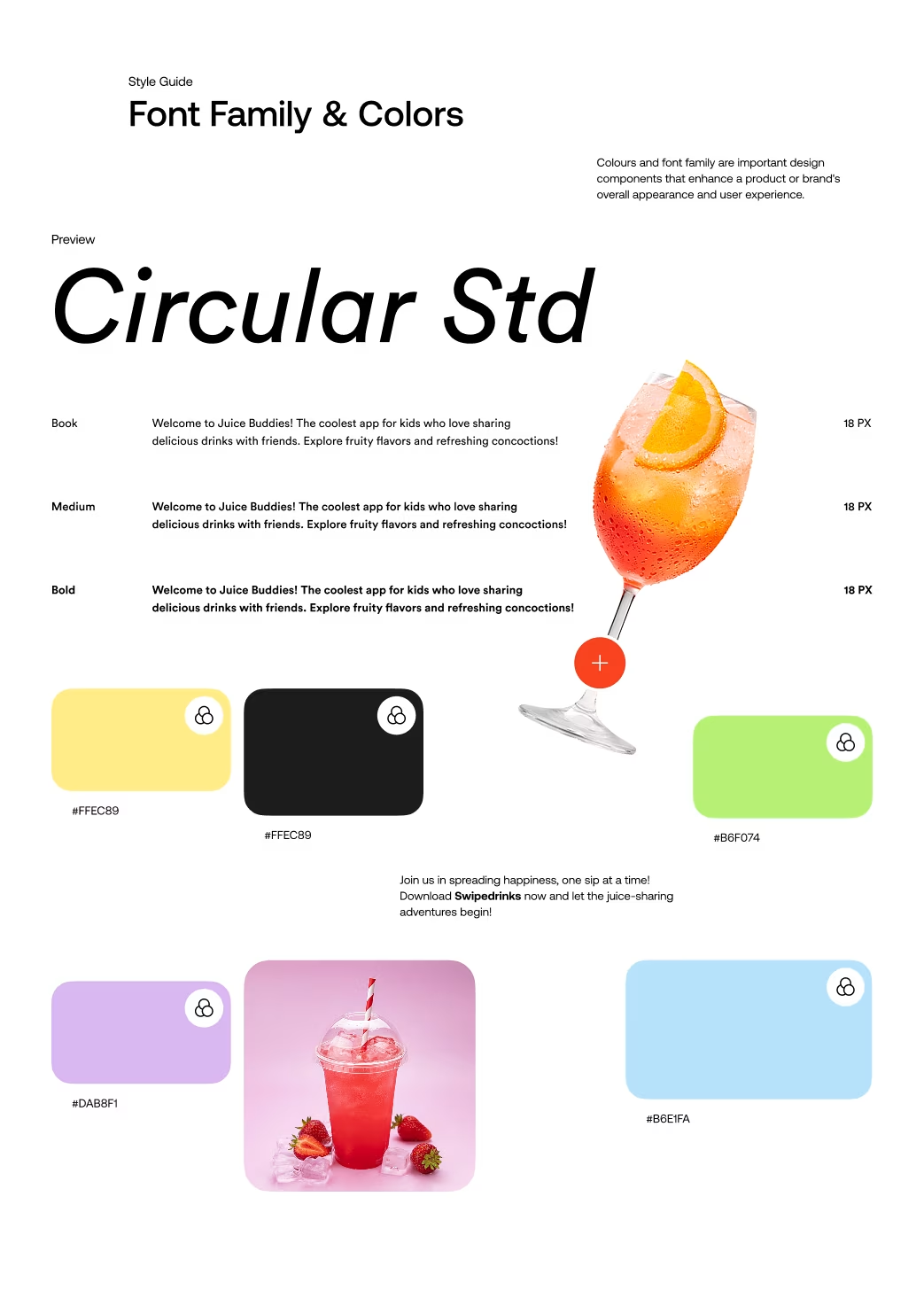
Style Guide
- Colors: Fresh greens, bright citrus accents, deep charcoal UI surfaces – evoking energy and refreshment
- Typography: Clean sans-serif fonts that balance fun and readability.
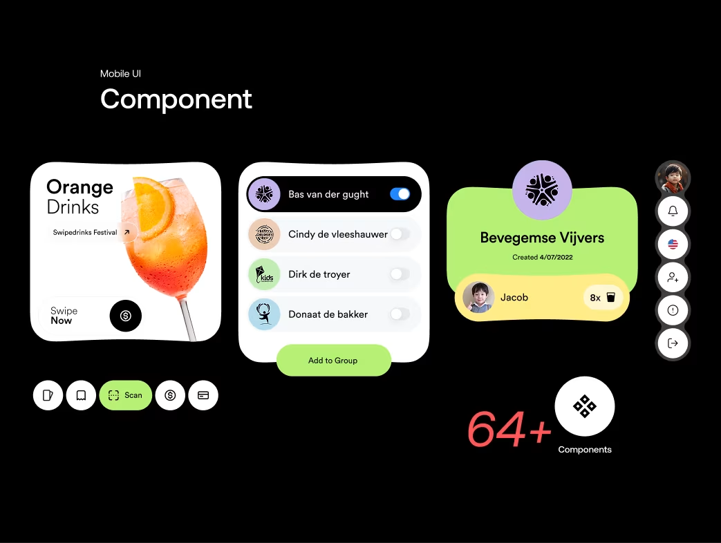
- Iconography & Motion: Bold icons with subtle bounce animations; swipe card transitions that add delight.
- UI System: Consistent spacing and modular cards ensure scalability across mobile screens.
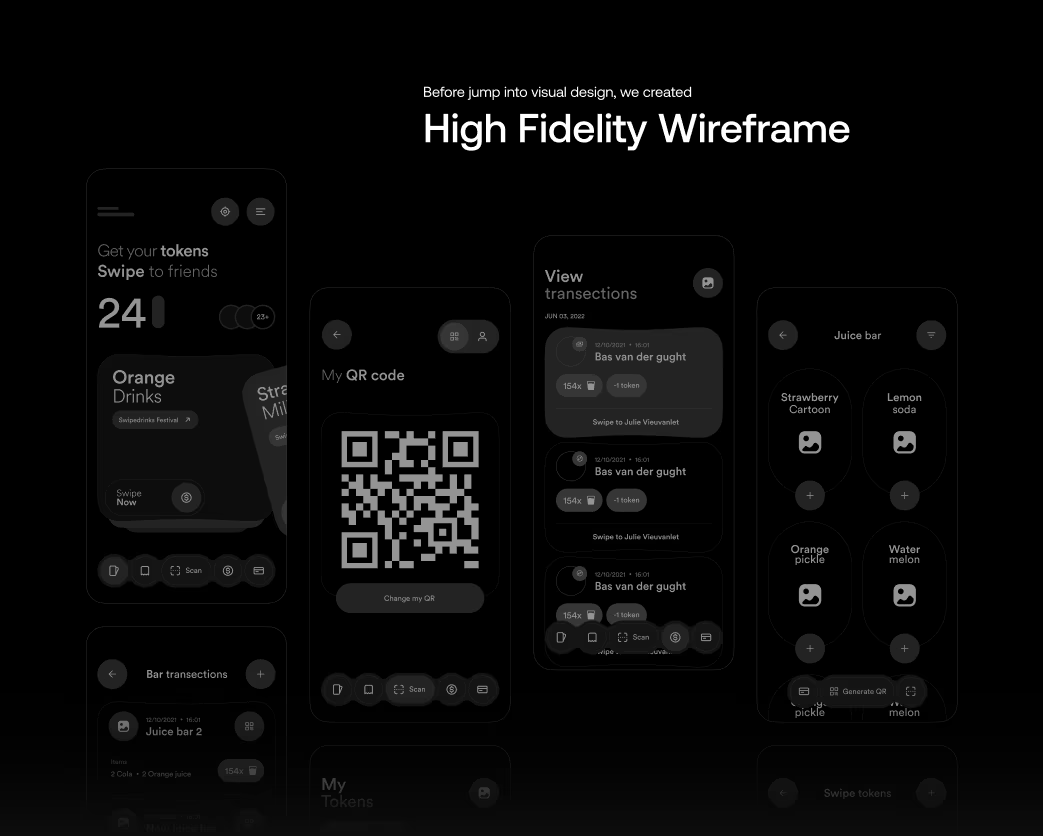
Wireframe
The wireframes prioritized clarity and speed: browse → swipe → share. The flow reduced steps and emphasized visual discovery. Early low-fidelity screens were validated with users for quick comprehension and ease of sharing.
Animations
Micro-interactions included:
- Card swipe animations that reveal drink details
- Animated share confirmations when sharing a drink with a friend
- Visual feedback for “new drink” notifications and trending flavours
- The animations enhance user delight and reinforce brand personality.
The animations enhance user delight and reinforce brand personality.
Multi screen
Designed for mobile first, the interface adapts for both iOS and Android devices with responsive layout adjustments. Consistent experience across screen sizes ensures fast browsing, easy sharing and uniform design language.
Visual Identity and Brand Story
SwipeDrinks’ brand identity reflects fun, connection and refreshment. The word “Swipe” conveys movement and exploration; “Drinks” anchors it in the beverage space. The visuals emphasise vibrant drink photography, playful UI overlays and a social sharing ethos. The brand story: “Discover. Share. Sip.” Every element reinforces the feeling of a casual gathering with friends — only digitally upgraded.
Results & Learnings
Although precise user-metrics are not published publicly, the project has been positioned by Orbix Studio as a flagship example of mobile app UI/UX for lifestyle and social behaviour.
Key learnings:
- Integrating social sharing into a core browsing flow boosts user retention.
- Swipe-based interactions, when well-designed, can transform functional apps into playful experiences.
- Motion and micro-interactions play a crucial role in elevating UI from utility to delight.
The Results
Our rebranding efforts delivered measurable success:

“Feedback gathered through surveys, interviews to measure impact and identify areas for improvement. Helps increase app's reputation and contributes to longterm success identify areas for improvement. ”