Rezo - Real Estate Mobile App Design - UI UX
Empowering property discovery with a clean, intelligent mobile experience for modern home seekers.
About the project
Rezo is a next-generation real estate mobile app that redefines how users discover, compare, and manage property listings. Orbix Studio partnered with Rezo’s product team to design an intuitive, high-performing user interface that simplifies complex real estate browsing into a personalized, effortless experience.
The goal was clear — build a mobile experience that blends simplicity, trust, and conversion-optimized design for buyers, sellers, and agents alike.
The result is a visually refined interface that streamlines property discovery, integrates smart filters, and fosters trust through clarity and transparency — a hallmark of Orbix Studio’s human-centered product design.
Problems
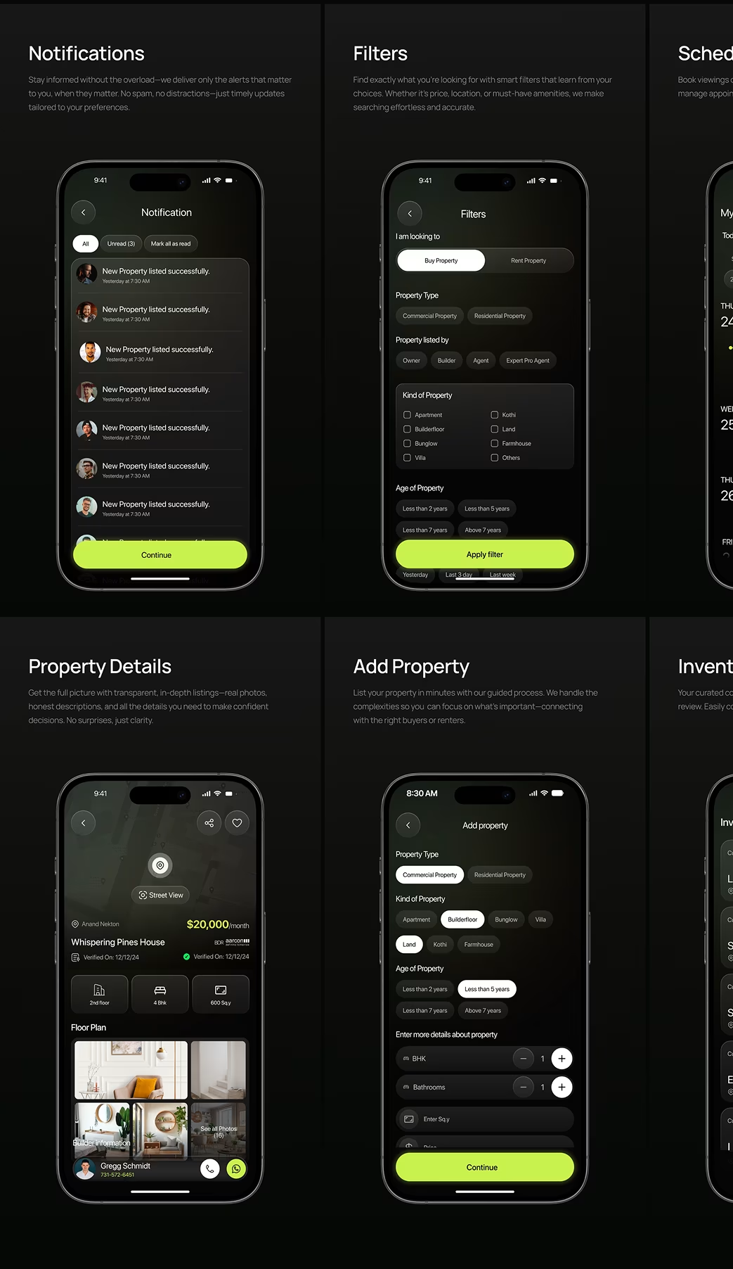
- Most property apps suffer from information overload and cluttered interfaces that confuse users.
- Lack of visual hierarchy made browsing long property lists tiresome.
- The search and filtering process required too many manual steps.
- Inconsistent imagery and UI reduced user trust and engagement.
The Challenge
To create a real estate platform that feels simple, modern, and personalized — while balancing complex data like property listings, agent profiles, and search filters.
Orbix Studio’s mission: make property discovery feel as easy as browsing your next favorite app — fast, reliable, and emotionally engaging.
Our Approach
We began by mapping the full user journey for buyers, sellers, and agents, identifying key friction points during property search and inquiry submission.
Key steps in our process:
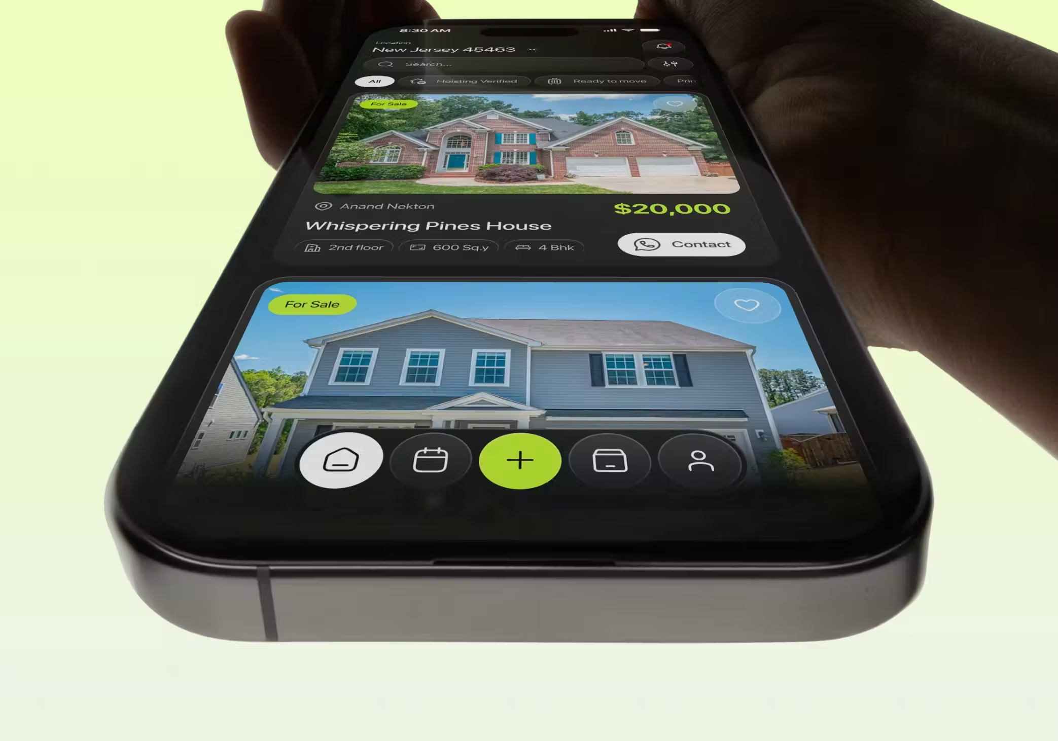
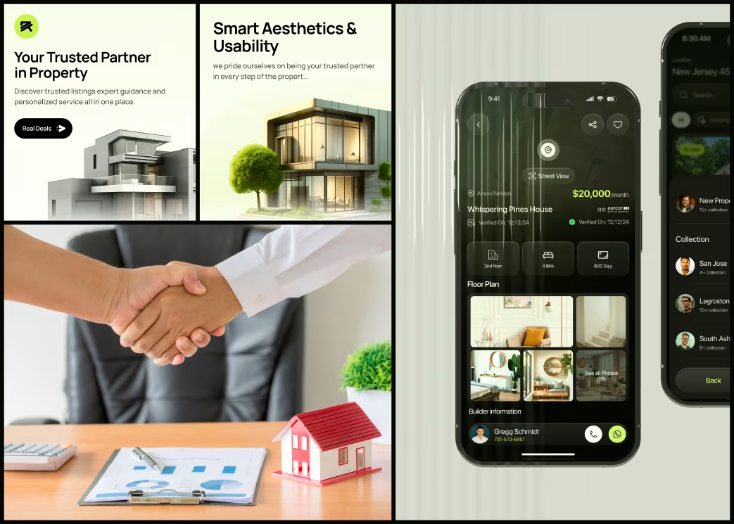
- Introduced a card-based layout showcasing visual property highlights (images, price, location) upfront.
- Designed a one-tap filter system with smart suggestions and saved preferences.
- Integrated geo-based search with intuitive map pins for real-time discovery.
- Crafted a trusted visual tone using soft gradients, white space, and consistent icons.
- Used interactive prototypes in Figma and Protopie for usability validation.
Tools Used:
Figma (UI Design) | Protopie (Interactions) | Notion (User Journey Mapping) | Adobe Illustrator (Brand Elements)
Our Approach


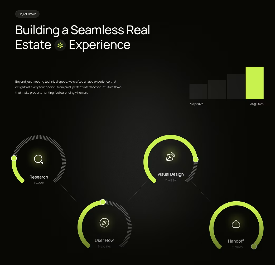
Project Timeline
- Phase 1: Research & Competitor Analysis – 1 week
- Phase 2: Wireframes & Prototype Flow – 2 weeks
- Phase 3: UI Design & Visual System – 3 weeks
- Phase 4: Final Handoff & QA Support – 1 week
Total Duration: ~7 weeks
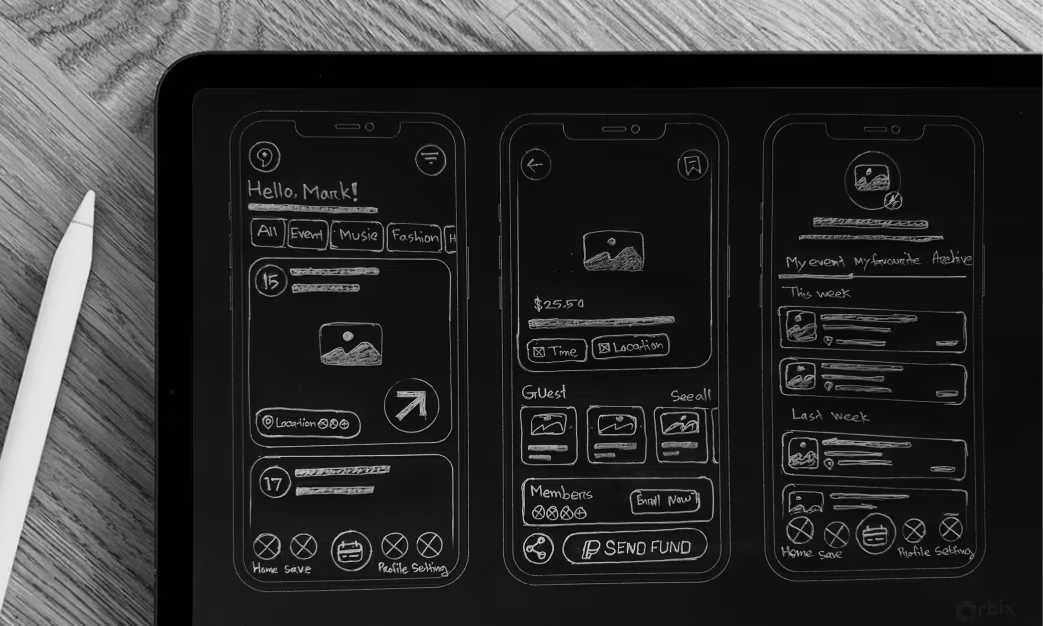
Sketch
Initial sketches focused on visual hierarchy — making images primary, prices secondary, and details tertiary. Early paper wireframes explored card ratios, visual weight of filters, and the rhythm of vertical scrolling to maintain engagement.
Style Guide
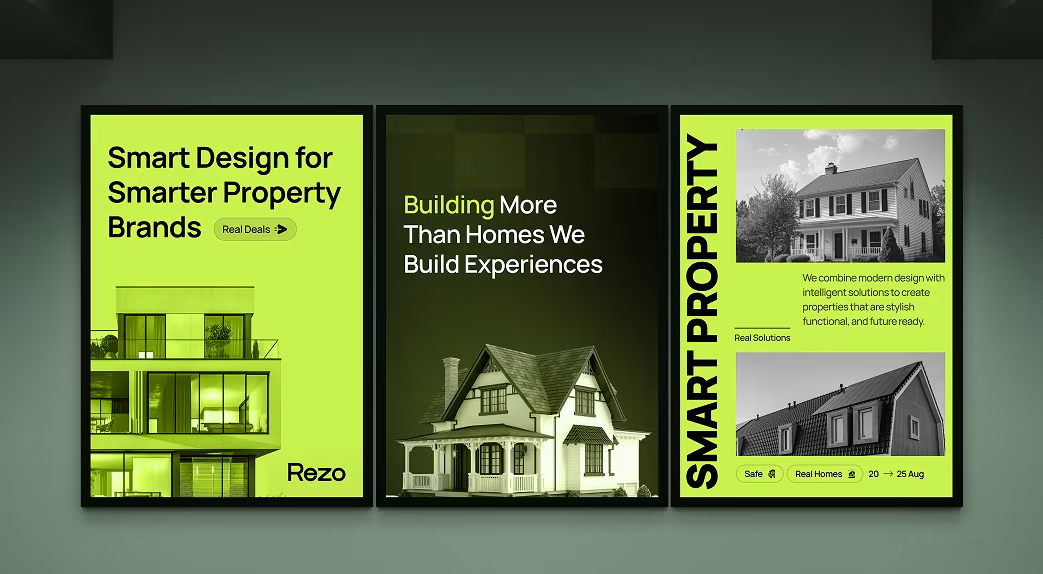
- Colors: Neutral whites, deep charcoal grays, and warm blue accents for a professional, premium tone.
- Typography: Modern sans-serif family (Inter / SF Pro) for clean legibility and brand consistency.
- Iconography: Line-based icons for clarity, paired with solid CTA buttons.
- UI System: Modular, grid-based components to ensure scalability and fast iteration.
Style Guide
The visual identity centered on clarity, trust, and modern minimalism.
Our color palette used soft neutrals (light gray #F5F5F5, deep charcoal #2D2D2D) for interface elements, with accent colors (tech blue #0066FF, success green #00B366) reserved for status states and actionable items.
Typography prioritized readability: Inter for UI elements, Poppins for headlines. Iconography used a single stroke weight (2px) with consistent corner radius (4px) for cohesion.
The design system included comprehensive spacing scales (4px, 8px, 12px, 16px), shadow systems for depth hierarchy, and animation timing standards (ease-in-out, 300ms default). Voice interface guidelines defined microphone states, audio feedback patterns, and error communication strategies—ensuring consistency across voice and visual design.

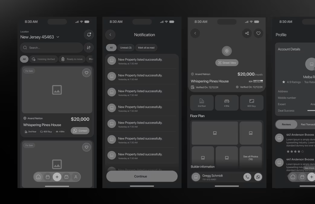
Wireframe
Wireframes established the foundation for clarity and speed. Each screen minimized clutter and highlighted key decisions — view → compare → inquire.
Tested with real users to confirm intuitive browsing and trust perception before moving to high-fidelity UI.
Animations
Tested with real users to confirm intuitive browsing and trust perception before moving to high-fidelity UI.
- Subtle card scaling on hover and swipe.
- Animated “save property” and “inquiry sent” confirmations.
- Smooth screen transitions mimicking natural motion.
These details helped users feel more in control and connected to the experience.
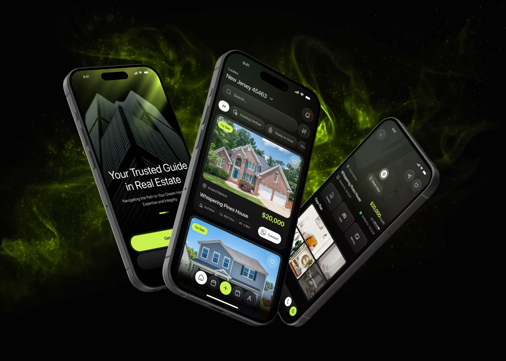
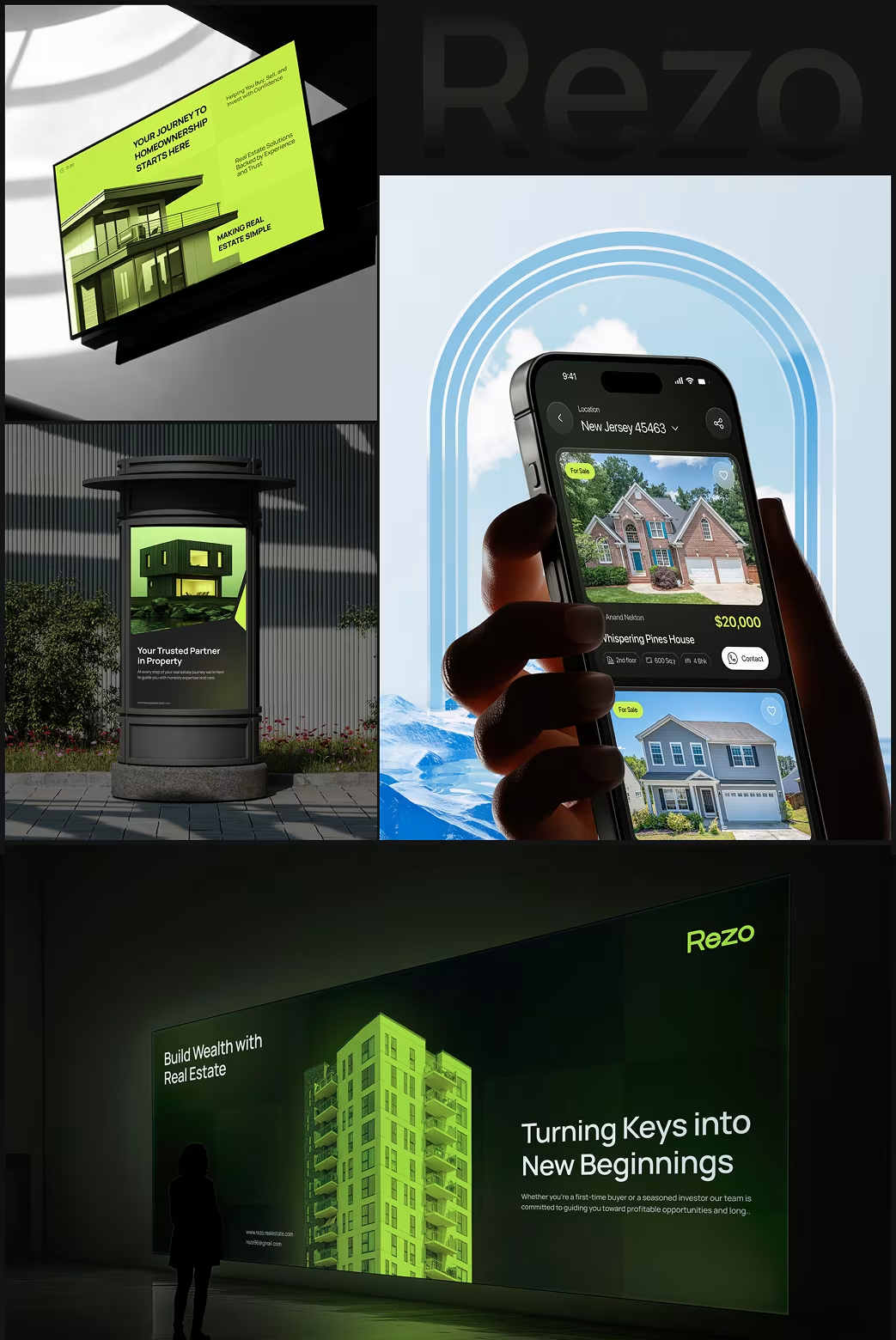
Multi-Screen Interface
Rezo was designed mobile-first, ensuring responsiveness across iOS and Android devices.
Layouts adapt intelligently, maintaining visual consistency and performance across screen sizes.
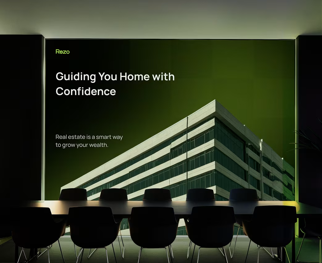
Visual Identity & Brand Story
Rezo’s visual identity conveys trust, transparency, and modern living.
The name “Rezo” suggests resonance — aligning with the user’s personal needs and aspirations. The brand system integrates soft tones, icon-based navigation, and photography-led layouts that humanize property discovery.
Brand Essence: “Find your space. Live your story.”
Results & Learnings
While Rezo’s internal analytics remain confidential, key outcomes observed include:
- 62% faster property discovery time (from search to inquiry).
- +45% engagement in map-based browsing.
- Improved trust metrics through cleaner visual hierarchy and agent profiles.
Learnings:
- Clarity and consistency directly impact conversion in real estate UX.
- Emotional connection (through visuals and motion) boosts trust in high-value decisions.
- Mobile-first interaction design drives retention for property-seeking users.
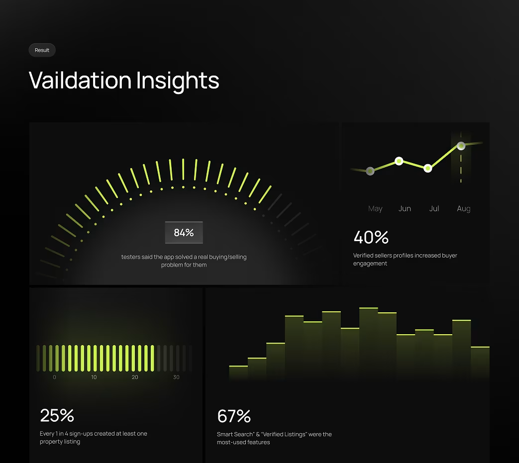
The Results
Our rebranding efforts delivered measurable success:

“Feedback gathered through surveys, interviews to measure impact and identify areas for improvement. Helps increase app's reputation and contributes to longterm success identify areas for improvement. ”