Orelax – Real Estate App UI/UX Design for Modern Property Discovery
Transforming the digital real estate experience through intuitive navigation, trust-driven design, and premium aesthetics.
About the project
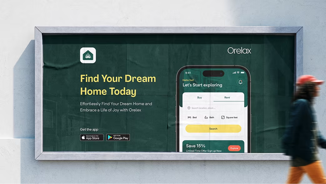
Orelax is a next-generation real estate platform built to simplify how people buy, rent, and sell properties online.
Orbix Studio partnered with Orelax to craft a seamless mobile and web experience that blends luxury brand appeal with high usability — empowering users to explore, compare, and connect with properties effortlessly.
The result: a modern PropTech solution that feels both credible and aspirational, setting a new design benchmark for digital real estate platforms.
Problems
Before the redesign, Orelax faced major challenges:
- A cluttered interface made browsing and filtering properties difficult.
- Lack of visual hierarchy and brand consistency reduced trust among users.
- Mobile users experienced high bounce rates due to poor responsiveness and confusing navigation.
The Challenge
Orbix Studio’s mission was to rebuild the Orelax experience from the ground up — creating a design system that felt premium yet practical.
Our challenge: make real estate browsing emotional and data-driven at the same time.
We aimed to deliver a product that users could trust — visually, functionally, and experientially.
Our Approach
We started by conducting user journey research, studying how people explore and decide on property listings. Through stakeholder workshops and UX audits, we uncovered key design priorities: clarity, confidence, and continuity.
Our design process included:
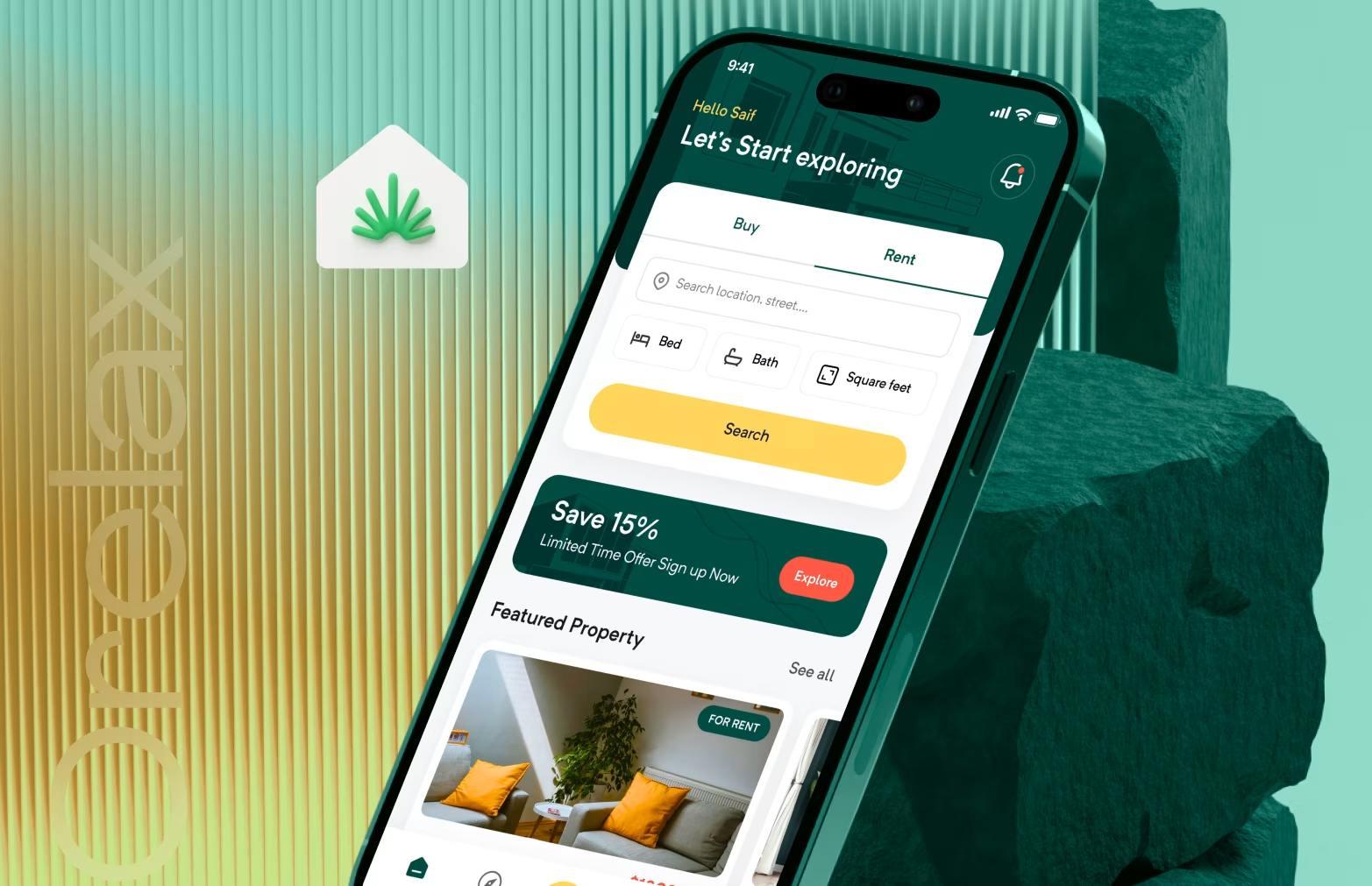
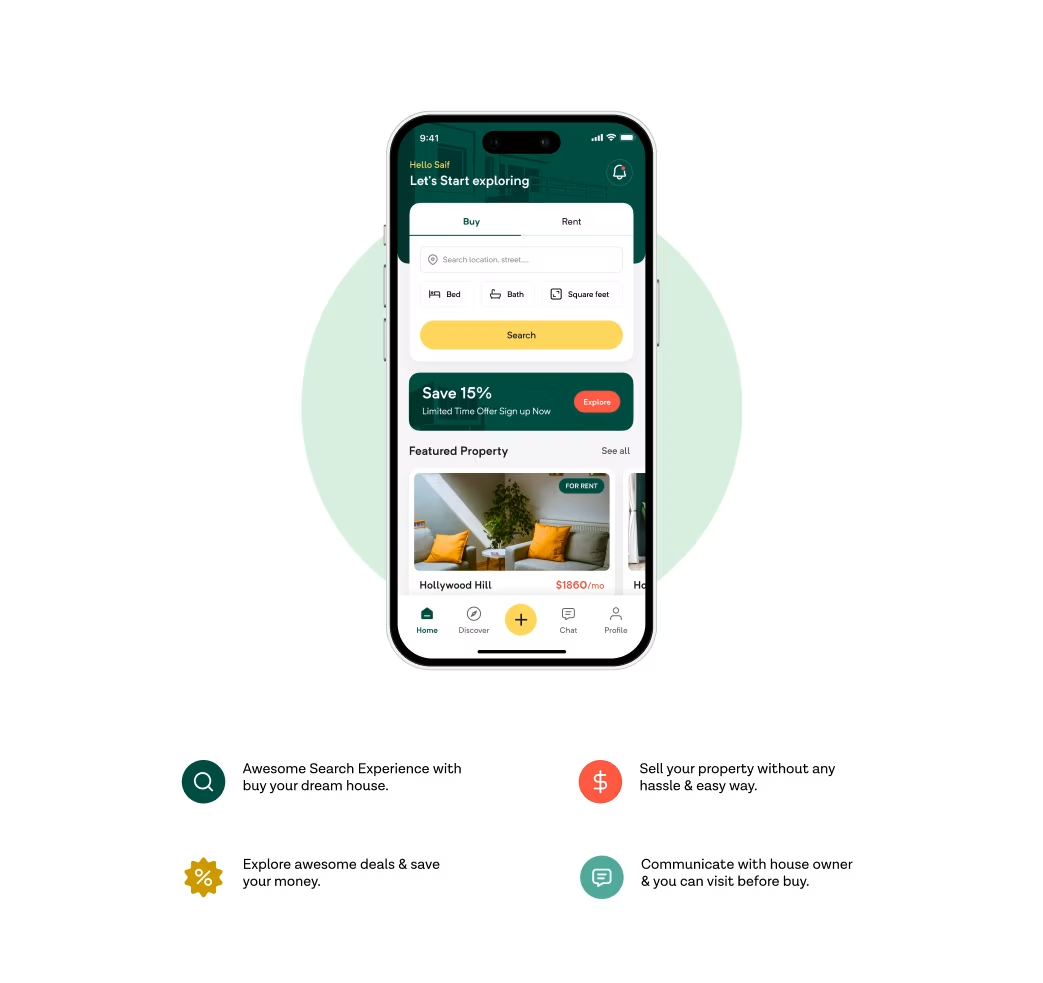
- Simplified navigation with clear category segmentation (Buy, Rent, Invest)
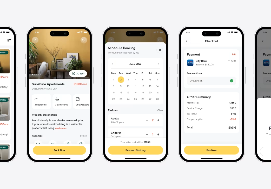
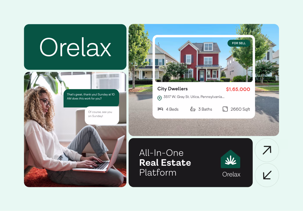
- High-impact visuals showcasing properties through large photography and immersive image carousels
- Trust-driven UI with verified badges, map integrations, and transparent pricing indicators
- Dynamic color palette inspired by sophistication and calm — combining deep neutrals with warm accents
- Modular grid system to ensure scalability across mobile and desktop
Tools Used: Figma, Miro, Framer, and After Effects
Our Approach


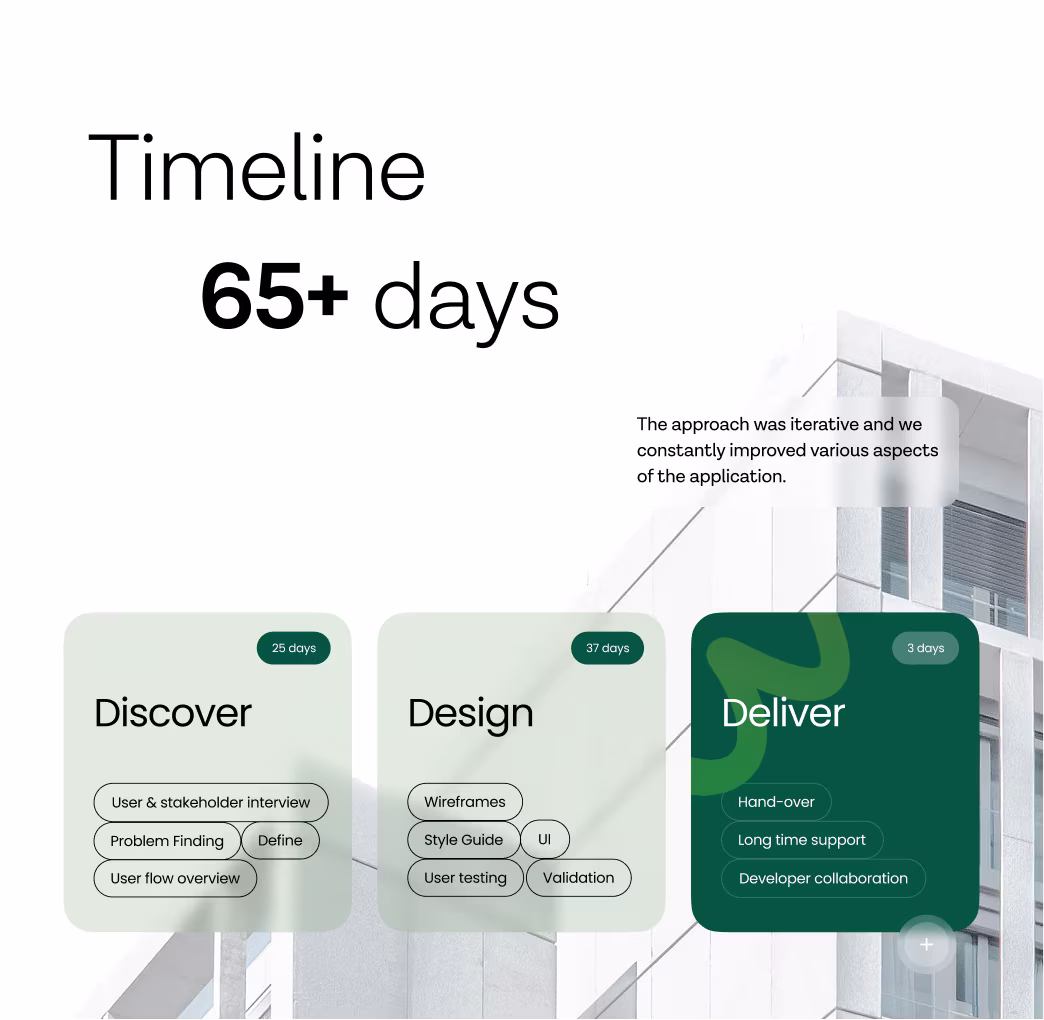
Project Timeline
Phase 1: UX Research & Journey Mapping – 2 Weeks
Phase 2: Wireframes & Flow Prototyping – 1 Week
Phase 3: UI Design & Branding System – 3 Weeks
Phase 4: Interactive Prototyping & Motion Design – 1 Week
Total Duration: 7 Weeks
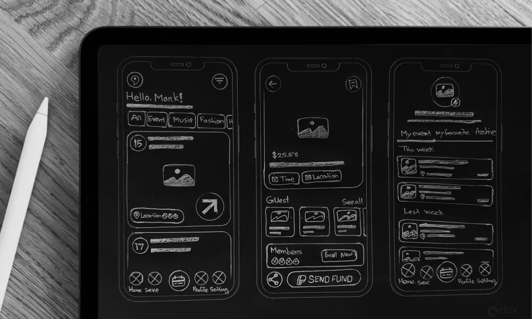
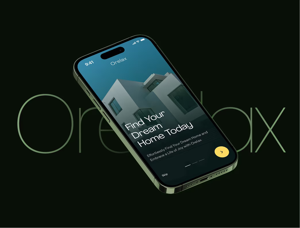
Sketch
Early sketches focused on visual hierarchy — balancing large visuals with concise information.
We explored multiple approaches for map-based browsing, minimal property cards, and trust badges that communicate safety and authenticity.
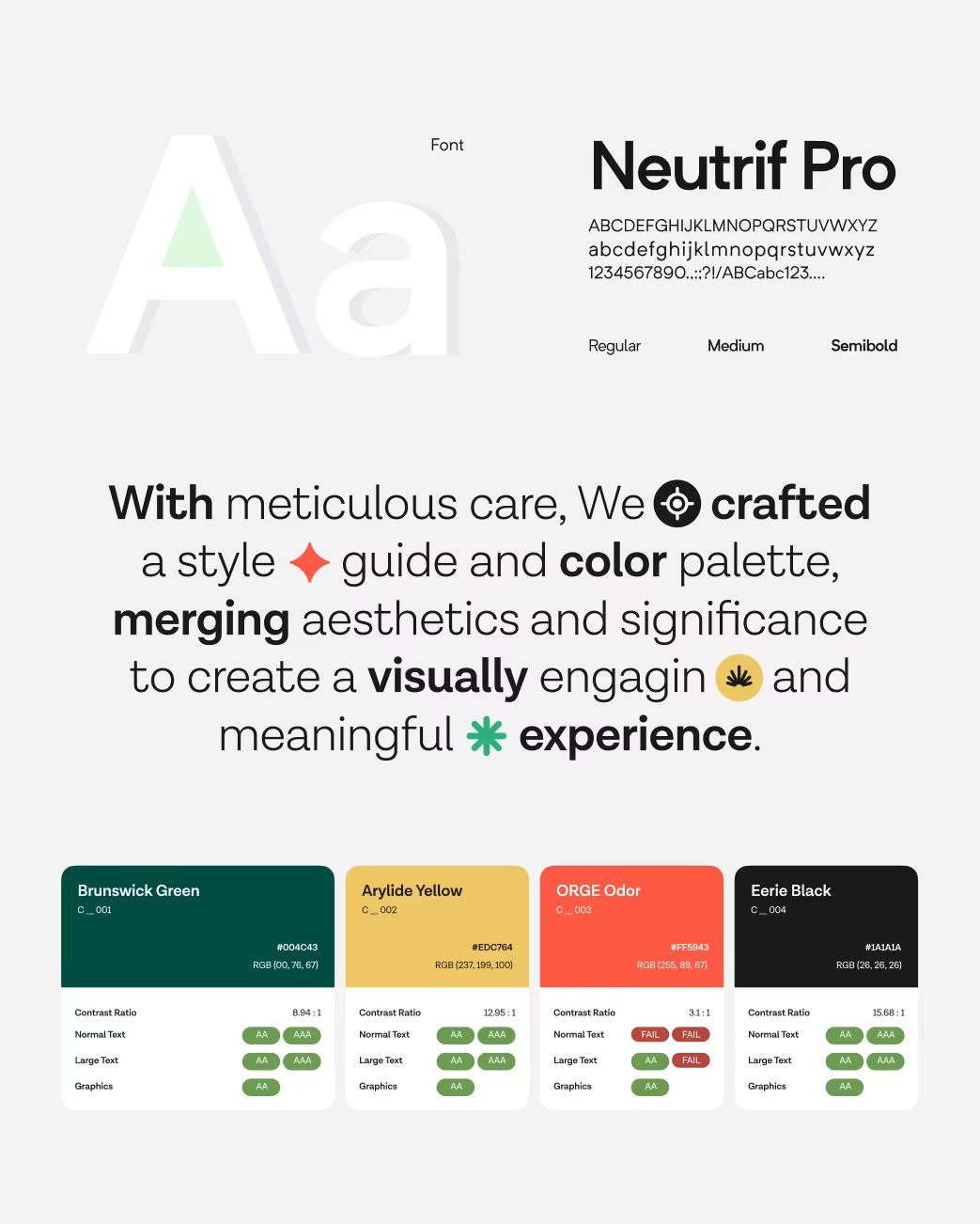
Style Guide
- Color Palette: Deep blue, off-white, and gold — representing trust, clarity, and luxury.
- Typography: Sans-serif geometric type for modernity and legibility.
- Iconography: Minimal and consistent, aligning with premium aesthetics.
- UI System: Scalable grid, consistent paddings, and soft shadows for visual depth.
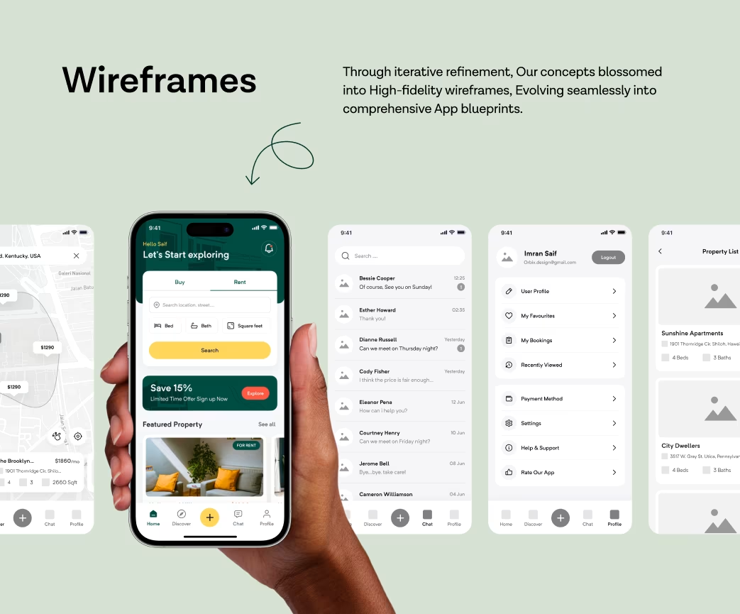
Wireframe
The wireframes established a clear, user-first flow:
- Discover properties by category
- View listing details with full-screen visuals
- Compare and shortlist easily
Book or contact agents directly Every interaction was designed to minimize cognitive load and enhance decision-making speed.
Animations & Interactions
Micro-interactions bring personality to every action:
- Smooth transitions between listing and detail pages
- Animated map pins for live property availability
- Subtle hover and tap feedback to guide user flow
These motion cues make the product feel more responsive, human, and premium.
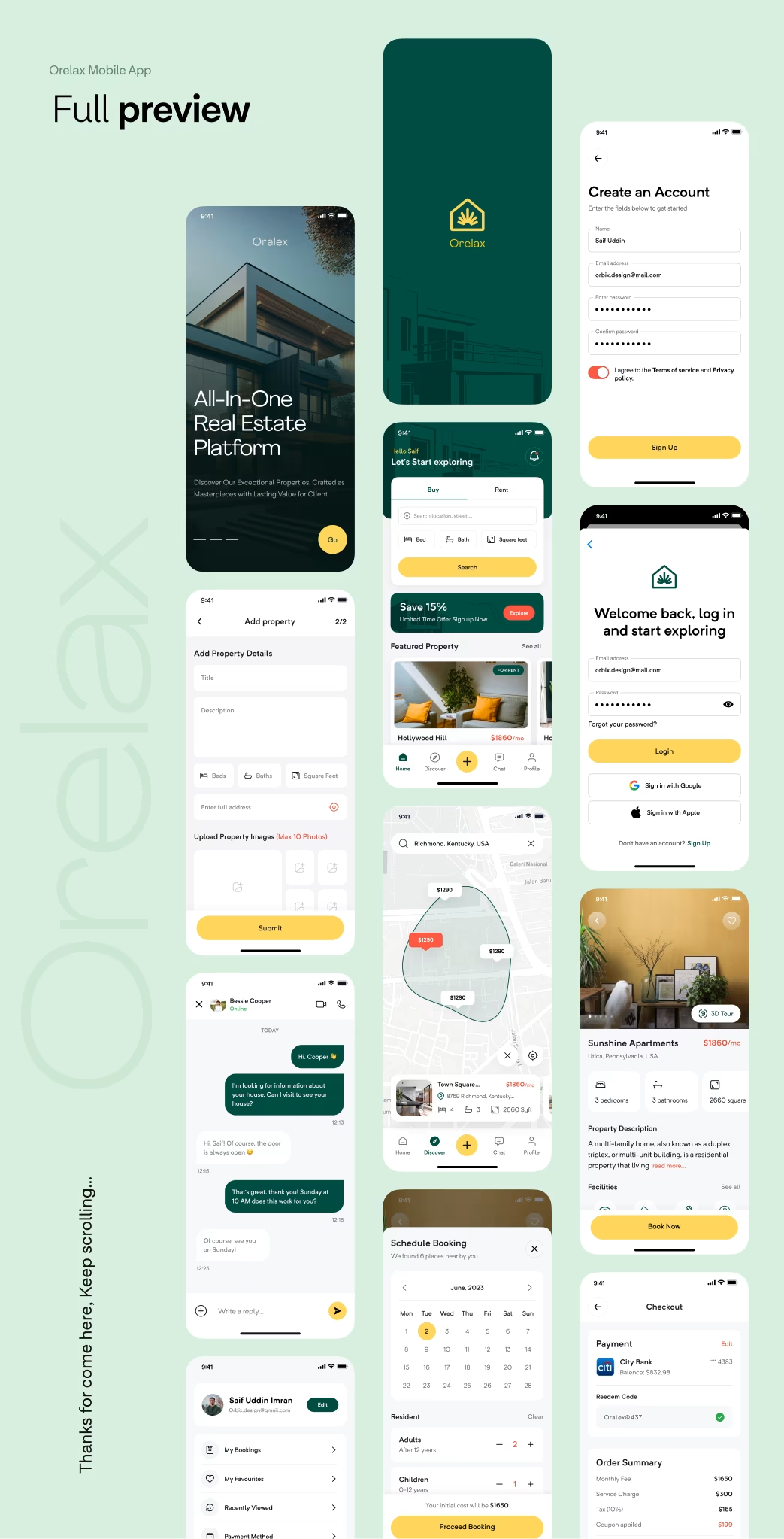
Multi screen
The Orelax interface was built to perform seamlessly across platforms — iOS, Android, and desktop. Each layout automatically adapts to screen ratios, ensuring a consistent browsing and booking experience anywhere.
Visual Identity and Brand Story
Orelax’s brand evolution reflects trust, comfort, and sophistication.
The design celebrates calm navigation — a feeling that every user seeks when exploring big life decisions like buying a home. Every element — from color to motion — communicates reliability, modernity, and care.
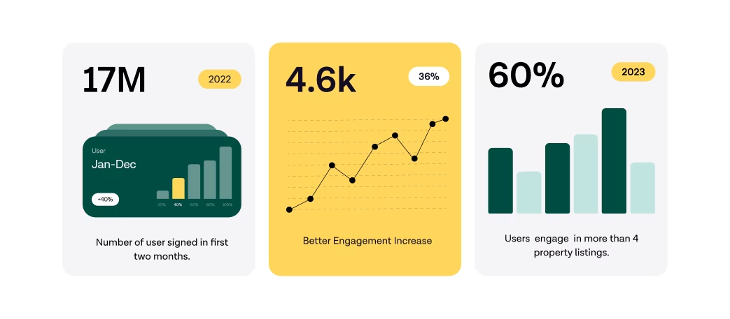
Results & Outcomes
Post-redesign, Orelax saw:
- +47% increase in session time
- +33% boost in property inquiry conversions
- Reduced drop-off rate on mobile by 41%
The project highlights how human-centered UI/UX design can redefine brand trust and digital engagement in the real estate sector.
Orelax now stands as a PropTech success story — demonstrating how Orbix Studio turns complex platforms into effortless, emotional experiences.
The Results
Our rebranding efforts delivered measurable success:

“Feedback gathered through surveys, interviews to measure impact and identify areas for improvement. Helps increase app's reputation and contributes to longterm success identify areas for improvement. ”