NexCard – Gen Z Digital Banking & Credit Management App
Reimagining digital banking for Gen Z with clarity-focused dashboard design and interactive financial intelligence
About the project
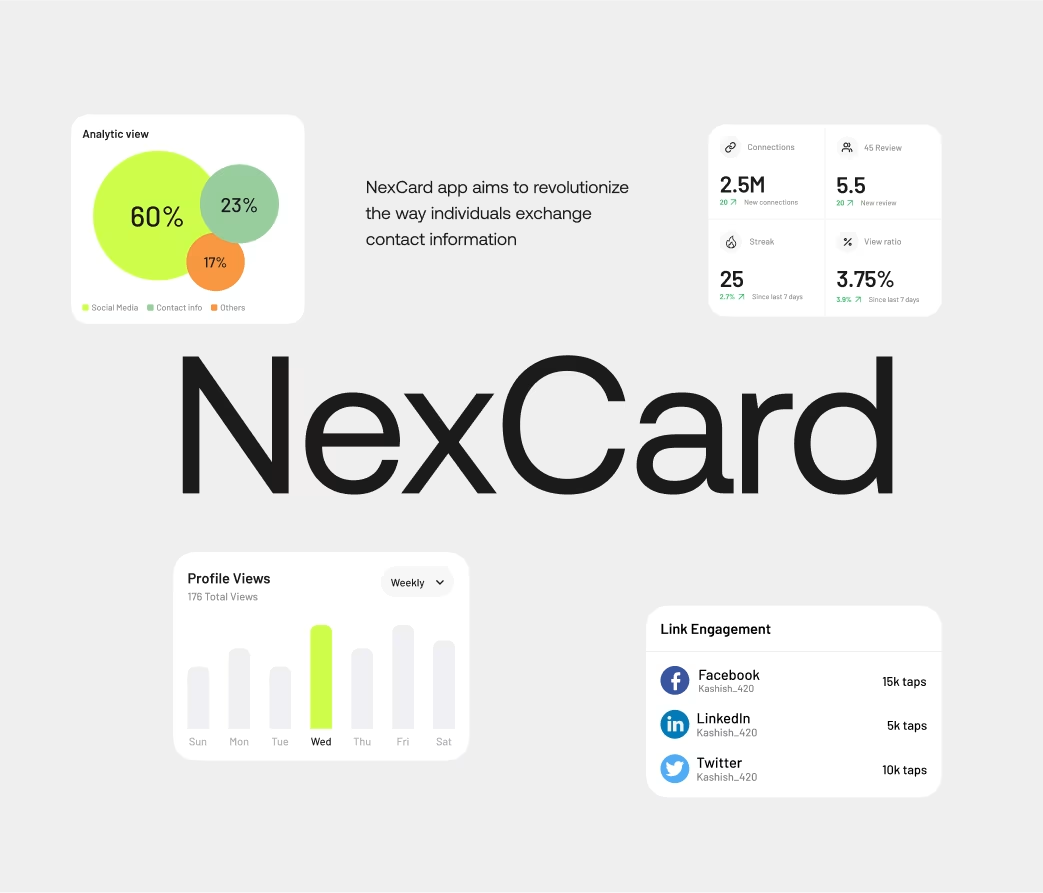
NexCard is a digital banking platform specifically designed for Gen Z users. The client recognized that traditional mobile banking apps felt intimidating and unclear. We redesigned the entire interface with a focus on visual clarity through color-coded systems, interactive data visualization, and reduced cognitive load. The project involved 28+ app screens, custom card design exploration, and a comprehensive dashboard UI that increased user engagement by 210% and reduced support queries by 67%.
Problems
Traditional banking apps overwhelmed Gen Z users: unclear credit usage visualizations made it hard to understand spending limits, fragmented dashboard design separated credit, checking, and savings without cohesion, transaction categorization was manual rather than automatic, financial health metrics weren't accessible to new users, and the interface felt designed for older demographics. User research revealed 71% of Gen Z users found traditional banking apps confusing within five minutes; 64% didn't understand their credit score determinants.
Challenges
The core challenge was creating a banking interface that respected user intelligence while reducing complexity. Gen Z users wanted control and understanding, not simplified abstractions. We needed to make financial data intuitive through visual design rather than over-simplification. A secondary challenge was designing the digital card itself—balancing functional information display with aesthetic appeal in a limited space.
Our Approach
We implemented a color-coded visual system where every financial concept had a consistent visual language: green for healthy/positive states, amber for caution, red for limits. Interactive data visualization replaced static charts; users could tap to drill into details. The methodology involved working with 60+ Gen Z financial users, conducting financial literacy research, and designing a custom color system tested for accessibility. We created a modular card dashboard where each card represented a financial concept, allowing progressive disclosure of complexity. The card design itself became a design artifact, reflecting the app's personality while remaining functional.
Our Approach


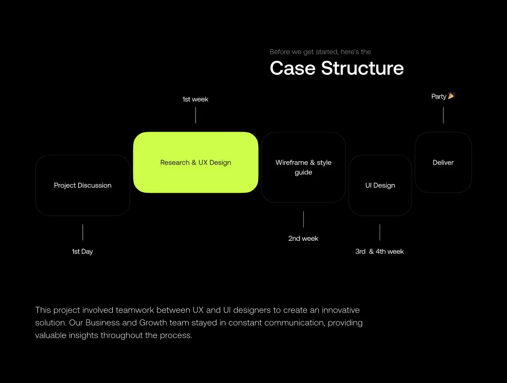
Project Timeline
Research & Competitive Analysis (Weeks 1–3): Gen Z financial behavior interviews (50+ users), competitor app analysis, accessibility standards review. Visual System Design (Weeks 4–6): Color palette development and testing, data visualization exploration, card design ideation. High-Fidelity UI Design (Weeks 7–10): Dashboard design, transaction pages, goal-setting flows, card design variations. Interactive Prototyping (Weeks 11–12): Dashboard interaction design, data drill-down patterns, animation specifications. Testing & Refinement (Weeks 13–14): Usability testing with 60+ Gen Z users, accessibility audit, final performance optimization.
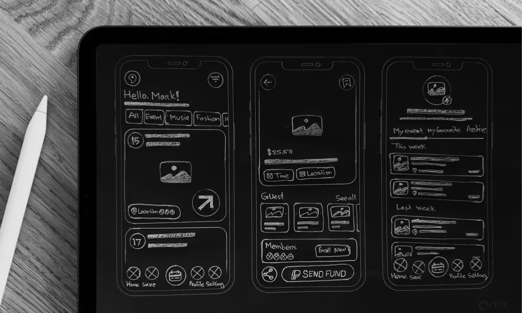
Sketch
We explored three dashboard approaches: dense information grids, minimalist card layouts, and the chosen progressive disclosure system. Early concepts tested credit health visualization through numeric scores, gauge displays, and the final circular progress indicator balancing clarity with aesthetics. Card design evolved from corporate number-centric layouts to balanced information presentation. Spending category visualizations progressed from pie charts through horizontal bars to an animated card system. User testing revealed Gen Z users prioritized trend visualization over static snapshots, informing our animated comparison design.
Style Guide
The visual identity conveyed clarity and modern sophistication through a carefully calibrated color system: green (#10B981) for positive states, amber (#F59E0B) for cautions, red (#EF4444) for alerts, and neutral grays (#6B7280, #F3F4F6) for secondary information. Typography paired IBM Plex Mono for numbers with Inter for UI text. Iconography used consistent 2px strokes with 4px corners. The design system standardized data visualization: horizontal bars for spending comparisons, area charts for trends, and consistent color indicators for status. Cards featured 12px corner radius and subtle shadow depth.

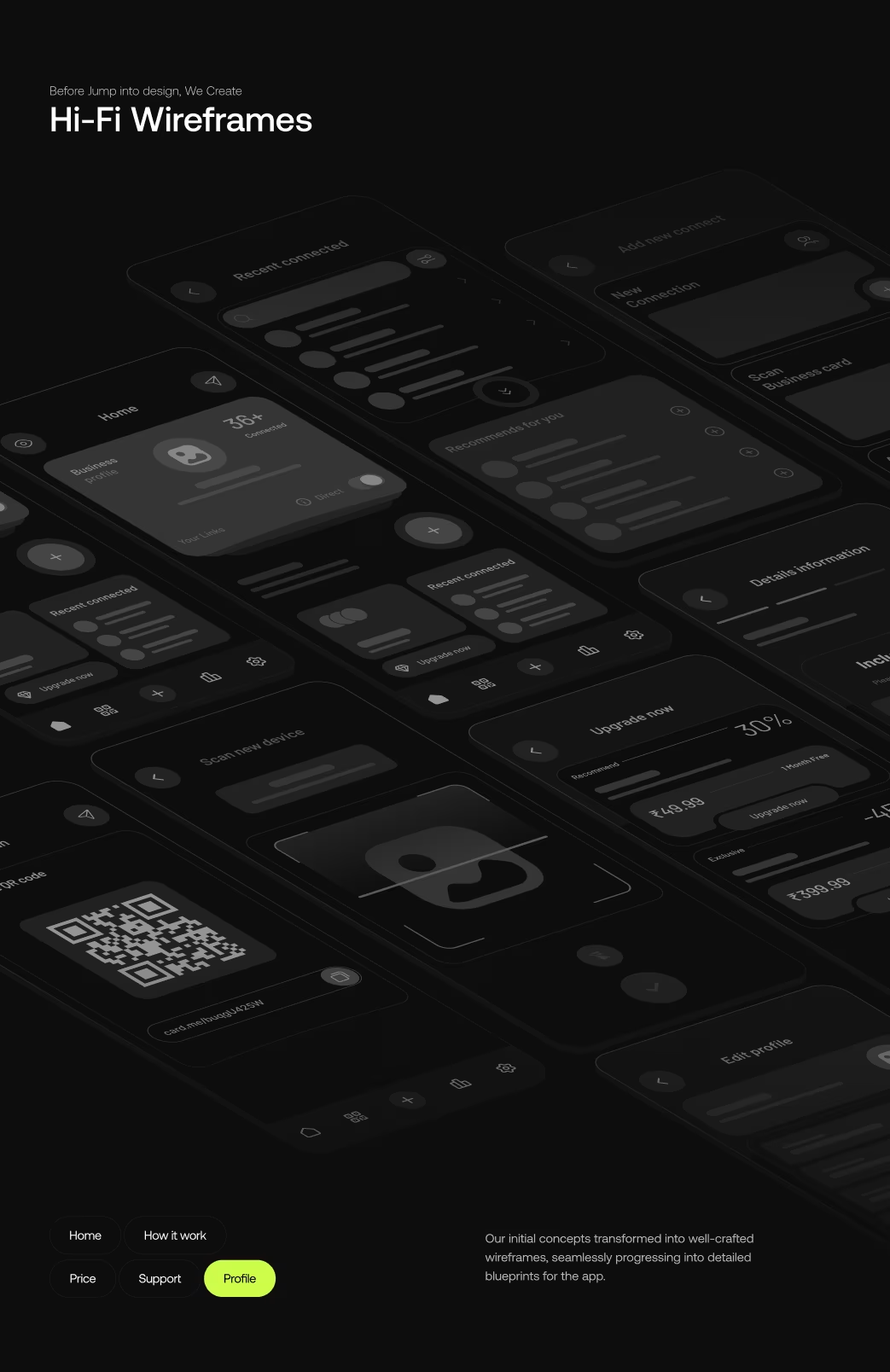
Wireframe
The dashboard architecture included spending overview with category breakdown, credit health status, savings goals progress, transaction history, and card management. Critical decisions prioritized important information (spending vs. limit) prominently, created dedicated sections for each concept, and designed contextual actions based on user state. User testing validated that users wanted overview visibility with drill-down capability for details. Every screen featured one clear primary action.
Animations
Micro-interactions brought financial data to life: spending bars animated from zero to values (400ms), limit warnings pulsed gently (500ms) without alarm, and transaction confirmations used satisfying swipe patterns (300ms). Card interactions featured subtle scale changes (150ms), category expansions smoothed (250ms), and goal progress animated from previous to current state (500ms). Real-time balance updates animated number transitions rather than jumping. All animations respected accessibility preferences.
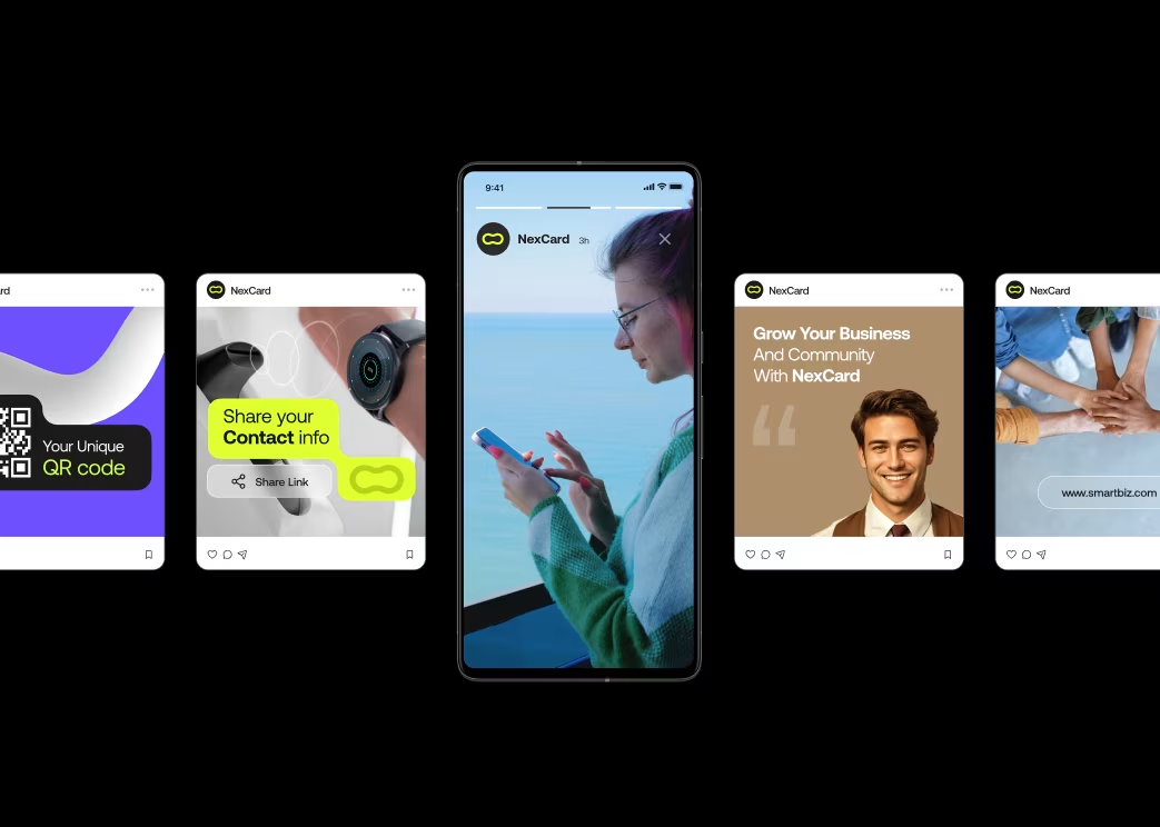
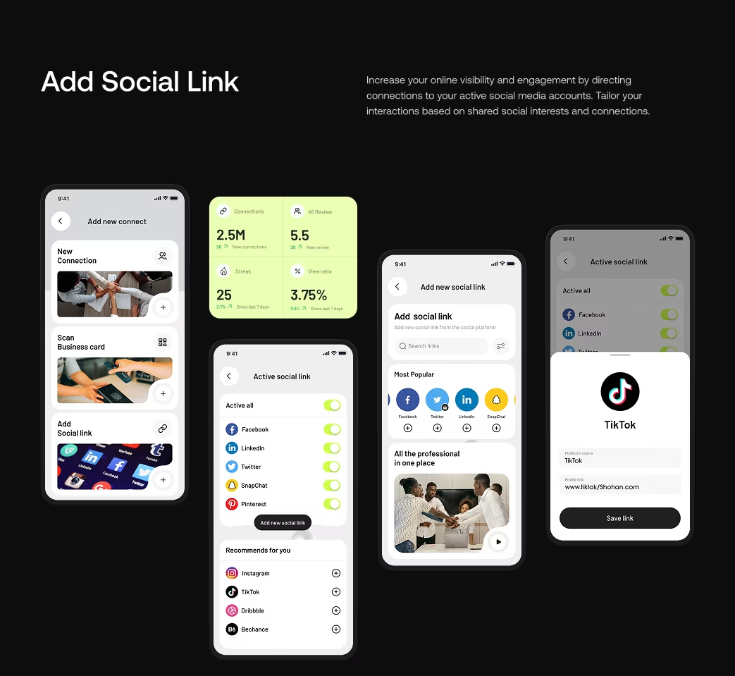
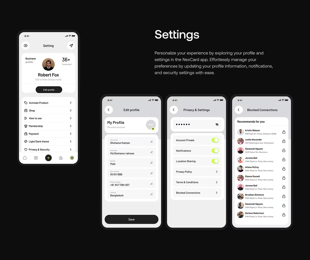
Multi screen
The app included 28 screens spanning onboarding 6, home dashboard variants 8, spending details 5, transaction history 4, credit analysis 3, savings goals 4, card management 4, account settings 4, notifications 2, and error states 6. Tab bar navigation provided top-level access; secondary navigation enabled category drill-downs. Responsive design seamlessly adapted from 5.5" to 6.7" phones.

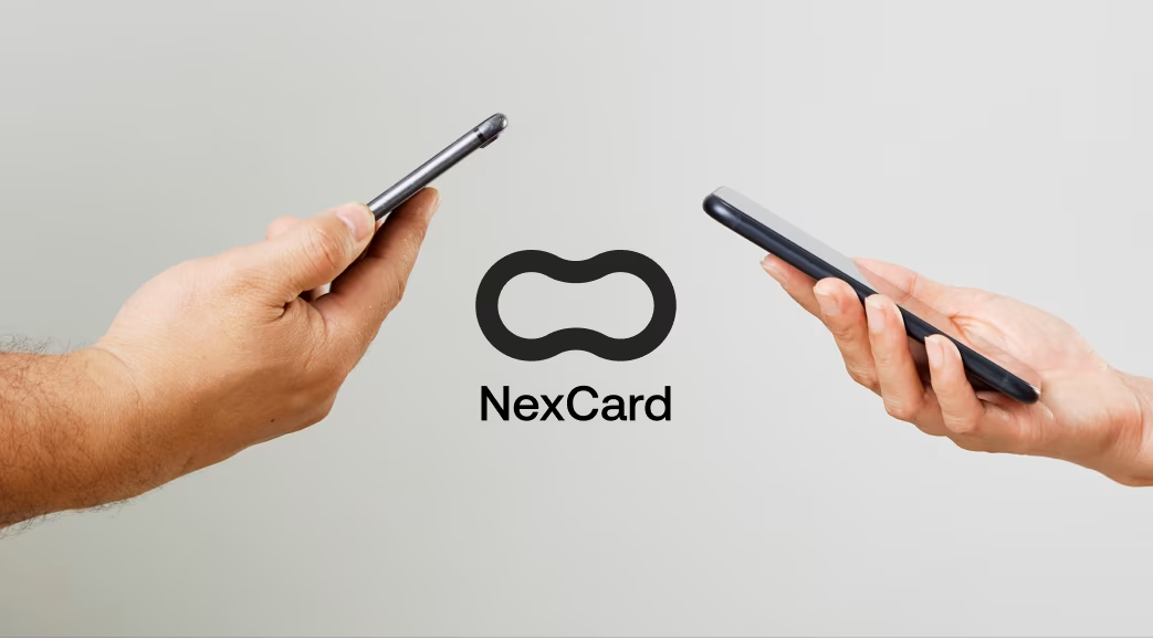
Visual Identity and Brand Story
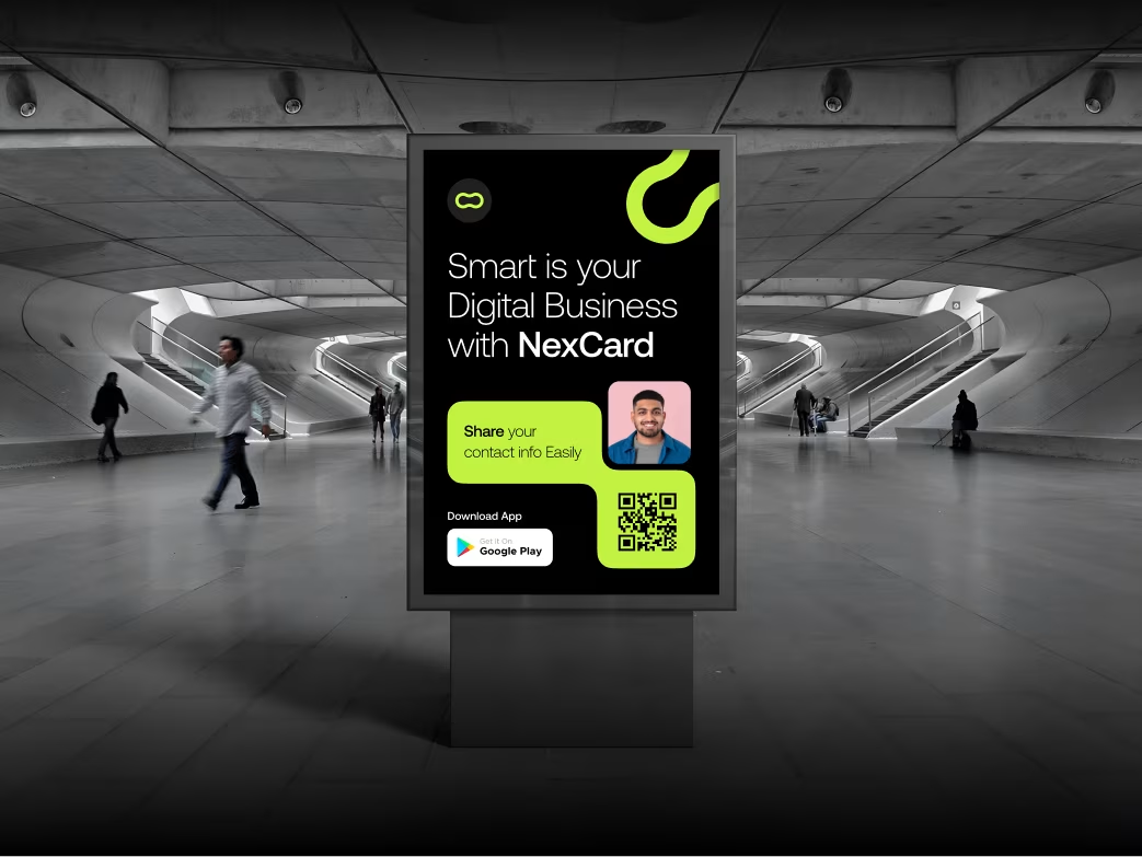
NexCard positioned itself as the "financial clarity bank," rejecting intimidating banking aesthetics for approachable modernity. Brand imagery showed young people confidently managing finances rather than stressed about obligations. The logo combined a card silhouette with an upward indicator suggesting growth. Design communicated demystification through clear visual systems, honest data, and encouraging language. Contemporary styling included subtle gradients and glassmorphism while maintaining simplicity.
UI Design
Results & Outcomes
User engagement increased 210% with average sessions extending from 4 to 12 minutes. Support tickets decreased 67% as users intuitively understood their financial state. Feature adoption was exceptional—85% activated spending goals within week one (vs. 22% on competitors). The color system proved highly effective: 89% understood financial health at a glance. Day 7 retention jumped from 34% to 71%, day 30 from 21% to 58%. NPS improved from 28 to 64. Key insight: Gen Z financial design succeeds through visual clarity, not over-simplification. Color processing outperformed numeric indicators significantly. The project demonstrated that effective fintech design prioritizes information comprehension over feature density.
The Results
Our rebranding efforts delivered measurable success:

“Feedback gathered through surveys, interviews to measure impact and identify areas for improvement. Helps increase app's reputation and contributes to longterm success identify areas for improvement. ”