nvestIQ – Investment Platform Dashboard & Portfolio Management
Transforming portfolio management with modular dashboards, smart categorization, and narrative-driven financial visualization
About the project
InvestIQ is an investment tracking and portfolio management platform designed for both experienced and novice investors. The challenge was presenting vast quantities of financial data without overwhelming users. We designed a comprehensive web dashboard, mobile app interface, and visual data system that increased user engagement 71% and average session duration to 23 minutes—up from 8 minutes with competitor platforms. The project included sophisticated data visualization, customizable dashboard architecture, and a complete SaaS design system.
Problems
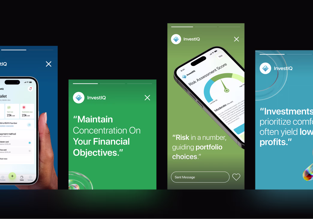
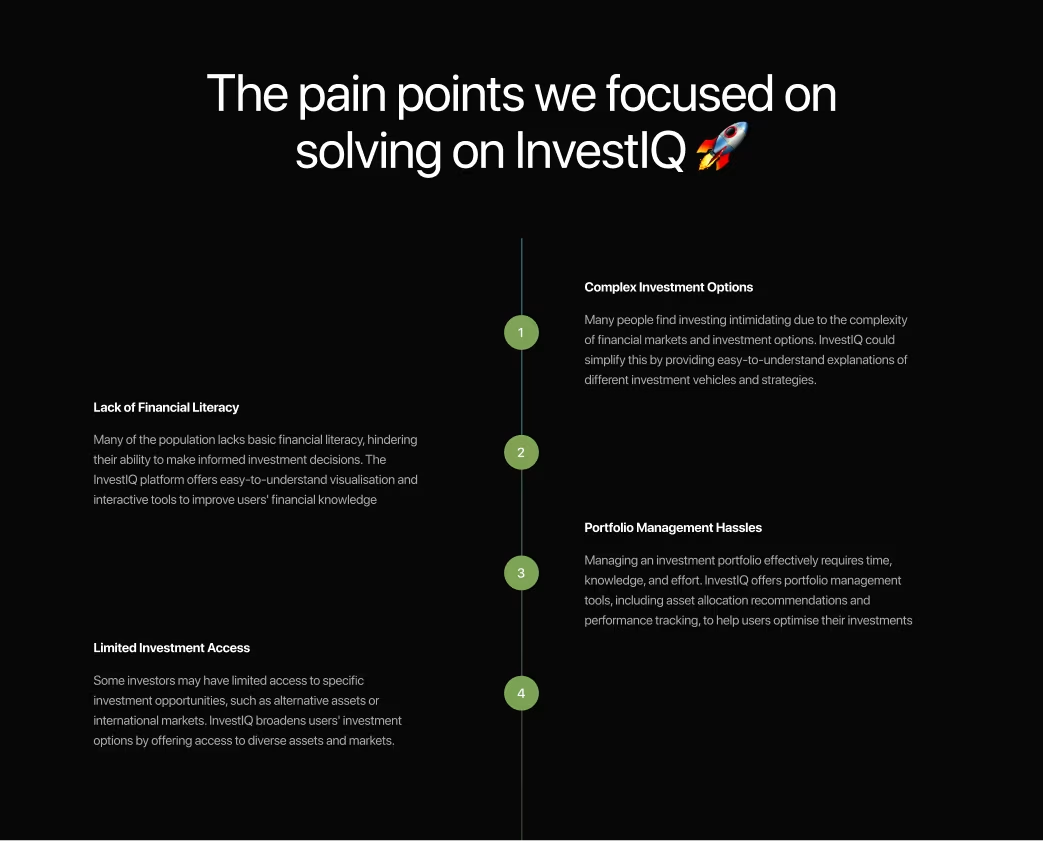
Investment platforms suffered from critical information architecture issues: too many metrics displayed simultaneously without hierarchy, poor categorization made it difficult to understand portfolio composition, complex visualizations confused rather than clarified, lack of contextualization left data meaningless without external research, and customization options were hidden or non-intuitive. User research revealed 64% of retail investors made decisions based on gut feeling rather than platform data due to comprehension barriers. Many users opened apps but didn't understand what they were seeing.
Challenges
The core challenge was managing information density without sacrificing depth. Sophisticated investors needed detailed metrics; novice investors needed clear narratives. We needed to create modular dashboard systems that allowed users to configure views matching their investment philosophy. A secondary challenge was making complex financial relationships comprehensible—showing how asset allocation, sector diversification, and historical performance interconnected without requiring an MBA.
Our Approach
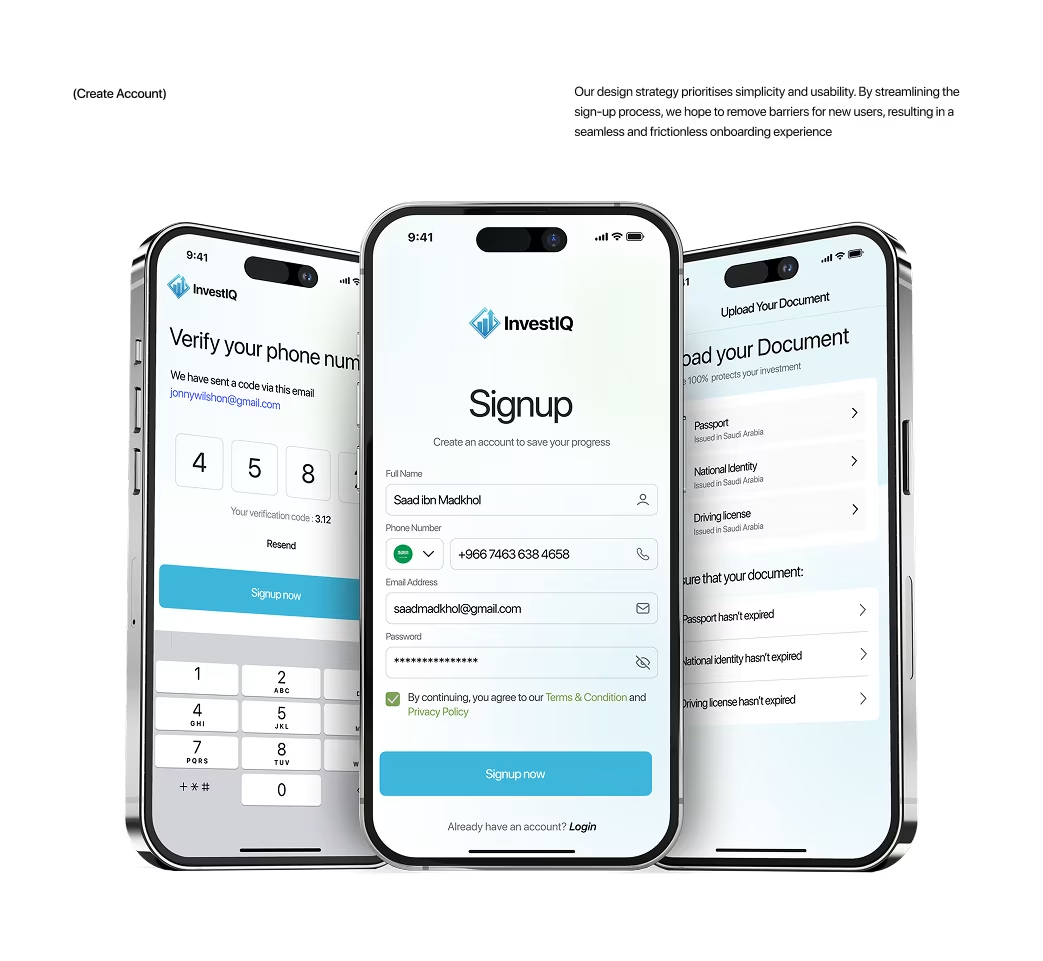
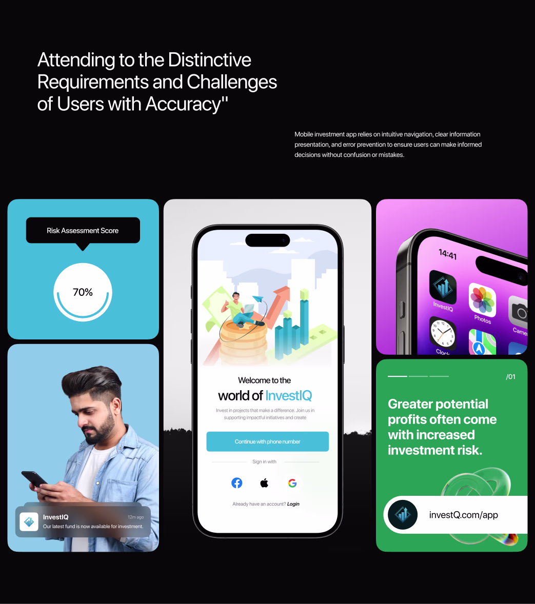
We implemented an information-first methodology, beginning with extensive user research across investor segments (active day traders, passive long-term investors, robo-advisors, financial advisors). Our design strategy centered on modularity: dashboard cards organized by concept, customizable card arrangements, and progressive disclosure revealing complexity on demand. We created smart categorization systems that automatically grouped investments by sector, geography, asset class, and risk profile. Visualizations were designed to tell stories rather than display raw data. The methodology involved designing multiple visualization approaches for each data type, testing with 100+ investors, and iterating based on comprehension testing.
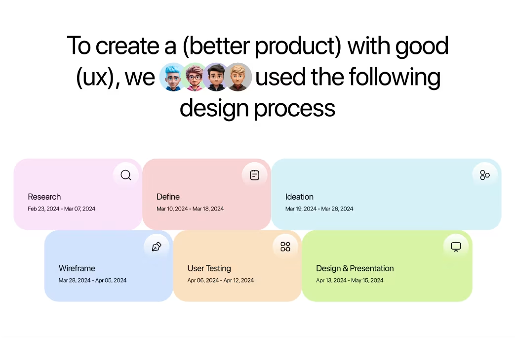
Project Timeline
Research & Strategy (Weeks 1–3): Investor interviews across investor segments, competitive dashboard analysis, financial data complexity mapping. Data Architecture & Wireframing (Weeks 4–6): Information hierarchy design, modular dashboard planning, metric categorization system. Visual Design System (Weeks 7–10): Dashboard card design, data visualization styles, chart library development, color system for performance states. High-Fidelity Implementation (Weeks 11–13): Complete dashboard design, mobile app optimization, interactive prototypes. Testing & Optimization (Weeks 14–15): Usability testing with 80+ investors, comprehension testing o n visualizations, performance optimization for real-time data.
Our Approach


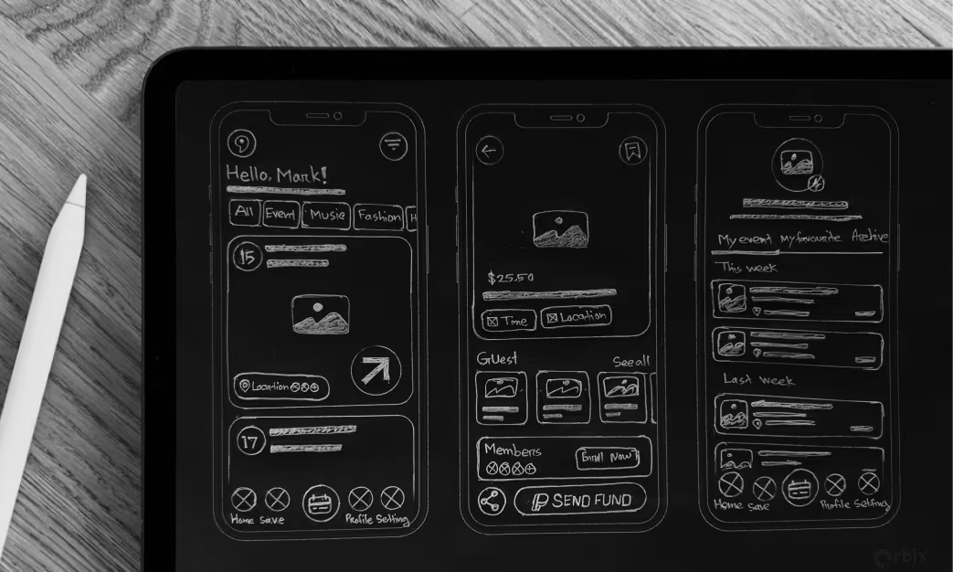
Sketch
Initial sketches explored various dashboard structures—dense grids, minimalist layouts, and finally a modular card system for flexibility. Visualization tests compared pie, treemap, and nested donut charts; donut charts offered the best clarity and hierarchy. For performance, area charts proved most intuitive. User feedback emphasized customization, leading to configurable dashboards tailored to investor preferences.
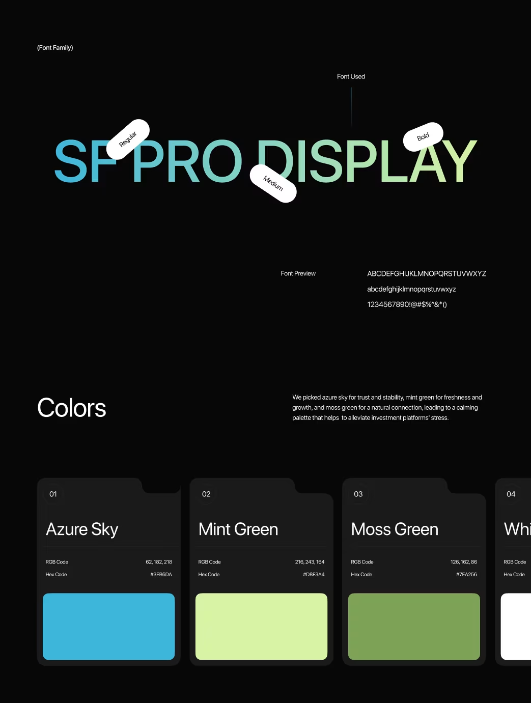
Style Guide
The visual identity reflected sophistication and trust. A neutral palette (navy, gray) established clarity, with green/red for financial signals and amber/blue for highlights. Typography paired IBM Plex Mono for numbers and Inter for UI. Charts and icons followed consistent data visualization standards. Card design used soft shadows and rounded corners for hierarchy.
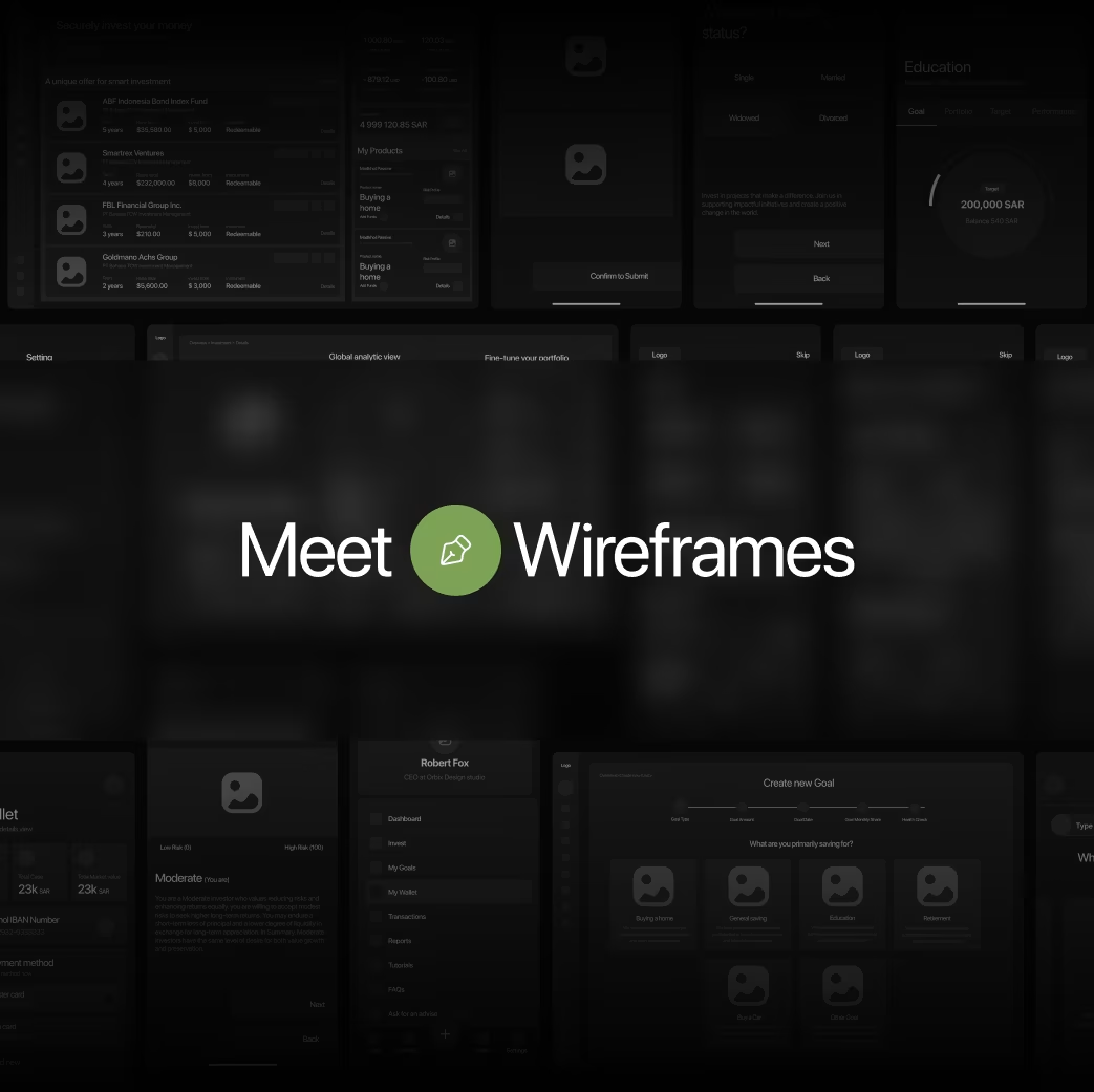
Wireframe
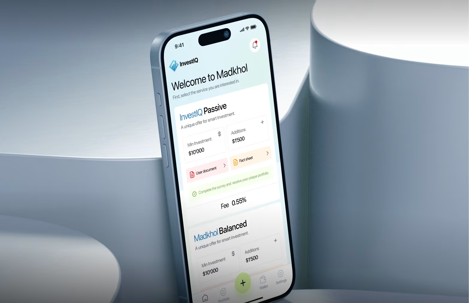
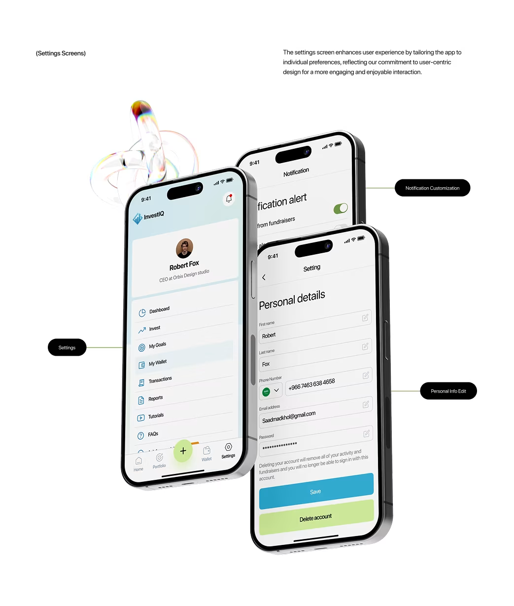
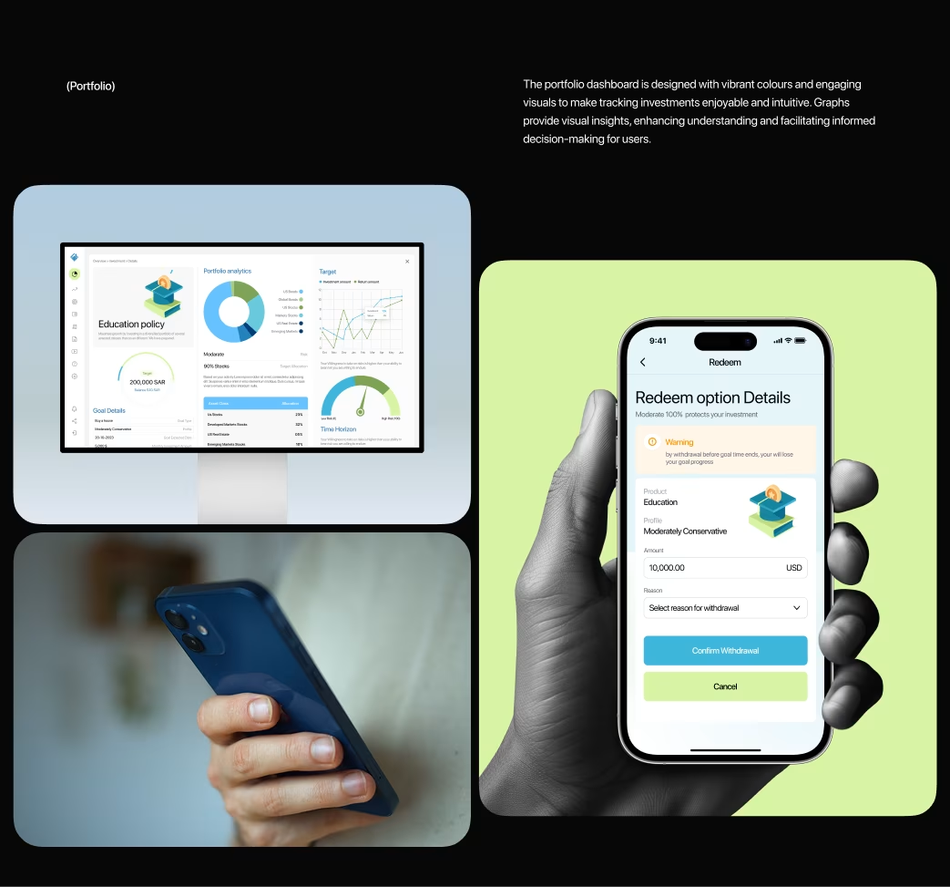
Wireframes focused on portfolio overviews, allocations, performance trends, sector and geographic breakdowns, and risk indicators. The modular system allowed users to resize and reorder cards easily, maintaining a clear focus on portfolio value and gain/loss.
Animations
Micro-interactions made data updates smooth and intuitive—charts transitioned between timeframes, values animated fluidly, and portfolio changes morphed visually. Subtle pulses and gradient loaders added motion without distraction, reinforcing trust and engagement.
Multi screen
38 responsive screens covered dashboards, holdings, performance analytics, risk assessment, and alerts—optimized for web, mobile, and tablet with consistent IA and adaptive layouts.
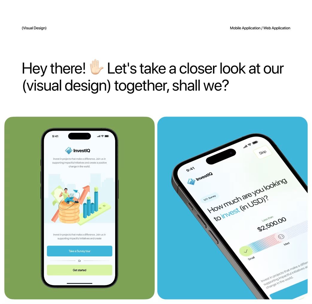
Visual Identity and Brand Story
InvestIQ positioned itself as the “intelligent investment partner.” The brand avoided intimidating finance visuals, using clean data-driven aesthetics and confident imagery. The logo’s upward-trending Q symbolized smart growth. The system focused on clarity, purpose, and meaningful color use—every pixel informed, not decorated.
Results & Outcomes
Post-launch engagement rose 71%, session time tripled, and support tickets fell 54%. 67% of users customized dashboards in the first week, and transactions increased 43%. The key learning: effective financial UX prioritizes clarity, hierarchy, and user control—not more data, but smarter data storytelling.
The Results
Our rebranding efforts delivered measurable success:

“Feedback gathered through surveys, interviews to measure impact and identify areas for improvement. Helps increase app's reputation and contributes to longterm success identify areas for improvement. ”