Helon Solar – Tech Company Branding
We’re building a solar tech company called Helon that stands for innovation trust and sustainability.
About the project
Helon Solar is a forward-thinking clean energy startup focused on solar technology innovation for residential and commercial use. Their mission: make solar power accessible, modern, and visually trusted.
Orbix Studio was brought in to design a complete brand identity that reflects sustainability, precision, and innovation — positioning Helon Solar as a global leader in renewable energy technology.
Challenges
The main challenge was translating technical excellence into an approachable and memorable visual identity. The existing materials lacked a modern, tech-savvy appeal and didn’t resonate with sustainability-driven audiences.
Our task: build a tech-forward yet human-centric brand identity that balances engineering precision with environmental optimism.
Our Solutions
We crafted a brand experience rooted in clean energy symbolism and digital innovation:
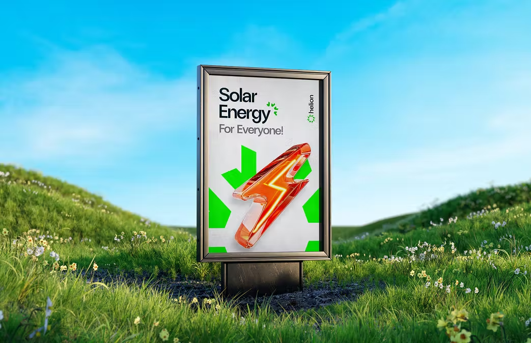
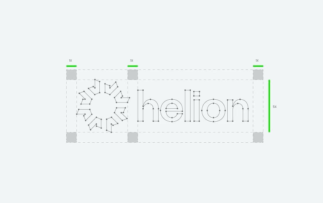
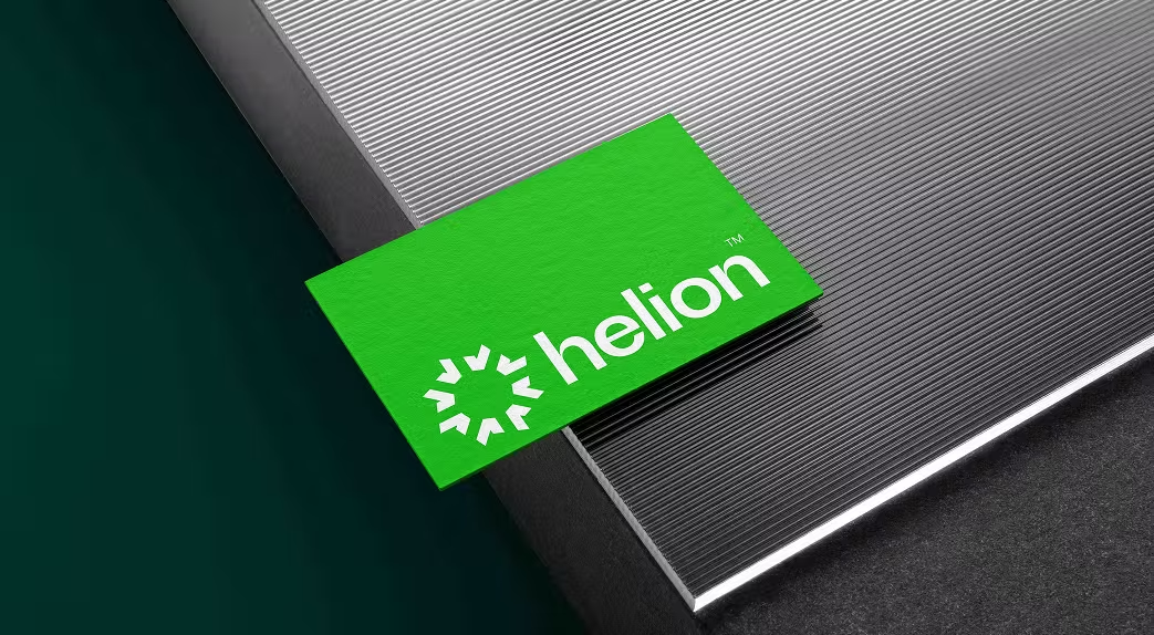
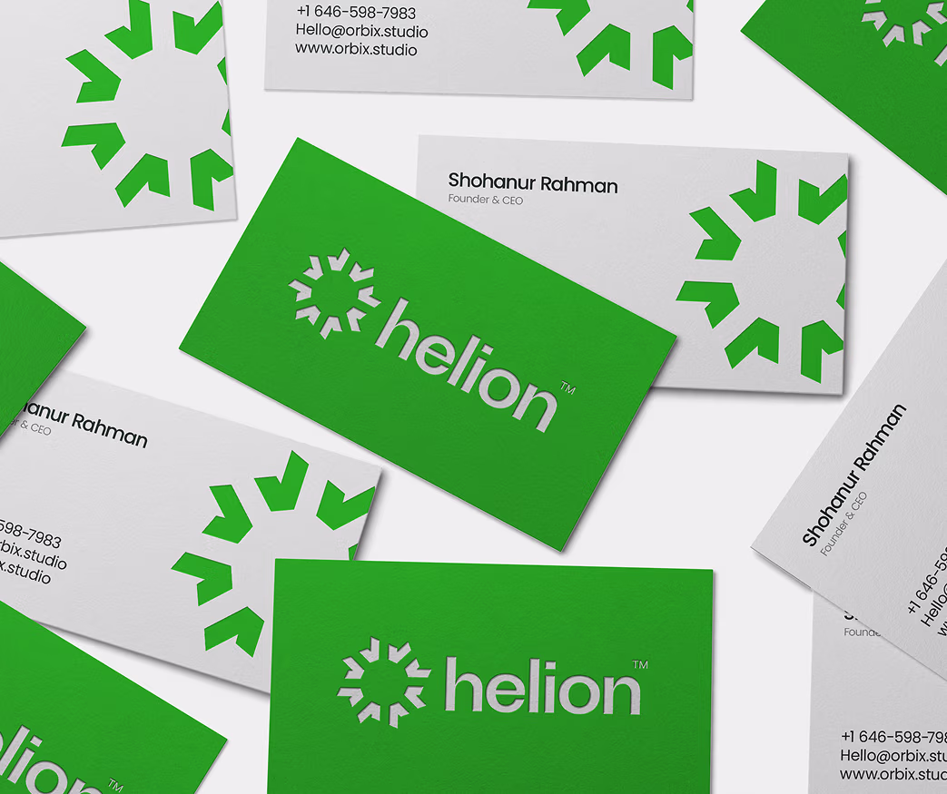
- Developed a geometric logo inspired by solar panels and light rays.
- Introduced a fresh, optimistic color palette of blues and warm golds.
- Designed tech-style typography to reflect innovation and reliability.
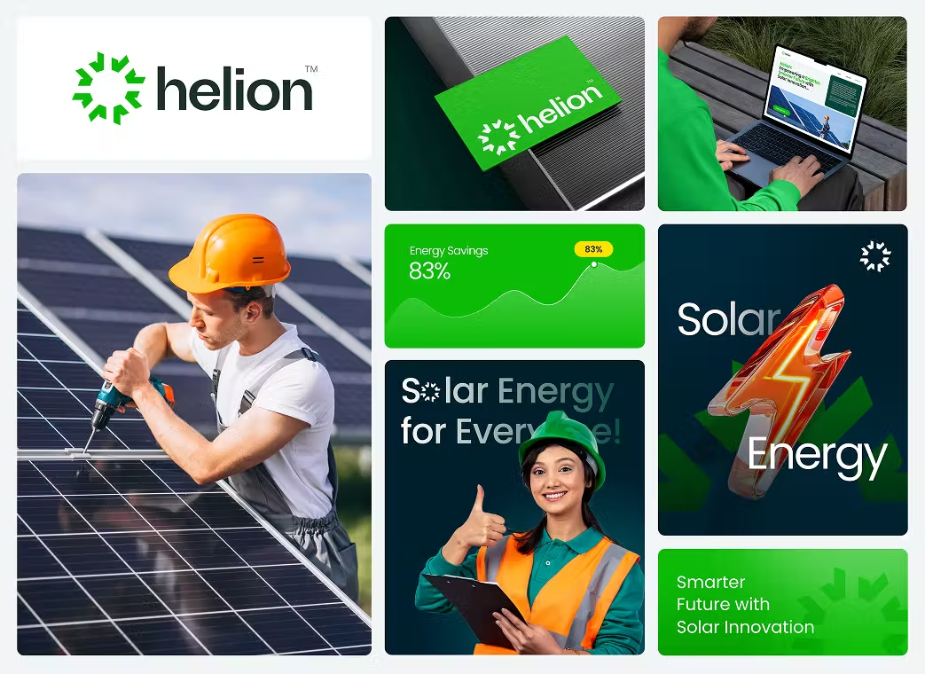
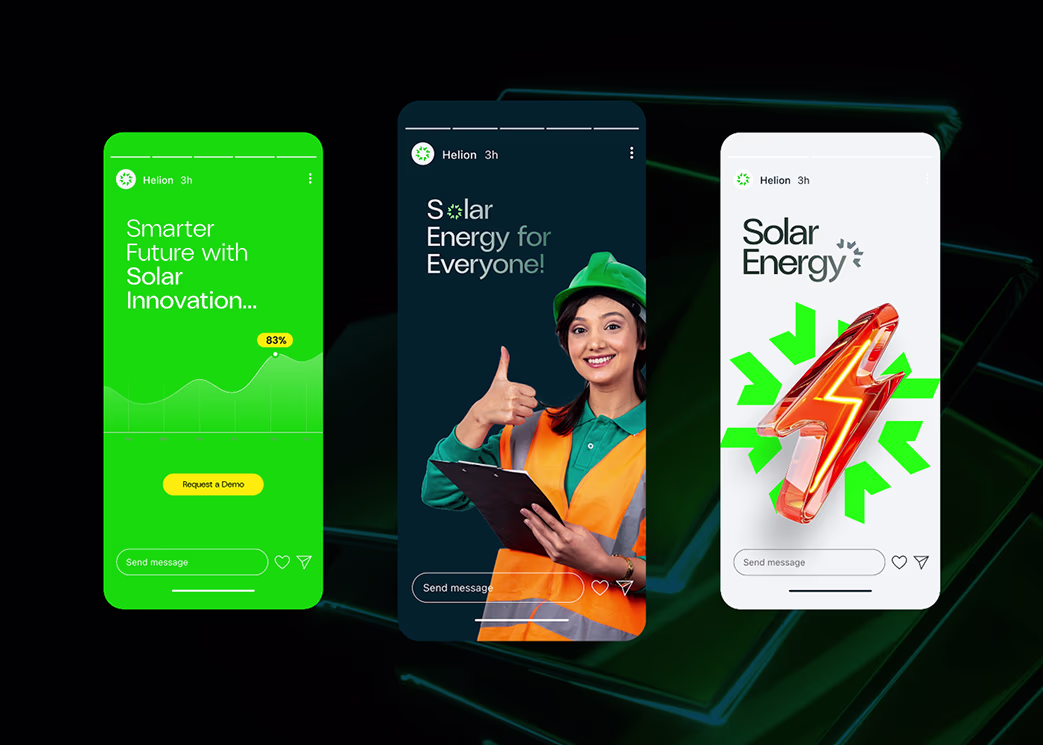
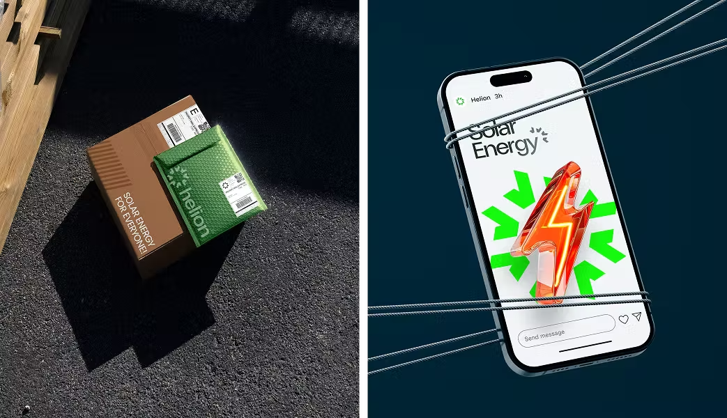
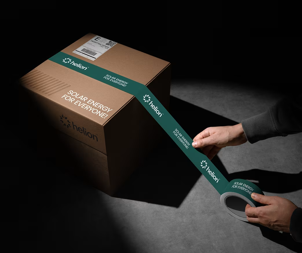
- Built a comprehensive brand system adaptable for digital, print, and packaging.
Our Approach

We conducted in-depth interviews and competitor analysis to understand Helon Solar’s positioning and sustainability goals. This allowed us to align brand visuals with customer expectations in the clean tech sector.

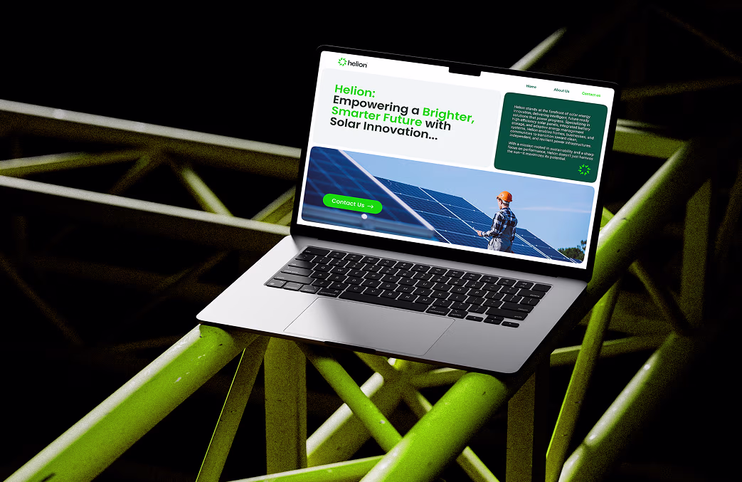
Our design direction focused on clarity, structure, and energy. We created a logo symbolizing solar rays converging into innovation — capturing the fusion of science and nature.

We implemented a modern visual identity system that ensures scalability, trust, and brand consistency across global platforms, from web to investor materials.

Brand Design Process
- Brand Research & Positioning
- Concept Development & Symbol Exploration
- Typography & Color Strategy
- Brand Collateral Design
- Guideline Creation & Handoff
Visual Identity System
- Logo: Inspired by light grids and solar geometry.
- Color Palette: Solar gold, energy blue, and clean white.
- Typography: Futuristic yet approachable sans-serif fonts.
- Visual Elements: Circular motion graphics symbolizing solar flow.

The Results
Our rebranding efforts delivered measurable success:
Customer engagement increased by
65%
across social media.
Website traffic grew by
42%
in the first 2 months post-launch.
Brand trust strengthened, with positive feedback from partners and investors.

“Feedback gathered through surveys, interviews to measure impact and identify areas for improvement. Helps increase app's reputation and contributes to longterm success identify areas for improvement. ”