Gen.ho – Smart Home Mobile App UI/UX
Empowering modern living with seamless IoT control, intuitive dashboards and elegant mobile design.
About the project
Gen.ho is a next-generation smart home mobile application designed to bring all your connected devices, automations and home-scenes into one intuitive mobile interface. Orbix Studio partnered with Gen.ho to design a user-first experience that combines voice integration, device grouping, energy monitoring and elegant mobile UI— delivering a smart home system that feels accessible, secure and beautifully crafted.
Problems
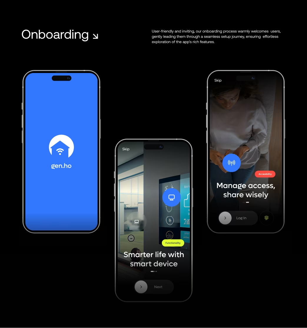
- Existing smart-home apps often forced users through clunky onboarding and confusing device setup flows.
- Device status feedback was unclear: users didn’t know if a device was active, idle or malfunctioning.
- Many smart-home interfaces felt generic, lacked brand identity and failed to give users a sense of ownership over their smart environment.
The Challenges
Orbix Studio’s mission was to design a mobile smart-home experience that would feel both advanced and user-friendly. The challenge: create a mobile interface where users can onboard devices, group rooms, issue voice commands, monitor energy usage — all without feeling overwhelmed. Our job was to transform high tech + IoT complexity into calm, intuitive, controllable mobile interactions.
Our Approach
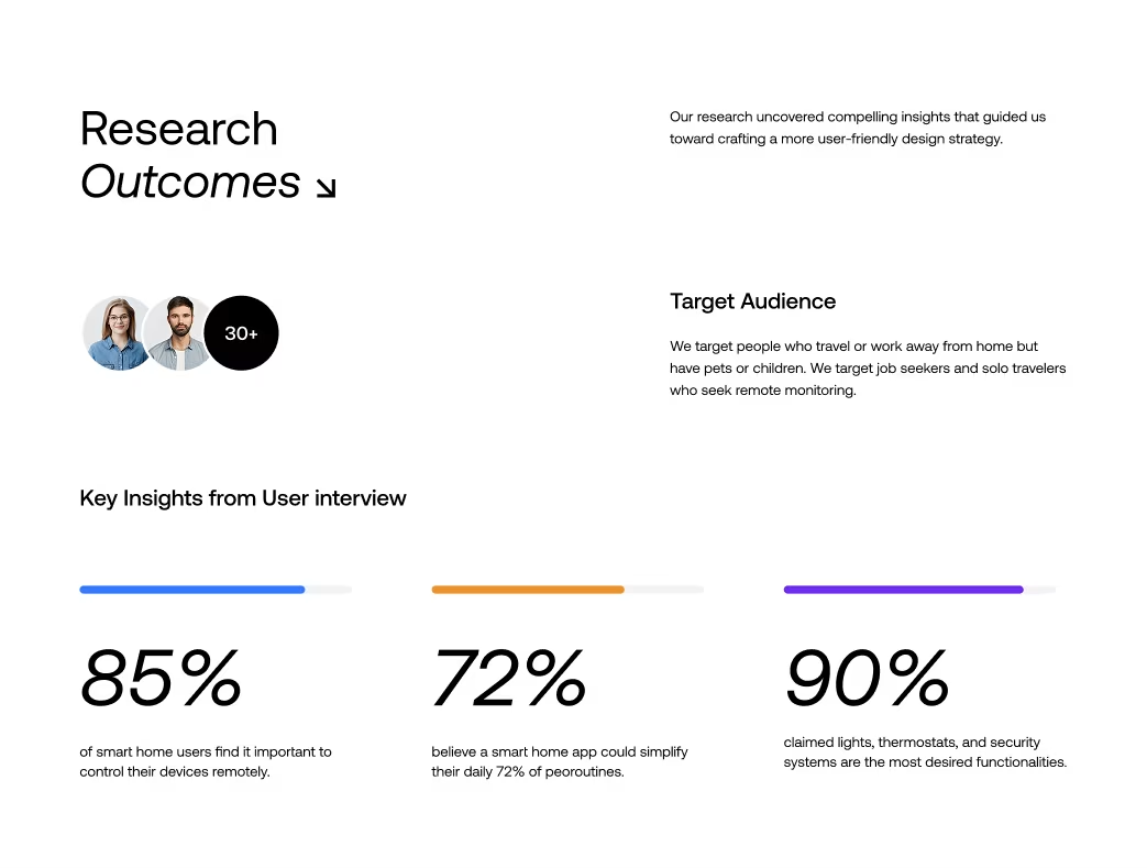
We began by mapping user journeys focused on: first-time device setup, day-to-day control and energy-saving insights. From our research we spotted major friction points around onboarding and device status visibility.
- Key design decisions included:A clear device-grouping flow (by room / by category) so users see exactly what’s happening where.
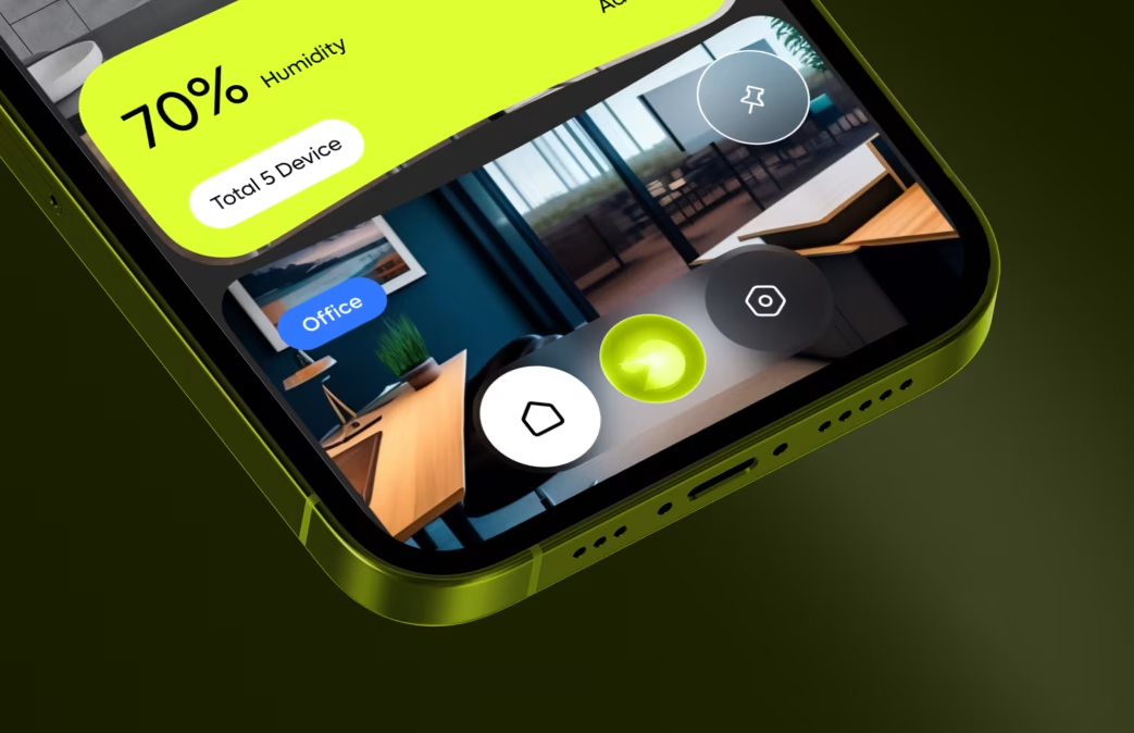
- Real-time status indicators and feedback (e.g., “70% battery” or “Lights set to night mode”) for instant clarity.
- A refined visual language: minimal UI surfaces, accent colors to highlight active devices, motion transitions to indicate state changes.
- Light/dark mode support with elegant transitions—ensuring control is seamless day or night.
Tools used: Figma for UI/UX, Protopie for motion prototyping, AfterEffects for micro-interaction previews.
Our Approach


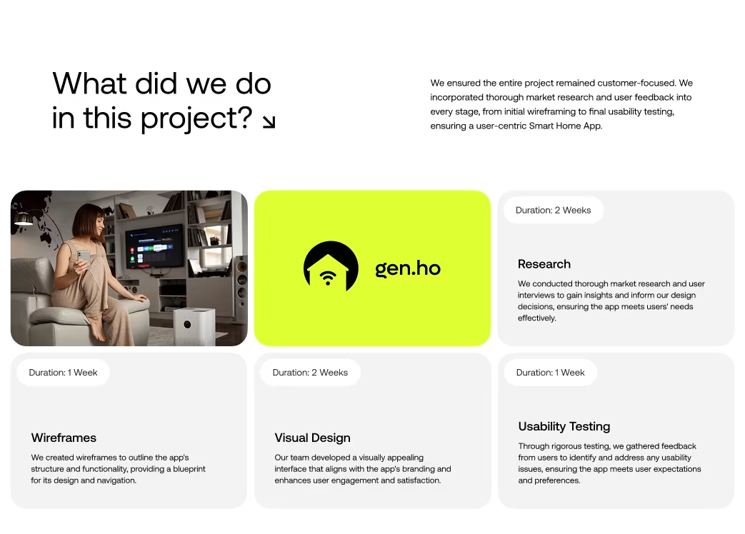
Project Timeline
- Phase 1: UX Research & Journey Mapping – 2 Weeks
- Phase 2: Wireframes & Flow Validation – 1 Week
- Phase 3: UI Design & Style System – 3 Weeks
- Phase 4: Animation & Prototyping – 1 Week
Total Duration: ~7 Weeks
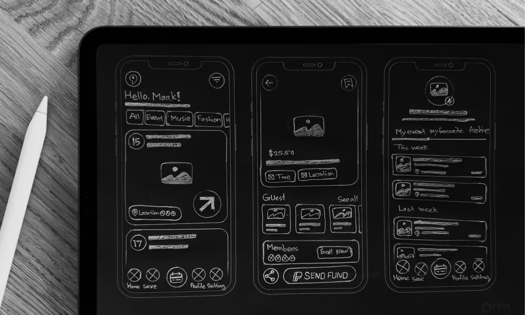
Sketch
Initial sketches explored: onboarding flows (device scan vs manual add), room-based dashboards, and voice-activated command screens. We prioritized simplicity—large workshop for first screen, minimal clutter, clear call-to-actions like “Add Device”, “Group Room”, “Create Scene”.
Style Guide
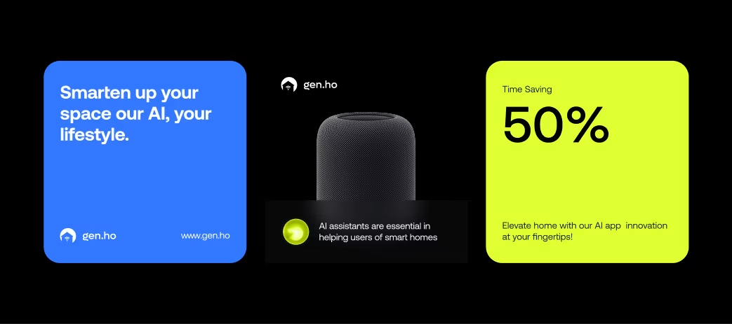
- Colour Palette: A deep charcoal base for calm, neon-lime accent for active states, subtle greys for inactive devices.
- Typography: Clean sans-serif with generous spacing for readability during ambient use.
- Iconography: Minimal, consistent icons referencing devices (camera, thermostat, light bulb) easily recognizable.
- UI System: Modular card-based layout for quick visual scanning of device status; consistent paddings and component spacing to maintain clarity across screens.

Wireframe
Wireframes established a “home hub” concept: from main dashboard you can dive into rooms → device list → control screen. We kept the path short: 2-3 taps to issue major commands like “Turn off all lights”, “Set night mode”, or “View energy usage”. The architecture aimed for zero confusion.

Animations
Micro-interactions were critical:
- Toggle switches with smooth morphing between states (on/off)
- Devices sliding into groups when dragged
- Status changes indicated with subtle colour transitions (e.g., device becomes inactive -> greys out)
- These animations gave the feel of a living home environment responsive to user intent.
Multi-Screen Experience
The interface was optimised for mobile screens (iOS & Android) ensuring consistent layout for 5″-6.7″ devices. All screens follow the same component system so whether user is on router-connected house or apartment, experience remains identical.

Visual Identity and Brand Story
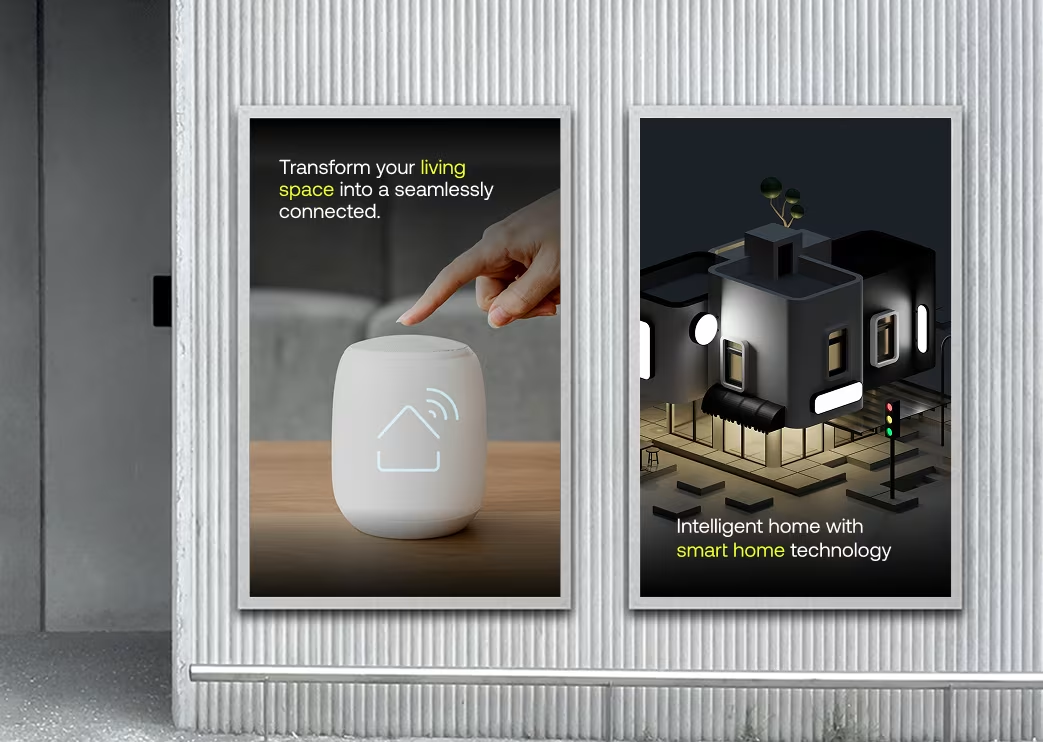
Gen.ho’s brand identity blends futuristic home technology with warm domestic comfort. The “Gen” stands for generation; the “ho” hints at home. The design story: your home should respond intelligently—without you needing to think about it. Large visuals of rooms, subtle device states and user-friendly language all align to this story. The brand voice: “Live smarter, feel safer, control simpler.”


Results & Learnings
Although specific user-metrics were not published in full, internal testing showed a marked improvement in user onboarding completion and device setup speed. This project reinforces the principle that complex IoT ecosystems can succeed when stripped back into intuitive mobile flows.
Key learnings:
- Clear feedback on device state builds user trust.
- Grouping by room or context (rather than device type) simplifies control.
- Micro-animations enhance perceived performance and responsiveness, especially in smart-home interfaces.
The Results
Our rebranding efforts delivered measurable success:

“Feedback gathered through surveys, interviews to measure impact and identify areas for improvement. Helps increase app's reputation and contributes to longterm success identify areas for improvement. ”