Dhaka Regency Hotel – Re-Branding & Visual Identity for Modern Hospitality
Elevating a business-class hotel in Dhaka to a globally recognised luxury brand through design clarity, digital focus and brand cohesion.
About the project
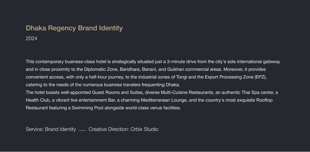
Dhaka Regency Hotel is a prominent business-class, five-star hospitality venue located near the international airport in Dhaka, tapping into both global travellers and corporate guests.
Orbix Studio was engaged to deliver a full re-branding—covering logo, typography, colour palette, signage, digital presence and collateral—to position the hotel as a modern icon of hospitality in the region.
Challenges
The existing visual identity lacked the sophistication and clarity required to stand out in the increasingly competitive luxury hospitality market. It did not fully reflect the hotel’s premium amenities, strategic location, or global ambitions. The challenge was to craft a brand identity that felt premium, cohesive across both physical and digital assets, and appealing to international and corporate audiences.
Our Solutions
- We developed a clean, refined logo and word-mark that communicate elegance, calm and professionalism.
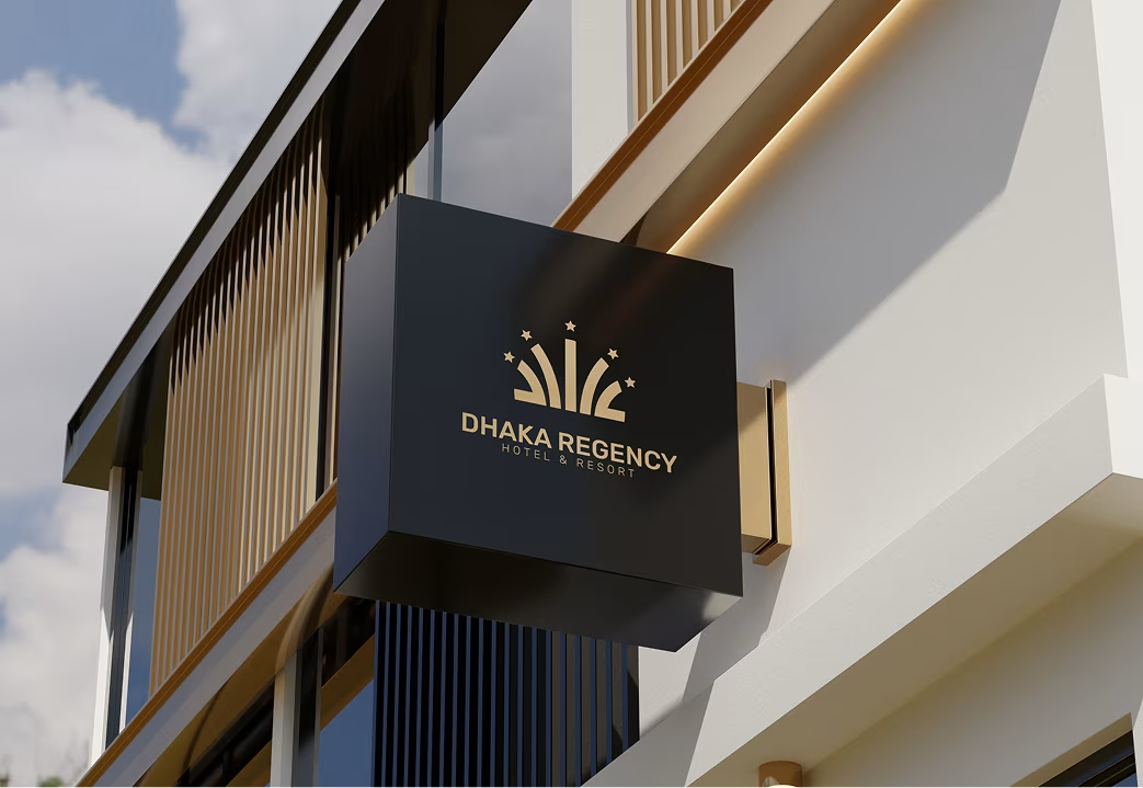
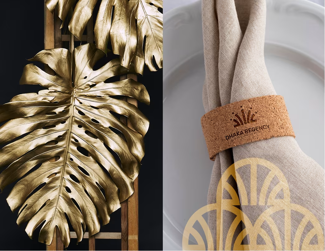
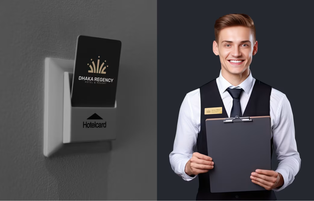
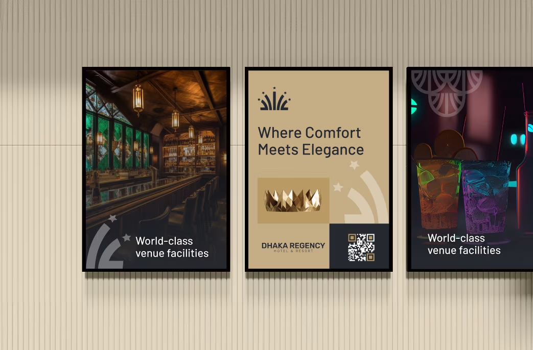
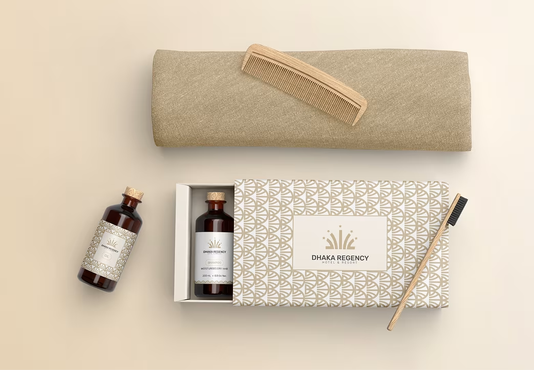
- Designed a visual system of colours, typography and iconography tailored for both print (signage, menus) and digital (website, app).
- Created digital touchpoints—booking UI, website, mobile interface—that reflect the new brand voice and ensure consistency across user journey.
Our Approach

We began by analysing guest profiles, competitor hotel branding, and stakeholder goals. Our workshops revealed key values: location convenience, business class comfort, and luxurious service experience.

We crafted a logotype and icon system that embody refined luxury and local context—drawing from Dhaka Regency’s architecture and its strategic location to create a meaningful brand mark.

The resulting visual identity system provides full scalability across brand-touchpoints—from in-hotel signage and collateral to digital and social environments, ensuring one unified brand expression.
Brand Design Process
- Brand Audit & Positioning
- Logo & Icon Exploration
- Colour Palette & Typography System
- Collateral & Digital Application
- Style Guide Production & Handoff
Visual Identity System
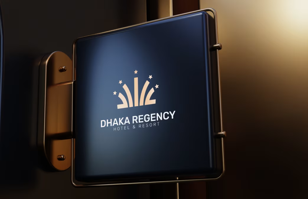
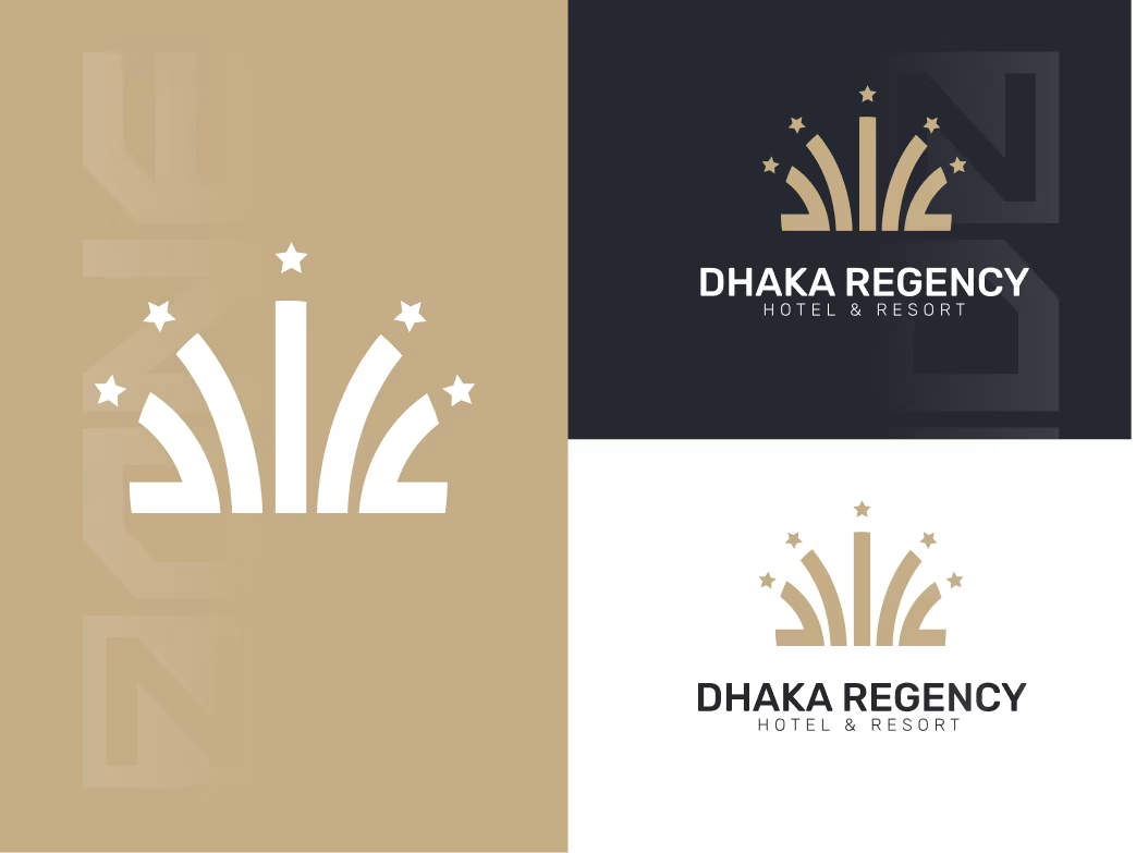
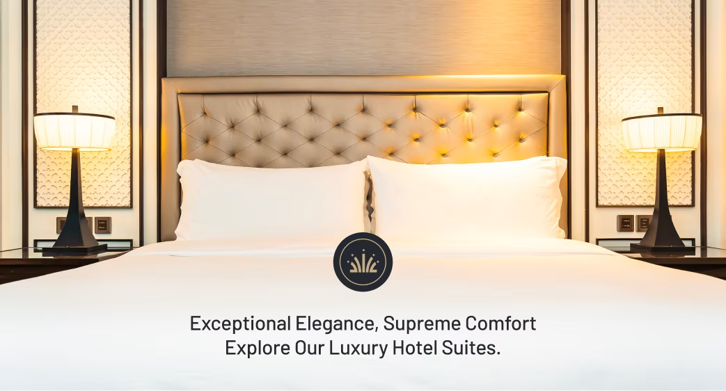
- Logo: A strong, refined word-mark paired with symbol subtly evoking architecture and hospitality.
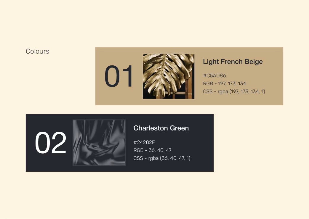
- Colours: A palette of deep navy, gold accents and warm neutrals — conveying luxury and comfort.
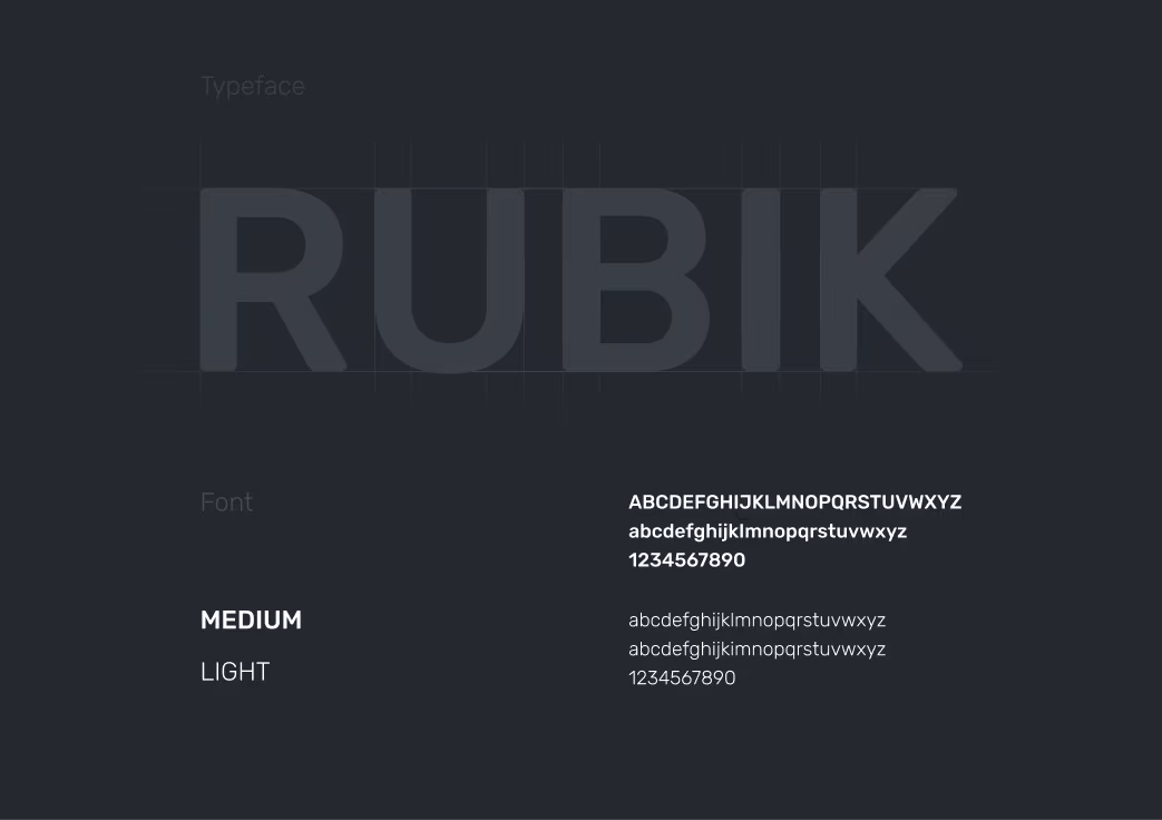
- Typography: Modern serif for elegance plus clean sans-serif for clarity in digital.
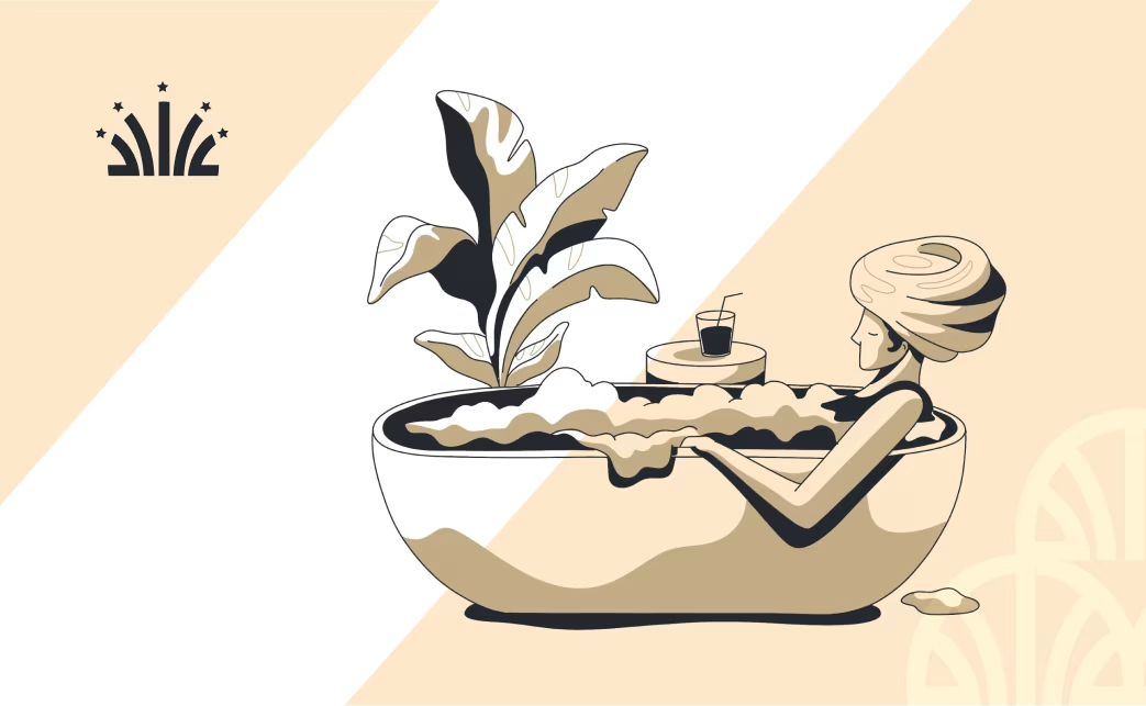
- Design Elements: Use of grid layouts, generous white space and photography that emphasises hospitality experience.

The Results
Our rebranding efforts delivered measurable success:
Customer engagement increased by
68%
across social media platforms.
Website traffic grew by
47%
within the first 3 months after launch.
Brand recall improved by 54% supported by positive guest feedback and higher booking trust scores.

“Feedback gathered through surveys, interviews to measure impact and identify areas for improvement. Helps increase app's reputation and contributes to longterm success identify areas for improvement. ”