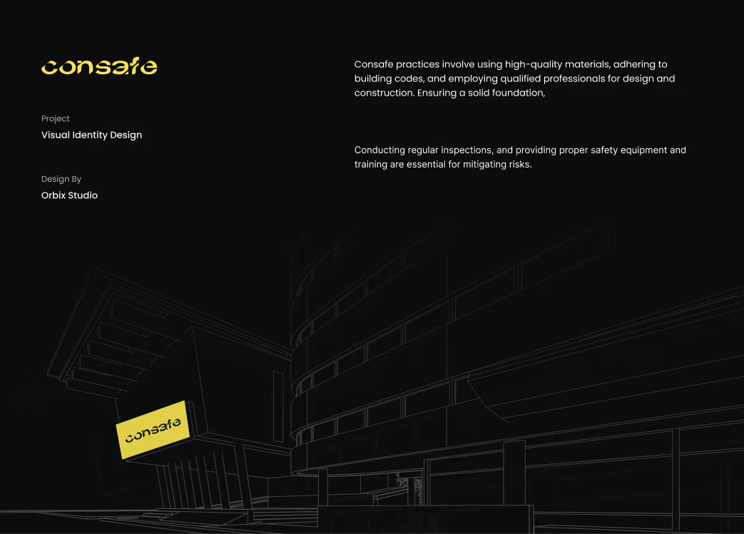
Consafe – Construction Branding
Building trust through bold identity and modern visual storytelling.
About the project
Consafe is a construction and real estate development company focused on delivering safe, modern, and sustainable structures. Orbix Studio was commissioned to create a full brand identity system — from logo and color palette to marketing collateral and digital presence — that reflects strength, reliability, and innovation.
Our goal was to help Consafe stand out in a competitive real estate market with a brand identity that communicates safety, precision, and trust.
The Challenge
Consafe needed a complete rebranding to move away from its traditional image and reflect innovation in construction technology. The challenge was balancing industrial strength with modern simplicity for both B2B and public-facing audiences.
Our Solutions
We designed a solid, confident identity anchored in structure and precision:
- Developed a bold logo mark based on modular building blocks.
- Created a professional color palette of steel gray and safety orange.
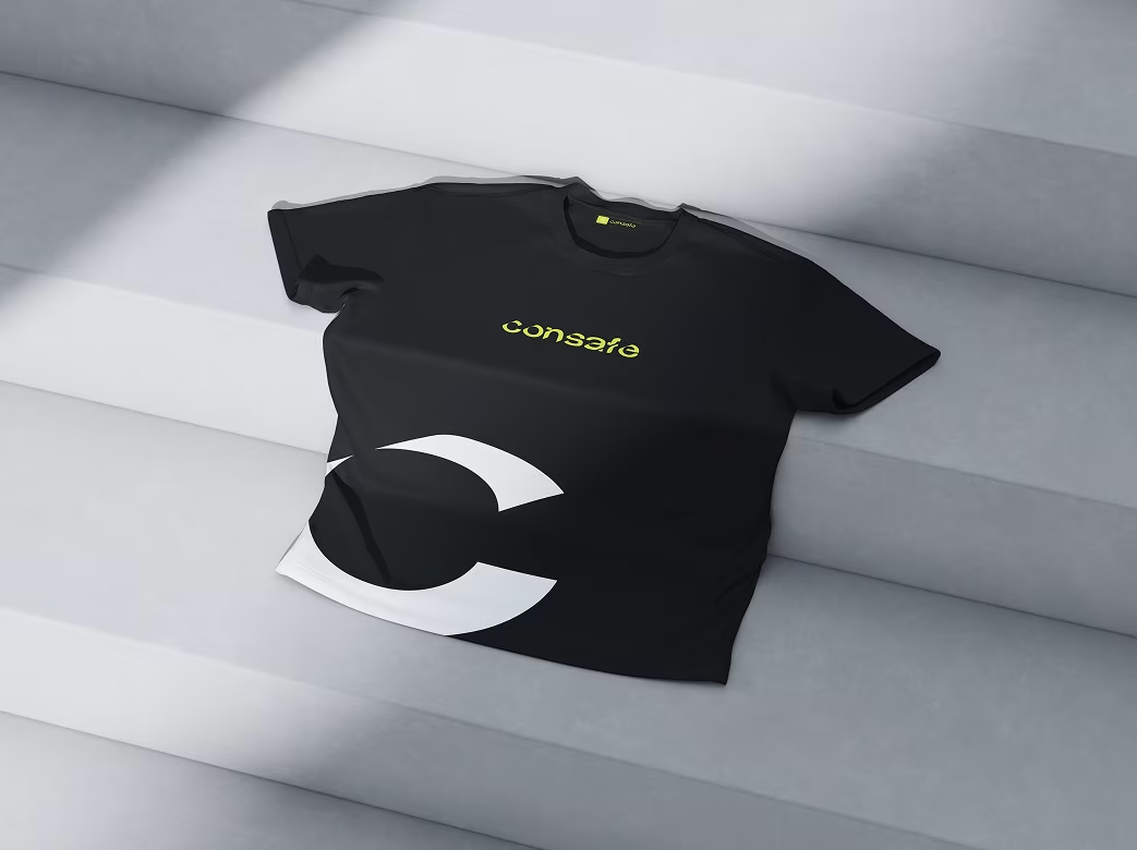
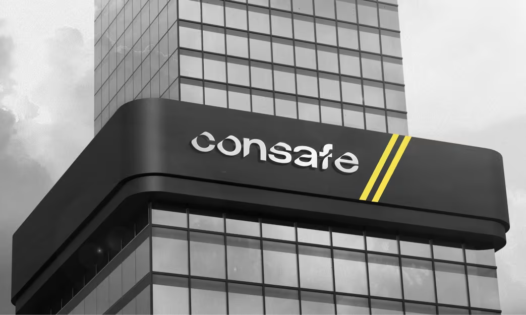
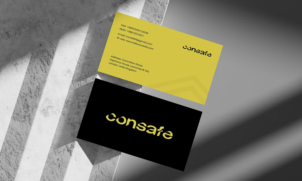
- Designed uniforms, signage, and corporate stationery for brand cohesion.
- Built a responsive web UI to improve credibility and lead generation.
Our Approach

We began with a deep dive into the construction and real estate market to understand Consafe’s core positioning. Workshops with stakeholders revealed the need for a stronger digital and offline brand identity that communicates reliability, safety, and modernity.

We designed a strong geometric logo and bold typography that symbolize strength and structure—core attributes of the construction industry. The visual language balanced industrial precision with professional warmth.

From the logo grid to the color palette and brand guidelines, we crafted a scalable visual identity that remains consistent across print, signage, and digital assets, strengthening brand recall and trust.
Brand Strategy & Design Process
- Research & Positioning: Understanding Consafe’s strengths and customer trust factors.
- Logo Development: “Safe” motif integrated into bold architectural forms.
- Visual System: Icons, grid system, and typographic hierarchy designed for scalability.
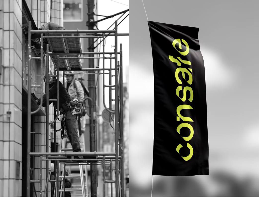
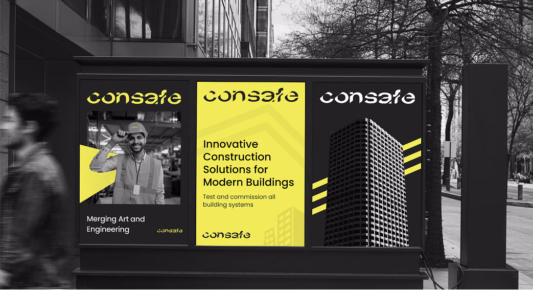
- Applications: Stationery, business cards, construction site banners, digital templates.
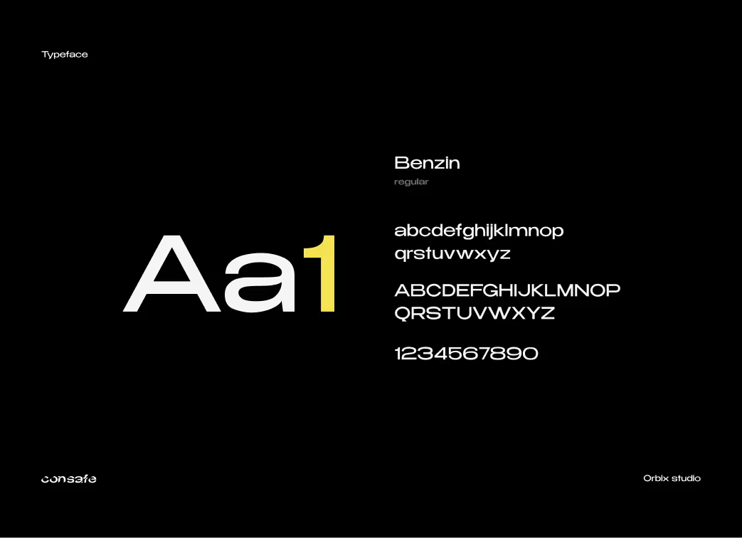
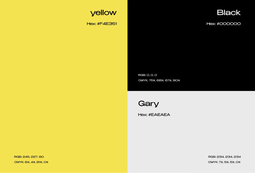
Typography, Colors & Elements
- Primary Font: Sans-serif geometric typeface for clarity.
- Color Palette: Charcoal Gray (#333333), Industrial Yellow (#F4B400), White (#FFFFFF).
- Design Elements: Diagonal bars, grid alignments, and modular layouts.
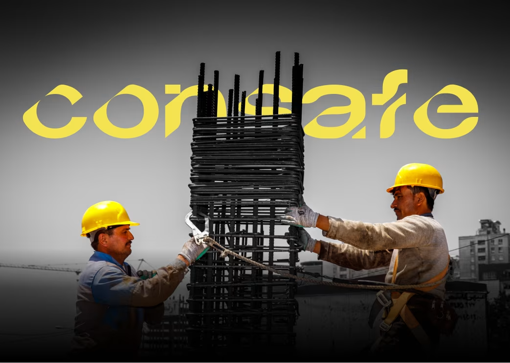

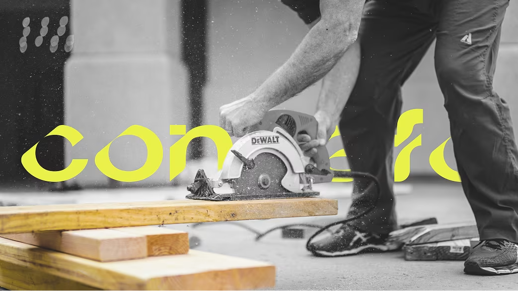
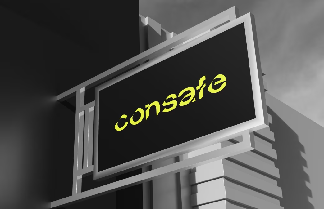
Visual Identity System
The final logo features angular elements that evoke construction precision and structural balance. The design language blends dark neutrals with vibrant yellow accents — symbolizing energy, optimism, and safety.

The Results
Our rebranding efforts delivered measurable success:
Brand visibility increased by
70%
after rebranding.
Digital leads rose by
43%
aided by new brand materials.
Client trust improved, leading to new B2B partnerships.

“Feedback gathered through surveys, interviews to measure impact and identify areas for improvement. Helps increase app's reputation and contributes to longterm success identify areas for improvement. ”