Cardboard Stage – Logo & Brand Identity Design
A playful yet professional identity for a new-age creative stage platform.
About the project
Cardboard Stage is a creative event production company that bridges art, technology, and storytelling through immersive experiences. Their goal was to create a bold, memorable brand identity that communicates creativity, collaboration, and stage innovation.
Orbix Studio was tasked with designing a full visual identity system that resonates with artists, brands, and audiences across live events, digital platforms, and promotional campaigns.
The Challenges
The previous identity lacked consistency and emotional connection. The brand didn’t reflect the company’s dynamic creative spirit or its commitment to high-quality stage experiences.
Our challenge was to develop a design system that could balance artistic freedom with brand structure, ensuring that every touchpoint—from logo to social visuals—told one cohesive story.
Our Solutions
We crafted a modern identity inspired by stage geometry, spotlight movement, and creative collaboration.
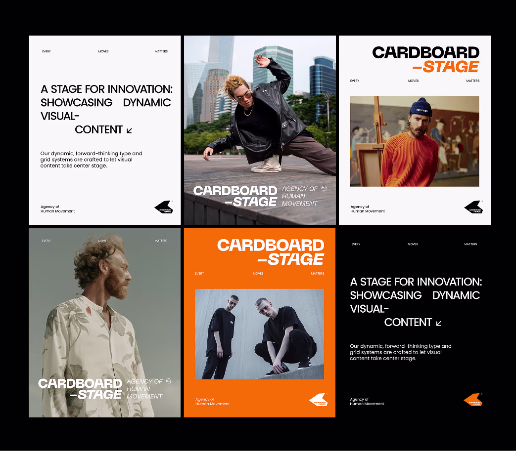
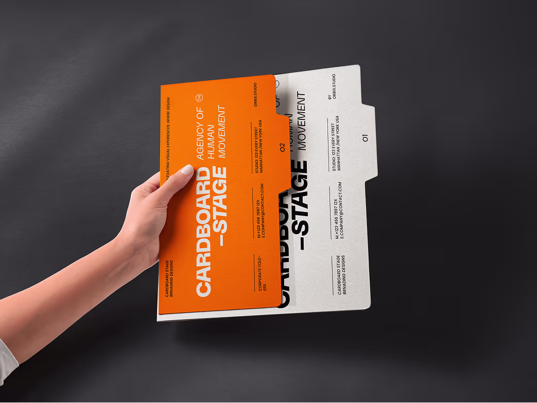
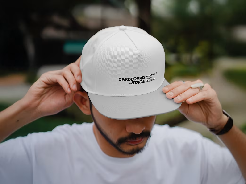
- Developed a versatile logo system adaptable for both print and digital.
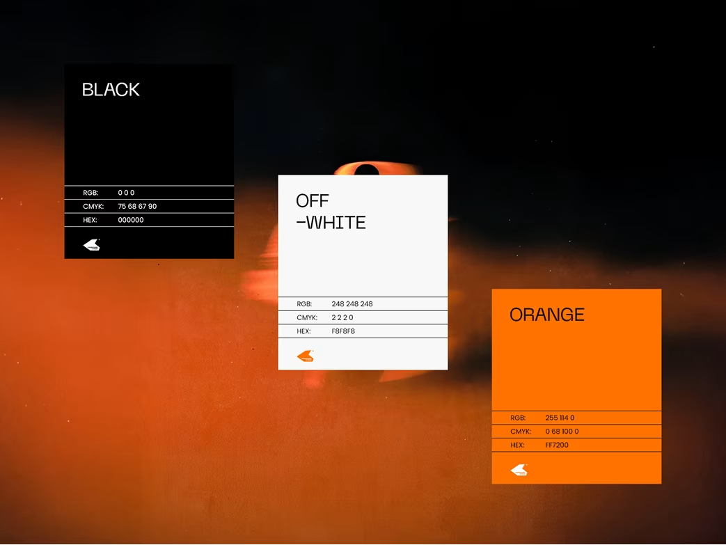
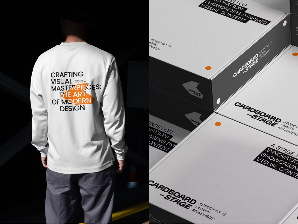
- Defined a vivid color palette symbolizing creativity and connection.
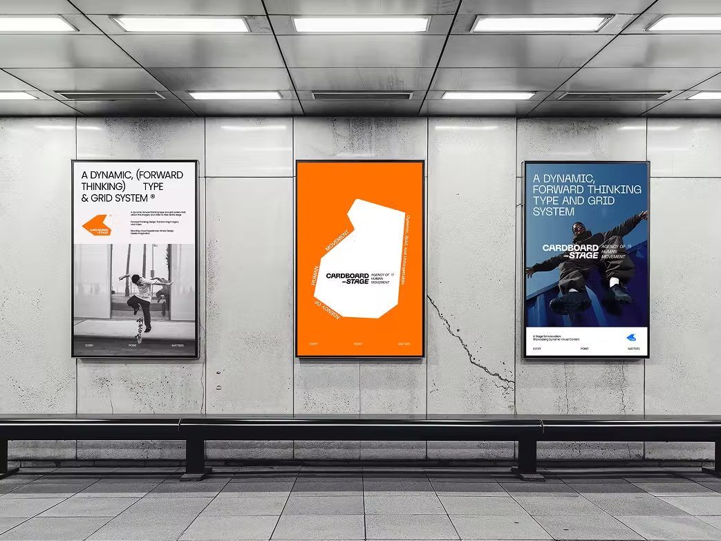
- Built a modular design grid for flexibility in marketing materials and digital layouts.
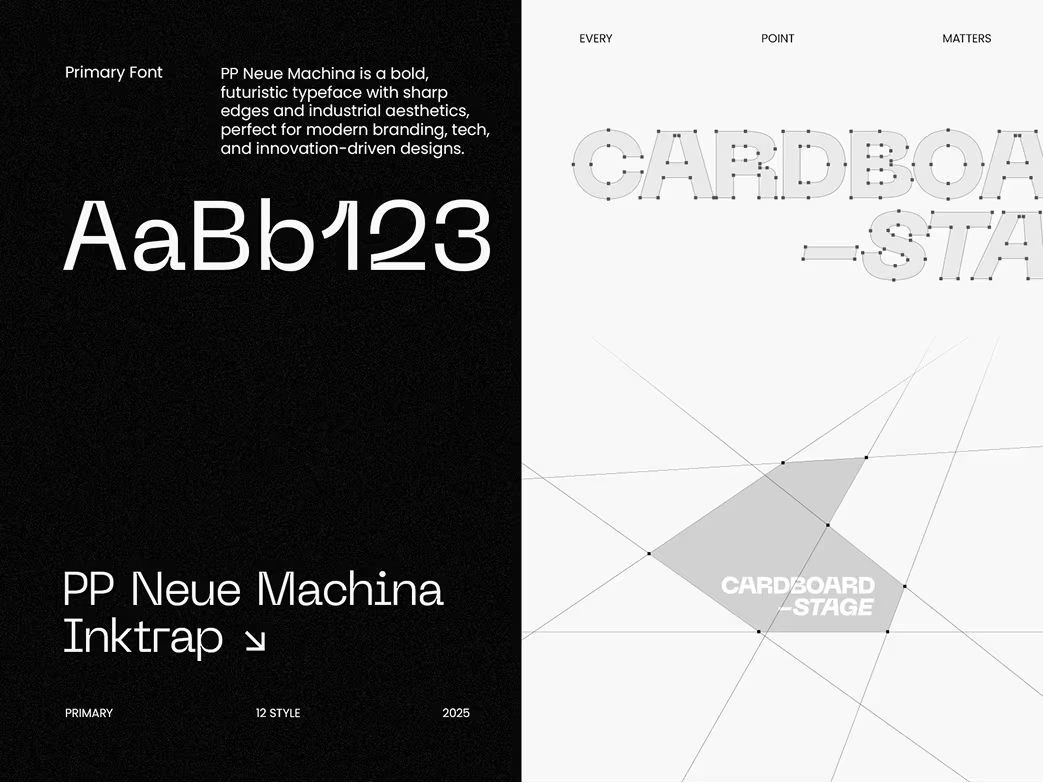
- Designed brand assets and typography that deliver energy, rhythm, and visual impact.

Our Approach

We conducted stakeholder workshops to understand Cardboard Stage’s creative process, target audience, and brand tone. Competitor benchmarking helped us identify positioning gaps within the event and production industry.

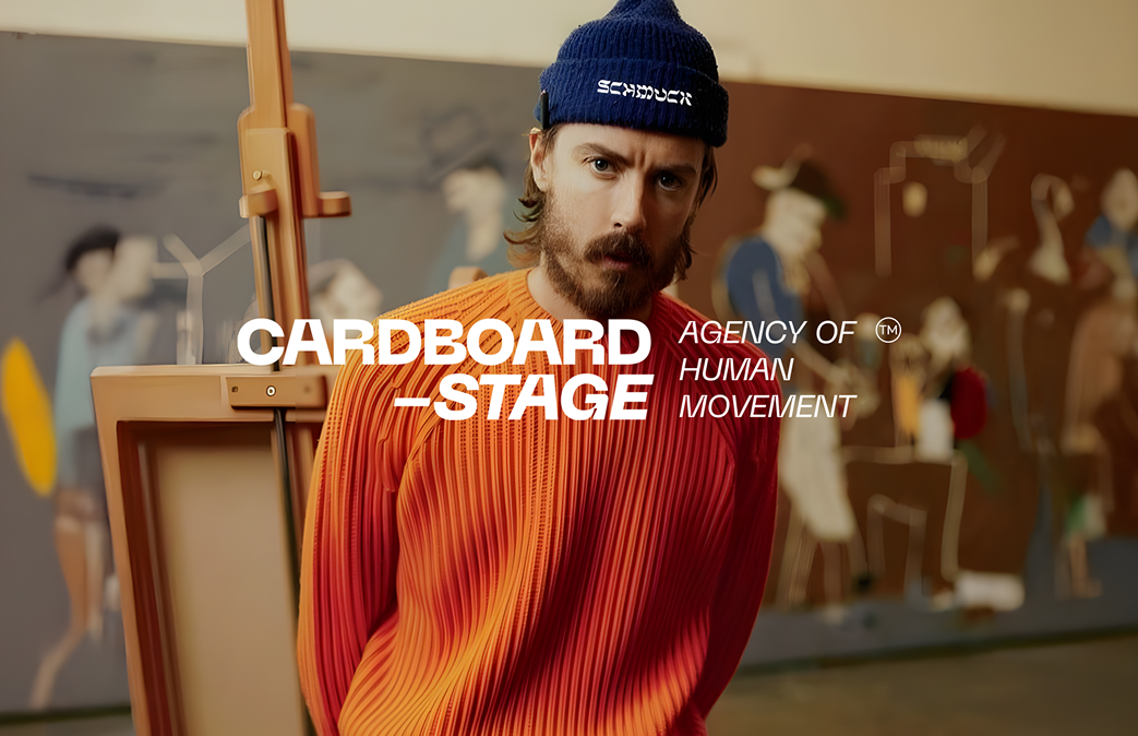
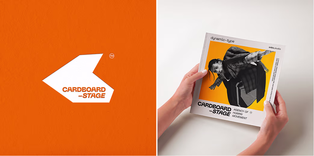
We explored stage-inspired visual metaphors to design a dynamic logo that embodies movement, spotlight, and structure—turning Cardboard Stage into a visual expression of creativity in motion.

We developed a scalable visual system with brand guidelines that ensured consistency across event posters, digital media, and partnerships. The result: a bold, recognizable identity that commands attention in creative markets.
Brand Design Process
Our design process followed a structured yet creative flow:
- Brand Discovery & Strategy
- Moodboard & Concept Exploration
- Logo Refinement & Typography Selection
- Color System & Graphic Language
- Brand Guidelines & Final Delivery
Each stage emphasized collaboration and testing, ensuring the identity reflected the brand’s performance-driven spirit.
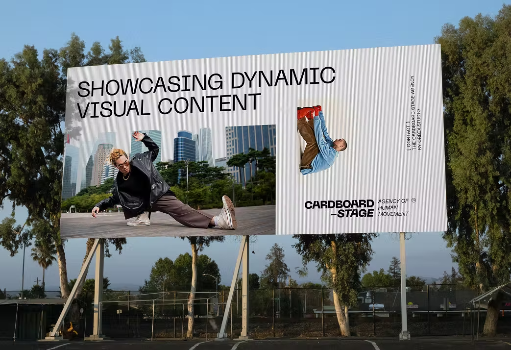
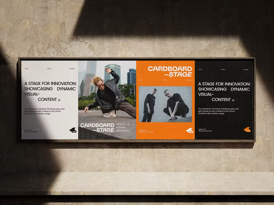
Visual Identity System
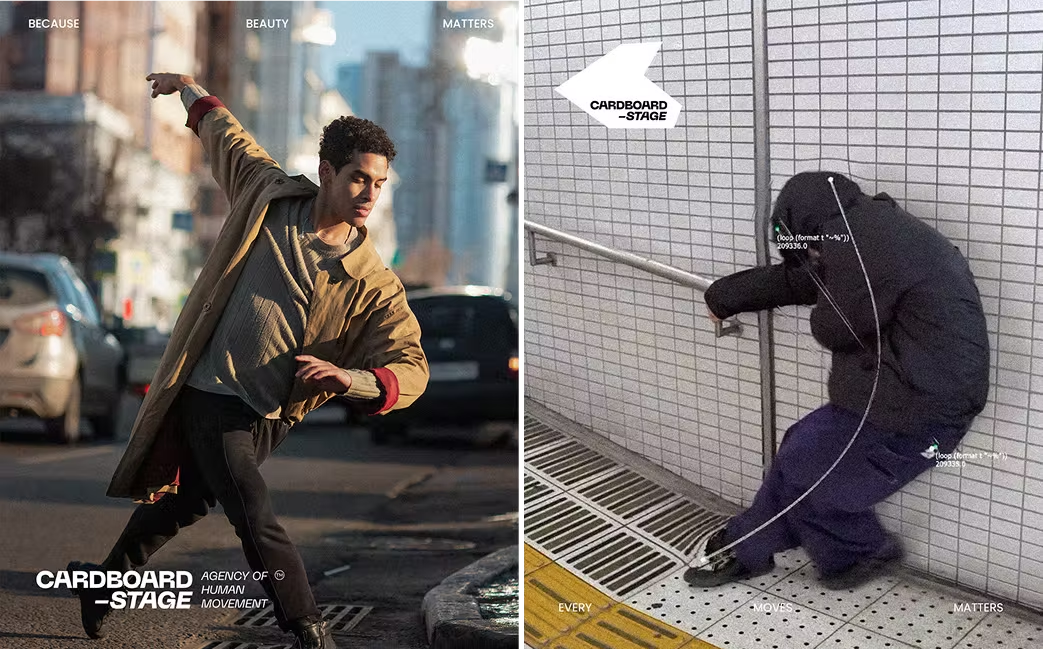
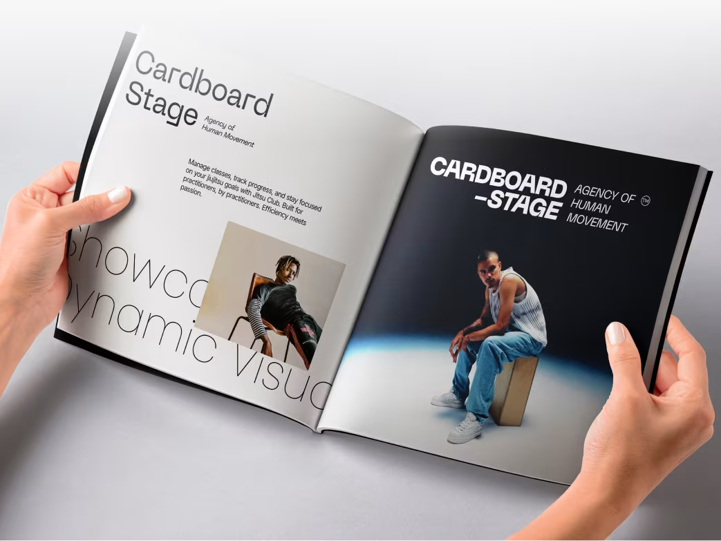
The new identity features geometric forms and modular compositions that mimic stage lights and structures.
- Logo: Modular and responsive for various use cases.
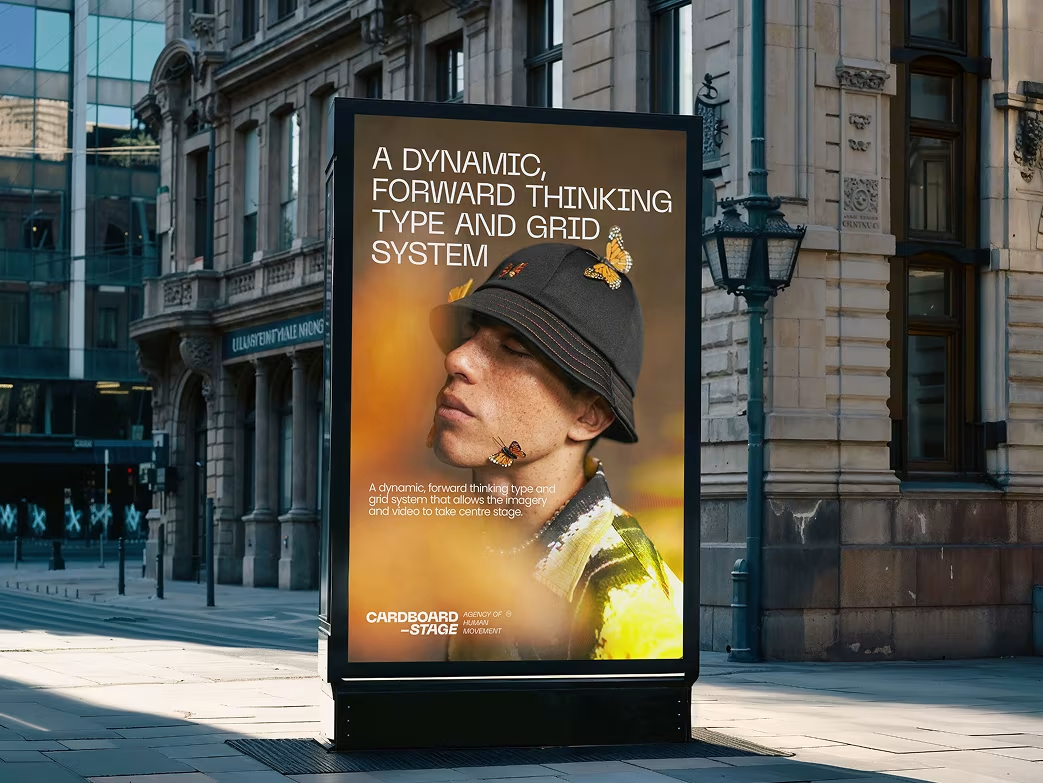
- Typography: A clean, bold sans-serif typeface for modern legibility.
- Color Palette: Vibrant gradients reflecting creativity and emotion.
- Visual Language: Abstract stage lights and shapes that reinforce energy and motion.
The Results
Our rebranding efforts delivered measurable success:
Customer engagement increased by
58%
across social media.
Brand inquiries grew by
37%
within three months post-launch.
Client satisfaction improved, with positive feedback on clarity, creativity, and emotional connection.

“Feedback gathered through surveys, interviews to measure impact and identify areas for improvement. Helps increase app's reputation and contributes to longterm success identify areas for improvement. ”