BlueGulf — Website UI/UX Design (Webflow + Framer)
A modern digital presence for a legacy marine contracting brand.

About the project
BlueGulf is a marine and contracting company aiming to modernize its online presence. The goal was to create a responsive website that communicates trust, precision, and scale — aligning with the brand’s position as a global engineering leader.
The Challenges
The previous website failed to reflect BlueGulf’s technical capabilities. Navigation felt outdated, project pages lacked clarity, and there was no clear conversion path for inquiries. The brand needed a site that projected confidence and captured international attention.
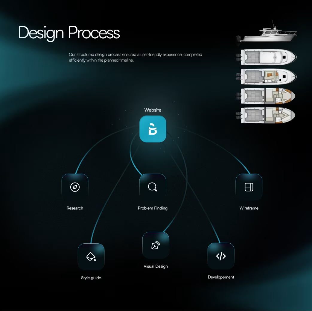
Our Approach
We began with a UX audit to identify user pain points and business goals. Our design strategy combined clear content hierarchy, powerful visuals, and Framer-based animations to bring life to BlueGulf’s story — ensuring every click builds credibility.
Our Approach


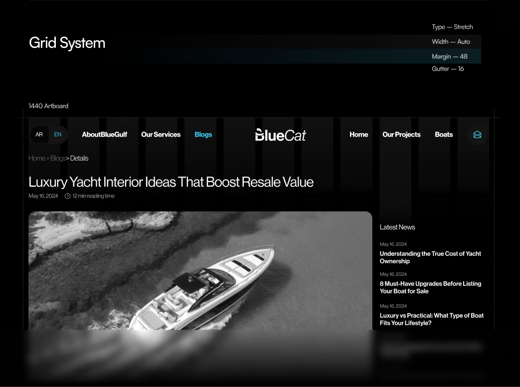
Website Structure
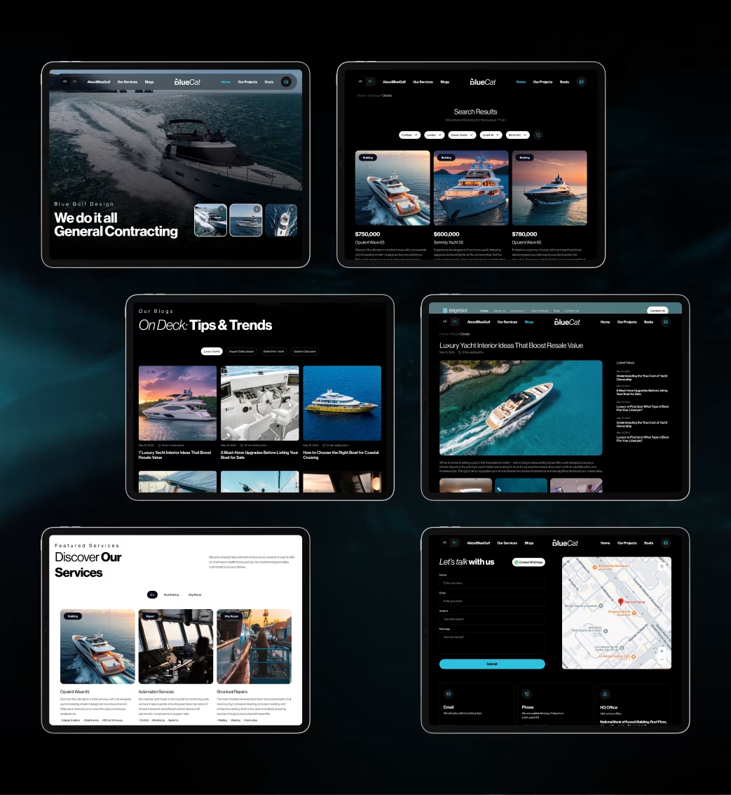
We developed a clean, logical structure focusing on service discovery and project storytelling.
Core pages included:
- Homepage
- About Us
- Services Overview
- Projects / Case Studies
- Contact Page
Each section was designed to minimize bounce rates and guide visitors toward inquiries.
Design System
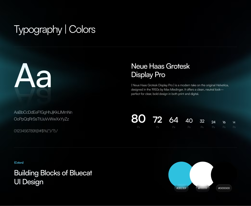
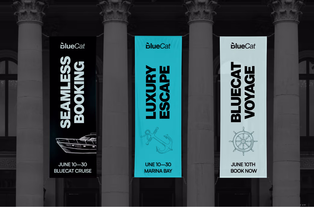
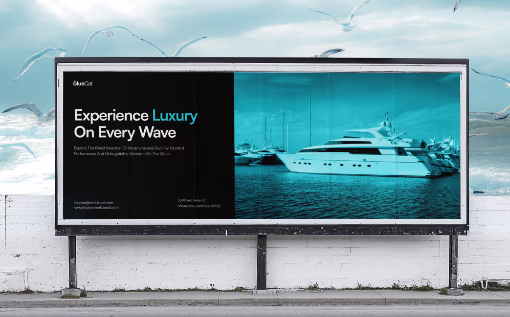
The design system uses marine blue and silver-gray tones inspired by sea and steel — symbolizing stability and innovation. We applied a 12-column responsive grid, Inter typography, and high-contrast CTAs to enhance scannability and brand recall.
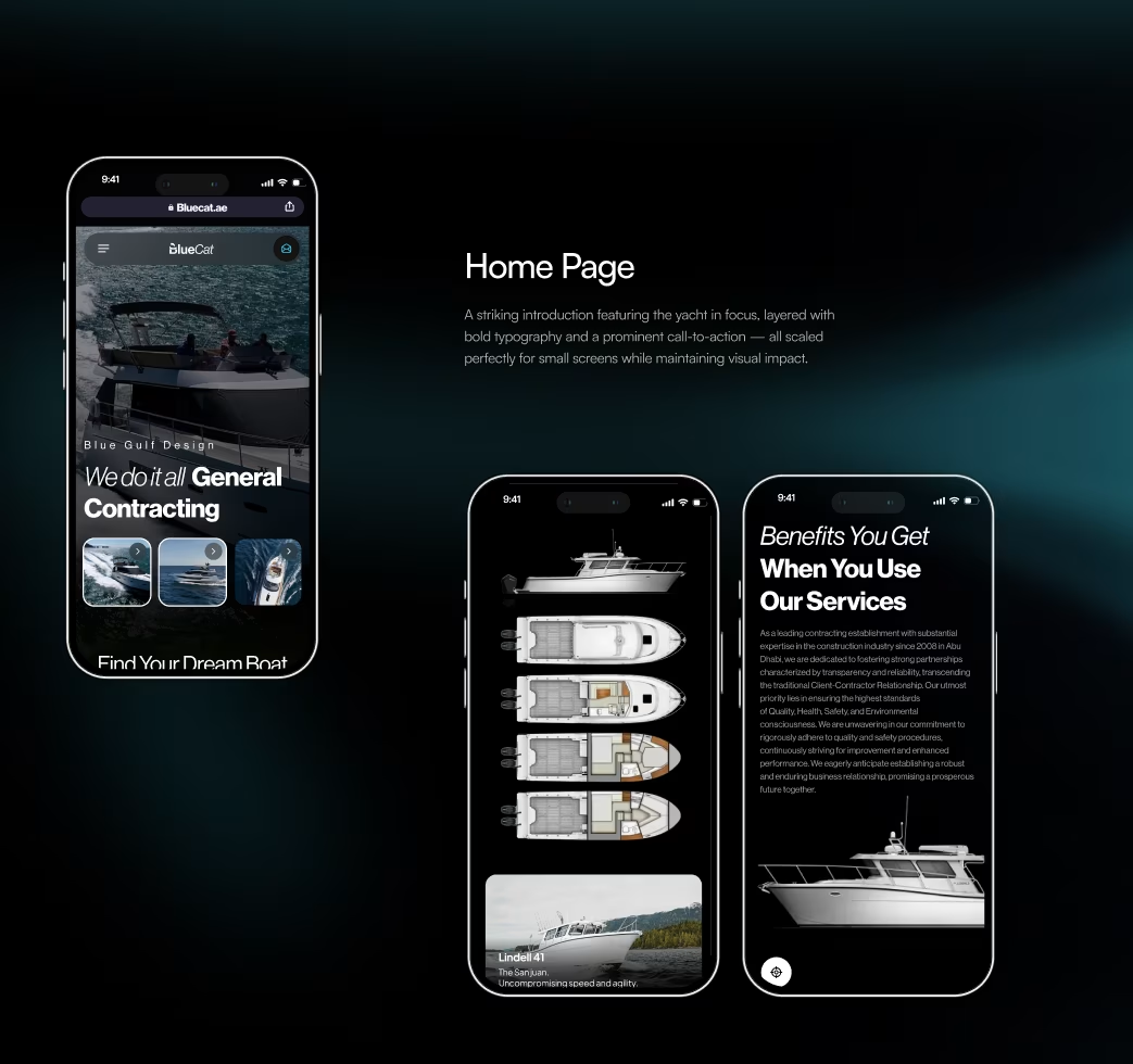
Homepage Design
The homepage was designed as a digital narrative — opening with bold visuals, followed by service highlights and project showcases. A clear “Book a Consultation” CTA leads visitors to direct contact.
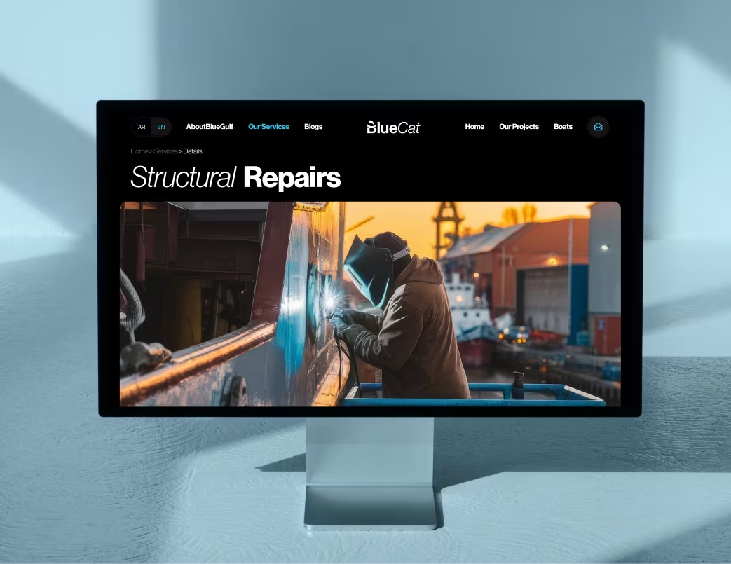
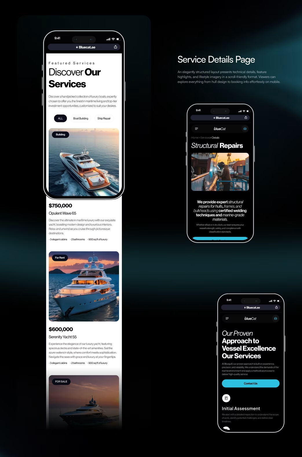
Services & Project Pages
Each service page includes a concise overview, process visuals, and related projects. Project pages were built to support high-quality visuals, fast loading, and case-study-style storytelling.
Interaction & Motion Design
Framer-based microanimations brought personality and polish. Smooth transitions between sections improved flow and kept users engaged longer.
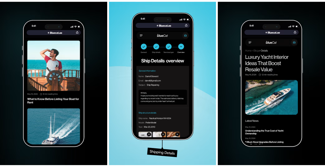
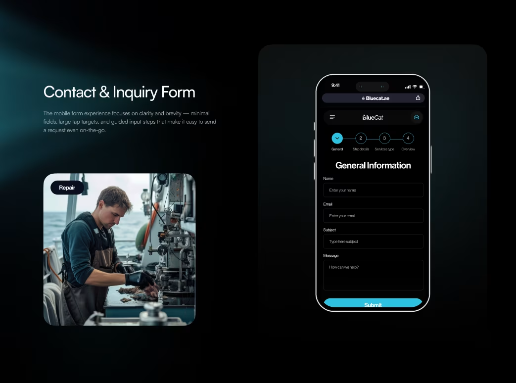
Responsive Experience
From desktop to mobile, every layout was optimized for speed and readability. Adaptive grid scaling, flexible image containers, and optimized font rendering ensured seamless browsing on all devices.
Visual Identity and Brand Story
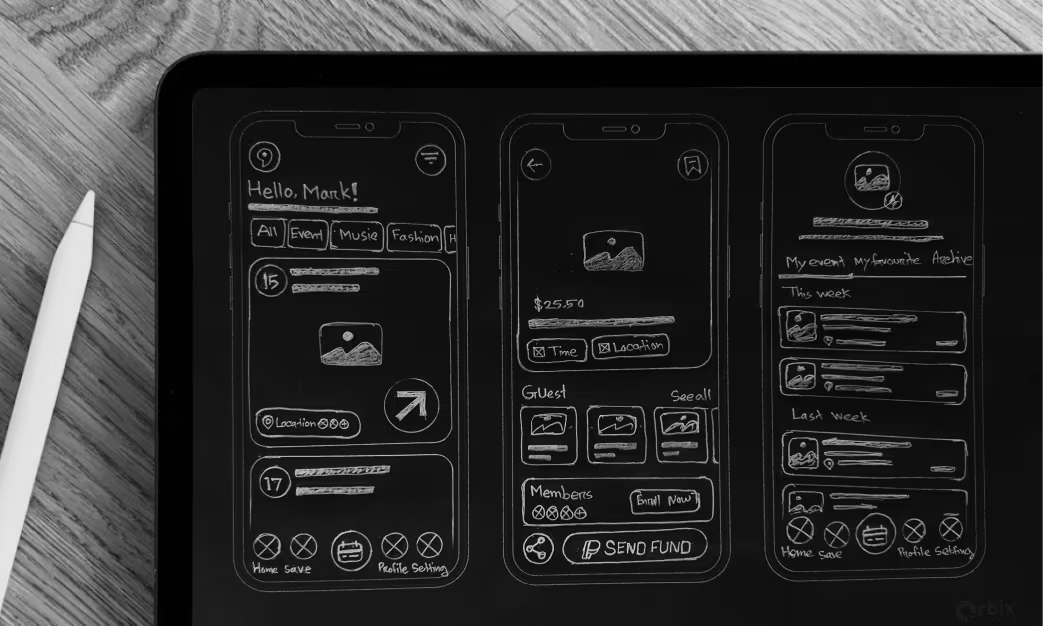
Our digital wireframes focused on the core functionality and structure of the app. We created low-fidelity prototypes to test user flows, ensuring that users could navigate from search to inquiry with minimal friction. This stage was crucial for identifying and fixing usability issues early on.
Results & Outcomes
Our digital wireframes and final design iterations focused on clarity, performance, and intuitive navigation. We validated the experience with multiple usability tests to ensure that users could complete key actions — from discovery to conversion — with minimal friction. The outcome is a high-performing digital product that feels effortless, engaging, and reliable across all touchpoints.
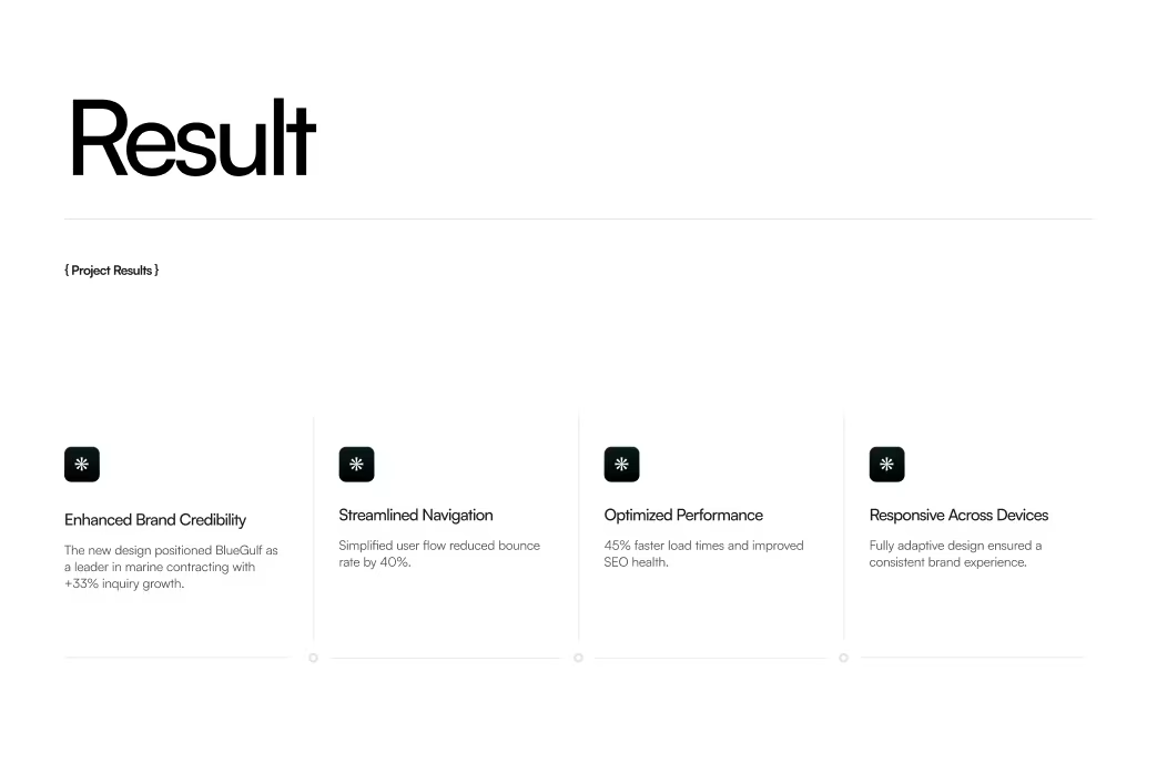
The Results
Our rebranding efforts delivered measurable success:

“Feedback gathered through surveys, interviews to measure impact and identify areas for improvement. Helps increase app's reputation and contributes to longterm success identify areas for improvement. ”