Table of Contents
In today’s hyper-digital economy, every business—from fast-growing startups to global enterprises—relies on mobile apps to connect with users, deliver value, and build brand loyalty. But great code alone doesn’t guarantee success. What truly separates winning apps from the rest is exceptional UI/UX design—the art of making complex interactions feel simple, intuitive, and delightful.
In 2026, with over 7.4 billion mobile users worldwide, users expect frictionless, personalized experiences. This makes mobile app UI/UX best practices not just a design checklist, but a strategic growth framework. Whether you're launching a new startup app or redesigning an enterprise platform, the principles below will help you build experiences that scale and convert.
1. Understand the User — Research Before You Design
Every successful app starts with deep user understanding. For startups, this means identifying a clear problem to solve. For enterprises, it's about optimizing workflows and minimizing friction in large ecosystems.
Best Practice: Conduct usability testing, interviews, and analytics-driven research to uncover real user pain points.
Tools to Use:
- Startups: Maze, Figma prototypes, and Typeform surveys.
- Enterprises: Hotjar, UXCam, and heuristic audits for legacy systems.
Pro Tip: Always define personas and use cases before designing interfaces. A data-backed design foundation improves user satisfaction by up to 40%, according to recent UX Benchmark data.

2. Prioritize Simplicity and Intuitive Navigation
In mobile UX, simplicity wins. Users abandon apps that require too many taps or unclear paths. Clear hierarchy, logical grouping, and consistent navigation patterns are essential.
For Startups:
Keep onboarding short. Use familiar gestures (swipes, taps) to reduce learning curves.
For Enterprises:
Ensure scalability. Use clear navigation bars and modular layouts that adapt as new features are added.
Tactics to Apply:
- Limit choices per screen (3–5 actions max).
- Keep icons recognizable and text labels consistent.
- Add a persistent bottom navigation bar for key features.
Result: Apps following clean navigation see 28% higher task completion rates and lower bounce rates across devices.
3. Optimize for Mobile-First Performance
A sleek interface is useless if it lags or crashes. Both startup and enterprise apps must embrace mobile-first optimization—designing for speed, responsiveness, and accessibility.
Key Optimizations:
- Reduce load times below 2 seconds.
- Optimize images and animations for lightweight performance.
- Use asynchronous loading for data-heavy features.
Example:
At Orbix Studio, optimizing a fintech client’s onboarding screen reduced load time by 42%, improving retention by 31%.
4. Leverage Consistent Visual Design and Branding
Consistency builds trust. Users recognize brands by their visual language—color, typography, spacing, and micro-interactions.
Startups:
Establish a design system early (Figma, Framer, or Webflow Style Guide). It ensures cohesion across future updates.
Enterprises:
Audit existing systems and unify fragmented interfaces using a centralized design library.
Pro Tip:
Consistent branding across UI elements increases user trust and recall by 23%. Use contrast to improve accessibility (WCAG AA compliance).
5. Enhance Onboarding with Clarity and Motivation
The first-time user experience (FTUE) determines retention. 70% of users drop off after one session if onboarding feels confusing or too long.
For Startups:
Highlight one key value—what problem the app solves. Use interactive tutorials or micro-tours.
For Enterprises:
Offer role-based onboarding, especially for apps with multiple user types (e.g., employees, managers, admins).
Best Practice Tips:
- Use progress bars and microcopy for guidance.
- Gamify onboarding with small success cues.
- Always allow a “Skip” option to avoid frustration.
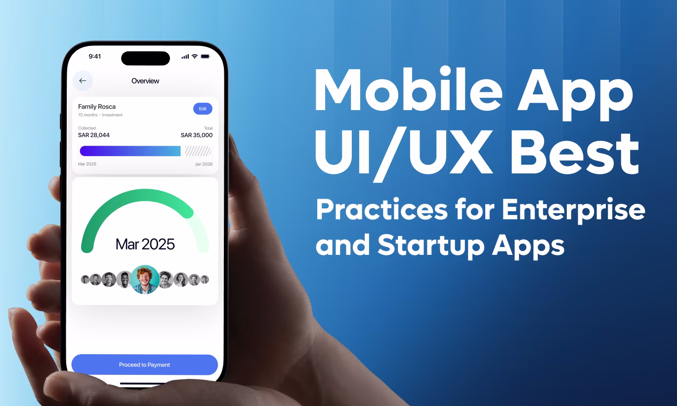
Here is the text from the image, which concludes the guide on mobile app UI/UX best practices:
6. Use Micro-Interactions to Humanize the Experience
Micro-interactions—small animations, button feedback, and transition effects—bring delight and clarity. They communicate system status and improve emotional engagement.
Examples:
- Button ripple on tap → feedback.
- Loading animation → keeps users informed.
- Success tick → confirmation builds trust.
Caution: Don't overdo animations. Subtlety keeps UX fast and professional.
Impact: Micro-interactions can boost perceived usability by 20−25%, according to Nielsen’s 2023 design trends report.
7. Data-Driven Personalization
AI and machine learning now enable real-time customization of UX.
For Startups: Personalized dashboards or recommendations can increase engagement. Example: showing top-used features first.
For Enterprises: Integrate analytics for adaptive UX—role-based dashboards, personalized notifications, and proactive control.
Tip: Always provide users with control over personalization to respect privacy.
8. Accessibility Is Not Optional
Accessibility compliance (WCAG 2.2) ensures inclusivity, legal safety, and brand goodwill.
Checklist:
- Support screen readers.
- Ensure color contrast ratio above 4.5:1.
- Enable text resizing and keyboard navigation.
Why It Matters: Failing to experience a disability. Accessible apps reach 25% more users and foster trust among all audiences.
9. Build Scalable Design Systems
Your app will evolve—new features, new platforms, new users. A scalable design system prevents visual chaos.
What to Include:
- Components library (buttons, modals, forms).
- Token-based design variables for color and spacing.
- Reusable patterns for mobile and tablet.
Result: Faster iteration, easier handoff, and consistent design quality across updates.
10. Test, Iterate, Repeat
Great design is never done. Both startups and enterprises must adopt an iterative UX mindset—testing assumptions continuously.
Recommended Testing Cycle:
- Usability testing (weekly or per feature release).
- A/B testing for UI updates.
- Analytics review for retention and engagement.
Example: A B2B SaaS client improved onboarding conversion by 47% after running 3 usability iterations with our UX team.
Conclusion: Design for Growth, Not Just Looks
Mobile app UI/UX design is not a one-time task—it's an ongoing growth strategy. Startups benefit from speed, validation, and clarity, while enterprises gain efficiency, scalability, and retention.
By following these best practices—simplicity, personalization, accessibility, and iterative testing—you create apps that users love and remember.
Whether you're launching your MVP or redesigning a global enterprise solution, investing in design excellence is how you turn digital products into powerful growth engines.